
Section S.2 - Presenting Data Graphically
Categorizing Data
Once we have gathered data, we might wish to classify it. Roughly speaking, data can be classified as categorical data or quantitative data.
| Quantitative and Categorical (Qualitative) Data |
|
Categorical (qualitative) data are pieces of information that allow us to classify the objects under investigation into various categories. Quantitative data are responses that are numerical in nature and with which we can perform meaningful arithmetic calculations. |
| Example 1 |
|
We might conduct a survey to determine the name of the favorite movie that each person in a math class saw in a movie theater. |
|
When we conduct such a survey, the responses would look like: Finding Nemo, The Hulk, or Terminator 3: Rise of the Machines. We might count the number of people who give each answer, but the answers themselves do not have any numerical values: we cannot perform computations with an answer like "Finding Nemo." This would be categorical data. |
| Example 2 |
|
A survey could ask the number of movies you have seen in a movie theater in the past 12 months (0, 1, 2, 3, 4, ...) |
|
This would be quantitative data. |
Other examples of quantitative data would be the running time of the movie you saw most recently (104 minutes, 137 minutes, 104 minutes, ...) or the amount of money you paid for a movie ticket the last time you went to a movie theater ($5.50, $7.75, $9, ...).
Sometimes, determining whether or not data is categorical or quantitative can be a bit trickier.
| Example 3 |
|
Suppose we gather respondents' ZIP codes in a survey to track their geographical location. |
|
ZIP codes are numbers, but we can't do any meaningful mathematical calculations with them (it doesn't make sense to say that 98036 is "twice" 49018 — that's like saying that Lynnwood, WA is "twice" Battle Creek, MI, which doesn't make sense at all), so ZIP codes are really categorical data. |
| Example 4 |
| A survey about the movie you most recently attended includes the question "How would you rate the movie you just saw?" with these possible answers:
1 - it was awful |
|
Again, there are numbers associated with the responses, but we can't really do any calculations with them: a movie that rates a 4 is not necessarily twice as good as a movie that rates a 2, whatever that means; if two people see the movie and one of them thinks it stinks and the other thinks it's the best ever it doesn't necessarily make sense to say that "on average they liked it." |
As we study movie-going habits and preferences, we shouldn't forget to specify the population under consideration. If we survey 3-7 year-olds the runaway favorite might be Finding Nemo. 13-17 year-olds might prefer Terminator 3. And 33-37 year-olds might prefer...well, Finding Nemo.
| You Try S.2.A |
|
Classify each measurement as categorical or quantitative: a. Eye color of a group of people |
Once we have collected data from surveys or experiments, we need to summarize and present the data in a way that will be meaningful to the reader. We will begin with graphical presentations of data then explore numerical summaries of data.
Presenting Categorical Data Graphically
Categorical, or qualitative, data are pieces of information that allow us to classify the objects under investigation into various categories. We usually begin working with categorical data by summarizing the data into a frequency table.
| Frequency Table |
|
A frequency table is a table with two columns. One column lists the possible values of the variable, and the other lists the corresponding frequency for each value (how many items fit into each category). The last row of the table should indicate the total number of data items by writing “n=…”. Many times a 3rd column is added, called the relative frequency column. The relative frequency expresses the frequency of each possible value, relative to the whole. Relative frequencies can be written as fractions, decimals, or percentages. |
| Example 5 | |||||||||||||||||||||||||||||||||||||||||||||
|
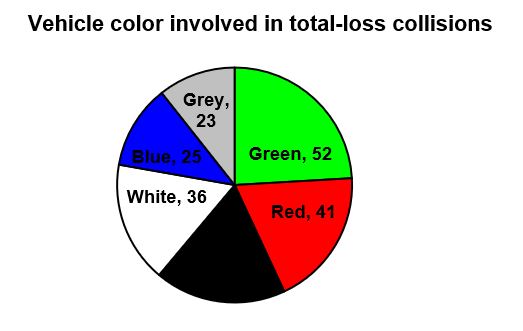
An insurance company determines vehicle insurance premiums based on known risk factors. If a person is considered a higher risk, their premiums will be higher. One potential factor is the color of your car. The insurance company believes that people with some color cars are more likely to get in accidents. To research this, they examine police reports for recent total-loss collisions. The data is summarized in the frequency table below.
When you add together the frequencies for each possible value of the variable, you end up with the total number of observed values. In this case, that total is 216 (n = 216). If we wanted to add a relative frequency column, we would find the relative frequency for each color by dividing the corresponding frequency by the total number of observations. The new table would be as follows:
Note: The relative frequency column should always sum to 1 (or 100%) since you are representing the entire data set. |
|||||||||||||||||||||||||||||||||||||||||||||
Sometimes we need an even more intuitive way of displaying data. This is where charts and graphs come in. There are many, many ways of displaying data graphically, but we will concentrate on one very useful type of graph called a bar graph. In this section we will work with bar graphs that display categorical data; the next section will be devoted to histograms that display quantitative data.
| Bar Graphs |
| A bar graph is a graph that displays a bar for each category with the length of each bar indicating the frequency of that category. |
To construct a bar graph, we need to draw a vertical axis and a horizontal axis. The vertical direction will have a scale and measure the frequency of each category; the horizontal axis has no scale in this instance, and represents the possible values of the variable of interest. The construction of a bar chart is most easily described by use of an example.
| Example 6 |
|
Using our car data from above, note the highest frequency is 52, so our vertical axis needs to go from 0 to 52, but we might as well use 0 to 55, so that we can put a hash mark every 5 units:
|
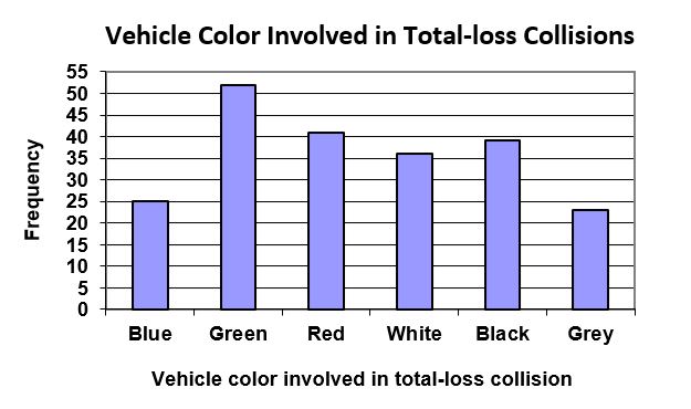
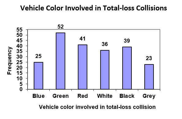
Notice that the height of each bar is determined by the frequency of the corresponding color. The horizontal gridlines are a nice touch, but not necessary. In practice, you will find it useful to draw bar graphs using graph paper, so the gridlines will already be in place, or using technology. Instead of gridlines, we might also list the frequencies at the top of each bar, like this:
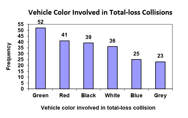
In this case, our chart might benefit from being reordered from largest to smallest frequency values. This arrangement can make it easier to compare similar values in the chart, even without gridlines. When we arrange the categories in decreasing frequency order like this, it is called a Pareto chart.
| Pareto Chart |
| A Pareto chart is a bar graph ordered from highest to lowest frequency |
| Example 7 |
|
Transforming our bar graph from earlier into a Pareto chart, we get:
|
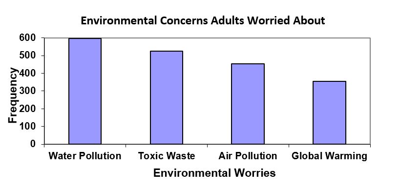
| Example 8 | ||||||||||||||
|
In a survey8, adults were asked whether they personally worried about a variety of environmental concerns. The numbers (out of 1932 surveyed) who indicated that they worried “a great deal” about some selected concerns are summarized below.
This data could be shown graphically in a bar graph:
|
||||||||||||||
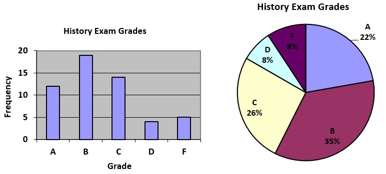
| You Try S.2.B |
|
Create a frequency table and bar graph to illustrate the grades on a history exam below: A: 12 students, B: 19 students, C: 14 students, D: 4 students, F: 5 students |
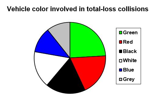
| Pie Chart |
| A pie chart is a circle with wedges cut of varying sizes marked out like slices of pie or pizza. The relative sizes of the wedges correspond to the relative frequencies of the categories. These relative frequencies are usually expressed as a percentage. |
| Example 9 |
|
For our vehicle color data, a pie chart might look like this:
Pie charts can often benefit from including frequencies or relative frequencies (percentages) in the chart next to the pie slices. Often having the category names next to the pie slices also makes the chart clearer.
|
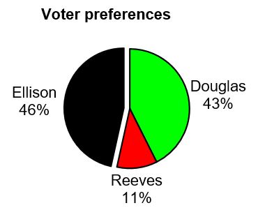
| Example 10 |
|
The pie chart to the right shows the percentage of voters supporting each candidate running for a local senate seat. If there are 20,000 voters in the district, the pie chart shows that about 11% of those, about 2,200 voters, support Reeves.
|
Pie charts look nice, but are harder to draw by hand than bar charts since to draw them accurately we would need to compute the angle each wedge cuts out of the circle, then measure the angle with a protractor. Computers are much better suited to drawing pie charts. Common software programs like Microsoft Word or Excel, OpenOffice.org, Write or Calc, or Google Docs are able to create bar graphs, pie charts, and other graph types. There are also numerous online tools that can create graphs9.
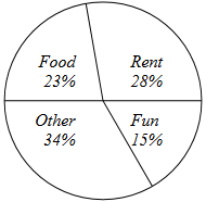
| You Try S.2.C |
|
Logan categorized his spending for this month into four categories: Rent, Food, Fun, and Other. The percentages he spent in each category are pictured here. If Logan spent a total of $2400 this month, how much did he spend on Food? |
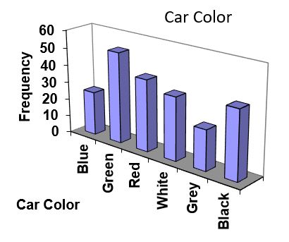
Don’t get fancy with graphs! People sometimes add features to graphs that don’t help to convey their information. For example, 3-dimensional bar charts like the one shown below are usually not as effective as their two-dimensional counterparts.
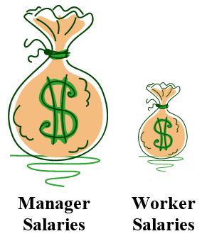
Here is another way that fanciness can lead to trouble. Instead of plain bars, it is tempting to substitute meaningful images. This type of graph is called a pictogram.
| Pictogram |
| A pictogram is a statistical graphic in which the size of the picture is intended to represent the frequencies or size of the values being represented. |
| Example 11 |
|
A labor union might produce the graph to the right to show the difference between the average manager salary and the average worker salary. Looking at the picture, it would be reasonable to guess that the manager salaries is 4 times as large as the worker salaries – the area of the bag looks about 4 times as large. However, the manager salaries are in fact only twice as large as worker salaries, which were reflected in the picture by making the manager bag twice as tall.
|
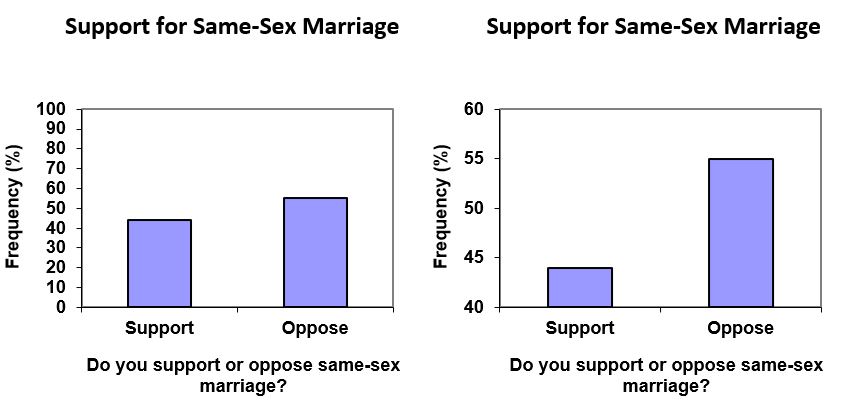
Another distortion in bar charts results from setting the baseline to a value other than zero. The baseline is the bottom of the vertical axis, representing the least number of cases that could have occurred in a category. Normally, this number should be zero.
| Example 12 |
|
Compare the two graphs below showing support for same-sex marriage rights from a poll taken in December, 200810. The difference in the vertical scale on the first graph suggests a different story than the true differences in percentages; the second graph makes it look like twice as many people oppose marriage rights as support it.
|
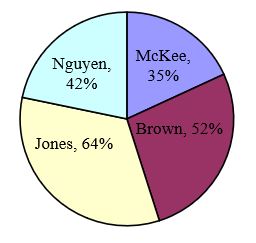
| You Try S.2.D |
|
A poll was taken asking people if they agreed with the positions of the 4 candidates for a county office. Does the pie chart present a good representation of this data? Explain.
|
Presenting Quantitative Data Graphically
Quantitative, or numerical, data can also be summarized into frequency tables.
| Example 13 | ||||||||||||||||||||||||
|
A teacher records scores on a 20-point quiz for the 30 students in his class. The scores are: 19 20 18 18 17 18 19 17 20 18 20 16 20 15 17 12 18 19 18 19 17 20 18 16 15 18 20 5 0 0 These scores could be summarized into a frequency table by grouping like values:
|
||||||||||||||||||||||||
Using this table, it seems like we could create a standard bar chart from this summary, like we did for categorical data:
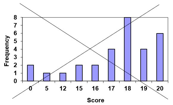
However, since the scores are numerical values, the bar graph above doesn’t really make sense; the first and second bars are five values apart, while the later bars are only one value apart. It would be more correct to treat the horizontal axis as a number line. This type of graph is called a histogram.
| Histogram |
|
A histogram is like a bar graph, but where the horizontal axis is a number line. The vertical axis still represents frequency, and the horizontal axis still represents the variable of interest. |
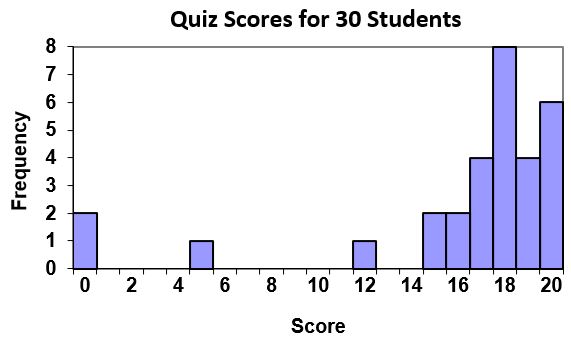
| Example 14 |
|
For the quiz score values in example 13, a histogram would look like:
|
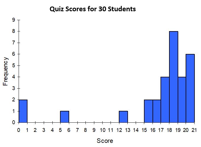
Notice that in the histogram, a bar represents values on the horizontal axis from that on the left hand-side of the bar up to, but not including, the value on the right hand side of the bar. Some people choose to have bars start at ½ values to avoid this ambiguity.
Unfortunately, not a lot of common software packages can correctly graph a histogram.
Fortunately, your graphing calculator can quickly create an accurate histogram using the STAT PLOT option.
If we have a large number of widely varying data values, creating a frequency table that lists every possible value as a category would lead to an exceptionally long frequency table, and probably would not reveal any patterns. For this reason, it is common with quantitative data to group data into class intervals.
| Class Intervals |
|
Class intervals are groupings of the data. In general, we define class intervals so that:
|
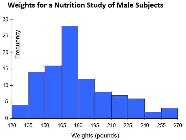
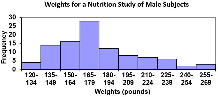
| Example 15 | ||||||||||||||||||||||||||
|
Suppose that we have collected weights from 100 male subjects as part of a nutrition study. For our weight data, we have values ranging from a low of 121 pounds to a high of 263 pounds, giving a total span of 263-121 = 142. We could create 7 intervals with a width of around 20, 14 intervals with a width of around 10, or somewhere in between. Often time we have to experiment with a few possibilities to find something that represents the data well. Let us try using an interval width of 15. We could start at 121, or at 120 since it is a nice round number.
A histogram of this data would look like:
|
||||||||||||||||||||||||||
In many software packages, you can create a graph similar to a histogram by putting the class intervals as the labels on a bar chart.
| You Try S.2.E | ||||||||||||||||||||||||||||||||||||
|
The total cost of textbooks for the term was collected from 36 students. Create a histogram for this data.
|
Calculator Instructions for Drawing a Histogram Using a TI-83/84:
- Turn on the calculator
- Press the “STAT” key
- Hit “Enter” on option 1: “Edit”. This will bring you to a screen that contains lists: L1, L2, L3, etc.
- Enter the data values (one value per row) into L1. For any negative values you need to use the (-) key, not the subtraction key. Continue until all data is entered into L1.
- Press the 2nd key and then “STAT PLOT” (top left of calculator)
- Press “Enter” on 1: “Plot 1”
- Use the arrows to “ON” to turn on Plot 1. Hit “Enter”.
- Use the arrows to go to the histogram picture and hit “Enter”.
- Make sure that Xlist displays L1
- Press the 2nd key and then “STAT PLOT” again.
- Make sure to turn off all other stat plots, and clear all equations before graphing the histogram.
- Press the ZOOM menu.
- Scroll down to option 9: “ZoomStat” and hit “Enter”.
References
[8] Gallup Poll. March 5-8, 2009. http://www.pollingreport.com/enviro.htm
[9] For example: http://nces.ed.gov/nceskids/createAgraph/ or http://docs.google.com
[10] CNN/Opinion Research Corporation Poll. Dec 19-21, 2008, from http://www.pollingreport.com/civil.htm
Section S.2 Answers to You Try Problems
S.2.A
a. Categorical
b. Quantitative
c. Quantitative
S.2.B
S.2.C
$2400(.23) = $552.00
S.2.D
While the pie chart accurately depicts the relative size of the people agreeing with each candidate, the chart is confusing, since usually percentages on a pie chart represent the percentage of the pie that the slice represents.
S.2.E
Answers vary
