
Section S.3 – Describing a Distribution and Measures of Central Tendency
Describing a Distribution
We will now begin to discuss how to describe a particular variable of interest. Of particular importance is the variable’s distribution.
| Distribution |
| The distribution of a variable tells you all possible values the variable can take on, and the frequency that each of the possible values occurs. |
In the last section, we looked at frequency tables and histograms, which are two ways of showing a variable’s distribution. Distributions can also be shown by fitting smooth curves to a graphical display of a data set, or using a formula.
| SOCS |
| In statistics, when we consider differences between distributions, we usually look at several characteristics of the distribution:
Shape – Outliers – Center – Spread Together we refer to these as the “SOCS” of the distribution |
| Distribution Shapes |
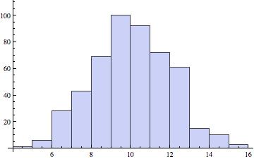
The shape of a distribution is frequently estimated by drawing a smooth curve to a histogram, as shown in the following diagram:
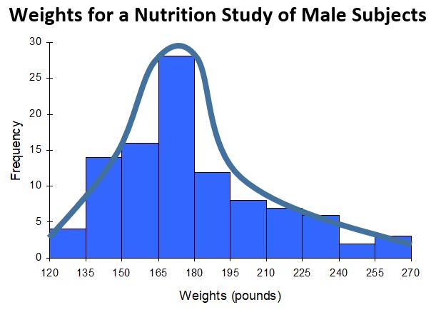
In the above histogram, a smooth curve has been drawn to roughly approximate the shape of the distribution for the variable “Weights”.
This particular distribution is right-skewed.
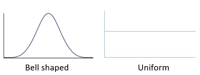
The previous example showed just one of the many possible distribution shapes that can be observed. There are several common distribution shapes, each with unique combinations of number of peaks, symmetry, center, and spread.
The most commonly used distribution curve in elementary statistics is a bell-shaped distribution curve, but it is important to realize that there are many possible distribution shapes. Some are symmetric, some are right-skewed, left-skewed, unimodal (one peak), or bimodal (two peaks). A few of the most common shapes are shown below.
| Symmetric Distribution |
| A symmetric distribution is a distribution shape in which the left and right sides of the distribution are roughly mirror images of one another. |
Symmetric Distribution Shapes:
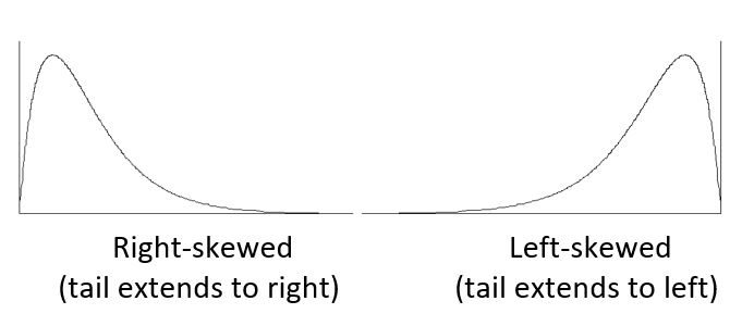
| Skewed Distribution |
| A skewed distribution is a distribution shape in which the data is asymmetrical, and tends to cluster toward one side, while having a longer “tail” on the other side. |
Skewed Distribution Shapes:
Note: In practice, there will be variables whose distribution shapes do not exactly fit any of the shapes described above.
| Example 1 |
|
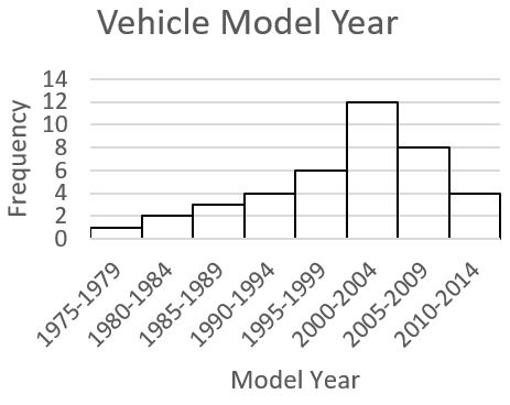
The histogram below shows the “Model Year” for a sample of 40 vehicles.
a. Is the distribution symmetric or skewed? b. Classify the shape of the distribution as bell shaped, uniform, right-skewed, or left-skewed. |
| Answers:
a. The distribution is a skewed distribution, as the data clusters on the right side and has a longer tail on the left side. b. This distribution is left-skewed, as the longer tail extends to the left. |
| Example 2 |
|
Given the histogram below:
a. Is the distribution symmetric or skewed? b. Classify the shape of the distribution as bell shaped, uniform, right-skewed, or left-skewed. |
| Answers:
a. The distribution is a symmetric distribution, as the data clusters fairly evenly on both the left and right sides. b. This distribution is bell-shaped. |
| Outliers |
We will only briefly touch on outliers in this text.
| Outlier |
| An outlier is a data value that is “extreme” when compared to the rest of the values in the data set.
It may be extreme in either direction, meaning it may be very small when compared to the rest of the values in the data set, or it may be very large when compared to the rest of the values in the data set. |
While there are several formal methods for determining if a data value is an outlier (or a potential outlier), the determination of outliers can be somewhat subjective. This means that it can be left up to the researcher to determine which observations are “extreme”.
| Example 3 | ||||||||||||||||||||
|
Consider the data set below which consists of “Exam Scores” for a sample of 20 Statistics students:
Do there appear to be any outliers in the data set? Why or why not? |
||||||||||||||||||||
|
It can be difficult to look at a list of data and try to identify any “extreme” or unusual values. These outliers are easier to identify by looking at a graph of the data. Create a histogram, and look for any outliers. They will be values that appear to fall far outside the normal values.
Notice the graph shows one bar that is “far” below the other bars in the graph. When looking more closely, we see that this bar represents 1 test score. If we look back at the data set, we can see this bar represents 1 student who scored an 18 on the Exam. The value 18 appears to be an outlier, because it is “far” outside the original group of data values. It is important to recognize that there is an outlier in the data set, as the outlier may affect the descriptive measures of the mean and standard deviation (coming up in the next sections). |
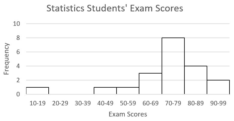
Since outliers can affect the descriptive measures we use to describe a data set (specifically the mean as a measure of center and the standard deviation as a measure of spread), it is important to visually inspect a data set to see if there appear to be any outliers. We will come back to this idea in the next several sections.
Recall, we started this chapter by defining a distribution, and describing the “SOCS” (Shape, Outliers, Center, and Spread) of a distribution. Now that we have spent time introducing the “Shape” of a distribution, and briefly discussing “Outliers”, we will move on to measuring the “Center”. We will discuss “Spread” later on in Sections S.4.
Measures of Central Tendency
The “Center” is an important aspect of a distribution. When we refer to the “Center” we are trying to get an idea of the location of the middle of the data set. There are three common measures of central tendency. They are the mean, median, and mode.
Let’s begin by trying to find the most “typical” value of a data set.
Note that we just used the word “typical” although in many cases you might think of using the word “average.” We need to be careful with the word “average” as it means different things to different people in different contexts. One of the most common uses of the word “average” is what mathematicians and statisticians call the arithmetic mean, or just plain old mean for short. “Arithmetic mean” sounds rather fancy, but you have likely calculated a mean many times without realizing it; the mean is what most people think of when they use the word “average”.
| Mean |
|
The mean of a set of data is the sum of the data values divided by the number of values. The Greek letter sigma, Σ, called a symbol of summation, is used to indicate the sum of data items. The notation ∑ x , read “the sum of x,” means to add all the data items in a given data set. We can use this symbol to give a formula for calculating the mean. Mean = [latex]\large\frac{\sum~x}{n}[/latex] |
| Example 4 |
|
Marci’s exam scores for her last math class were: 79, 86, 82, 94. The mean of these values would be: [latex]\frac{79~+~86~+~82~+~94}{4}[/latex] = 85.25. Typically we round means to one more decimal place than the original data had. In this case, we would round 85.25 to 85.3. |
| Example 5 |
|
The number of touchdown (TD) passes thrown by each of the 31 teams in the National Football League in the 2000 season are shown below. 37 33 33 32 29 28 28 23 22 22 22 21 21 21 20 20 19 19 18 18 18 18 16 15 14 14 14 12 12 9 6 Adding these values, we get 634 total TDs. Dividing by 31, the number of data values, we get 634/31 = 20.4516. It would be appropriate to round this to 20.5. It would be most correct for us to report that “The mean number of touchdown passes thrown in the NFL in the 2000 season was 20.5 passes,” but it is not uncommon to see the more casual word “average” used in place of “mean.” |
| You Try S.3.A |
|
The price of a jar of peanut butter at 5 stores was: $3.29, $3.59, $3.79, $3.75, and $3.99. Find the mean price. |
| Example 6 | ||||||||||||||||||||
|
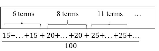
The one hundred families in a particular neighborhood are asked their annual household income, to the nearest $5 thousand dollars. The results are summarized in a frequency table below.
Income (thousands of dollars)Frequency15620825113017351940204512507n = 100 Calculating the mean by hand could get tricky if we try to type in all 100 values:
We could calculate this more easily by noticing that adding 15 to itself six times is the same as 15 • 6 = 90. Using this simplification, we get: [latex]\frac{15~\cdot~6~+~20~\cdot~8~+~25~\cdot~11~+~30~\cdot~17~+~35~\cdot~19~+~40~\cdot~20~+~45~\cdot~12~+~50~\cdot~7}{100}[/latex] = [latex]\frac{3,390}{100}[/latex] = 33.9 The mean household income of our sample is 33.9 thousand dollars ($33,900). |
| Example 7 |
|
Extending off the last example, suppose a new family moves into the neighborhood example that has a household income of $5 million ($5000 thousand). Adding this to our sample, our mean is now: [latex]\frac{15~\cdot~6~+~20~\cdot~8~+~25~\cdot~11~+~30~\cdot~17~+~35~\cdot~19~+~40~\cdot~20~+~45~\cdot~12~+~50~\cdot~7~+~5,000~\cdot~1}{100}[/latex] = [latex]\frac{8,390}{101}[/latex] = 83.069 While 83.1 thousand dollars ($83,069) is the correct mean household income, it no longer represents a “typical” value. |
Imagine the data values on a see-saw or balance scale. The mean is the value that keeps the data in balance, like in the picture below.
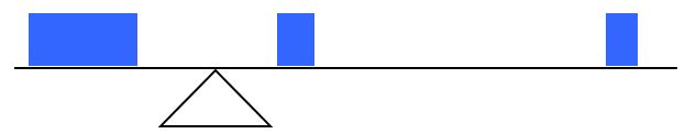
If we graph our household data, the $5 million data value is so far out to the right that the mean has to adjust up to keep things in balance

For this reason, when working with data that have outliers – as described in the previous section – it is common to use a different measure of center, the median.
| Median |
|
The median of a set of data is the value in the middle when the data is in order To find the median, begin by listing the data in order from smallest to largest. If the number of data values, n, is odd, then the median is the middle data value. This position in the ordered list of this value can be found by rounding n/2 up to the next whole number. If the number of data values is even, there is no one middle value, so we find the mean of the two middle values. The two middle numbers will be in the n/2 and the (n / 2) 1 positions in the ordered list. |
| Example 8 |
|
Returning to the football touchdown data, we would start by listing the data in order from smallest to largest. 6 9 12 12 14 14 14 15 16 18 18 18 18 19 19 20 20 21 21 21 22 22 22 23 28 28 29 32 33 33 37 Since there are 31 data values, an odd number, the median will be the middle number, the 16th data value (31/2 = 15.5, round up to 16, leaving 15 values below and 15 above). The 16th data value is 20, so the median number of touchdown passes in the 2000 season was 20 passes. Notice that for this data, the median is fairly close to the mean we calculated earlier, 20.5. |
| Example 9 |
|
Find the median of these quiz scores: 15 20 18 16 14 18 12 15 17 17 We start by listing the data in order: 12 14 15 15 16 17 17 18 18 20 Since there are 10 data values, an even number, there is no one middle number. The median will be the mean of the numbers in positions n/2 and (n/2) 1. Since n = 10, n/2 = 5 and (n/2) 1 = 6, so we need the mean of the 5th and 6th numbers in the ordered list. The 5th number in the ordered list is 16, and the 6th number in the ordered list is 17. So we find the mean of the two middle numbers, 16 and 17, and get (16 17)/2 = 16.5. The median quiz score was 16.5. |
| You Try S.3.B |
|
The price of a jar of peanut butter at 5 stores was: $3.29, $3.59, $3.79, $3.75, and $3.99. Find the median price. |
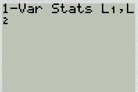
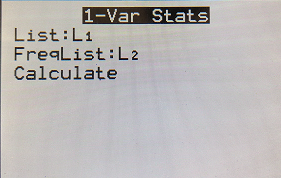
| Calculator Instructions for Finding Summary Statistics Using TI-83/84 |
|
1. Turn on the calculator This will bring you to a screen that contains lists: L1, L2, L3, etc. 3. Enter the data values (one value per row) into L1. For any negative values you need to use the (-) key, not the subtraction key. Continue until all data is entered into L1. The summary statistics should now be displayed. Using “1-Var Stats” you can get the mean (X̅), and median (Med). Scroll down to find the Median. Calculator Instructions for Finding Summary Statistics for a frequency graph Using TI-83/84: 1. Turn on the calculator This will bring you to a screen that contains lists: L1, L2, L3, etc. 3. Enter the data values (one value per row) into L1. For any negative values you need to use the (-) key, not the subtraction key. Continue until all data is entered into L1. Enter the frequency value into L2. The summary statistics should now be displayed. Using “1-Var Stats” you can get the mean (X̅), and median (Med). Scroll down to find the Median.
|
| Example 10 | ||||||||||||||||||||
|
Let us return now to our original household income data
Here we have 100 data values. If we didn’t already know that, we could find it by adding the frequencies. Since 100 is an even number, we need to find the mean of the middle two data values – the 50th and 51st data values. To find these, we start counting up from the bottom: There are 6 data values of $15, so → Values 1 to 6 are $15 thousand The next 8 data values are $20, so → Values 7 to (6 8)=14 are $20 thousand The next 11 data values are $25, so → Values 15 to (14 11)=25 are $25 thousand The next 17 data values are $30, so → Values 26 to (25 17)=42 are $30 thousand The next 19 data values are $35, so → Values 43 to (42 19)=61 are $35 thousand From this we can tell that values 50 and 51 will be $35 thousand, and the mean of these two values is $35 thousand. The median income in this neighborhood is $35 thousand. |
| Example 11 |
|
If we add in the new neighbor with a $5 million household income, then there will be 101 data values, and the 51st value will be the median. As we discovered in the last example, the 51st value is $35 thousand. Notice that the new neighbor did not affect the median in this case. The median is not swayed as much by outliers as the mean is. |
In addition to the mean and the median, there is one other common measurement of the “typical” value of a data set: the mode.
| Mode |
| The mode is the element of the data set that occurs most frequently. |
The mode is fairly useless with data like weights or heights where there are a large number of possible values. The mode is most commonly used for categorical data, for which median and mean cannot be computed.
| Example 12 | ||||||||||||||||
|
In our vehicle color survey, we collected the data
For this data, Green is the mode, since it is the data value that occurred the most frequently. |
It is possible for a data set to have more than one mode if several categories have the same frequency, or no modes if each category occurs only once.
| You Try S.3.C | ||||||||||||||
|
Reviewers were asked to rate a product on a scale of 1 to 5. Find a. The mean rating
|
Section S.3 Answers to You Try Problems
S.3.A
Adding the prices and dividing by 5 we get the mean price: $3.682
S.3.B
First we put the data in order: $3.29, $3.59, $3.75, $3.79, $3.99. Since there are an odd number of data, the median will be the middle value, $3.75.
S.3.C
There are 23 ratings.
a. The mean is [latex]\frac{1~\cdot~4~+~2~\cdot~8~+~3~\cdot~7~+~4~\cdot~3~+~5~\cdot~1}{23}[/latex] ≈ 2.5
b. There are 23 data values, so the median will be the 12th data value. Ratings of 1 are the first 4 values, while a rating of 2 are the next 8 values, so the 12th value will be a rating of 2. The median is 2.
c. The mode is the most frequent rating. The mode rating is 2.
