
2.2 – Frequency Graphs
Much like frequency tables, frequency graphs display the scores and frequencies, but they do it in a graphic. There are two basic types of frequency graphs: histograms and bar charts. In both, the x-axis (the horizontal axis) typically represents the scores or categories, and the y-axis (the vertical axis) represents the frequencies. Above each score or category is a bar with which the height indicates the frequency or number of people with that score or in that category. Below is an example of a histogram using the same quiz score data from our first frequency table:
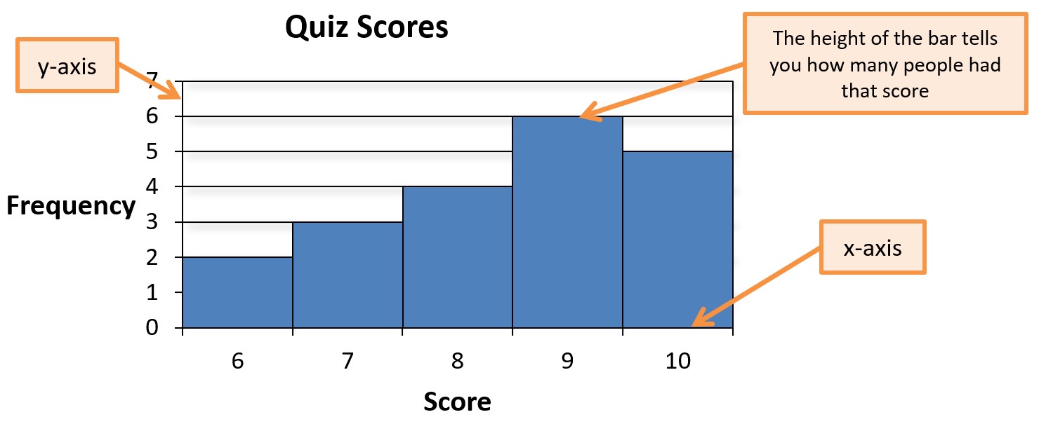
If you look at the blue bars above each score, you can see the number of individuals with each score. Thus, you can see that 2 people scored a 6, 3 people scored a 7, 4 people scored an 8, 6 people scored a 9, and 5 people scored a 10.
Histograms are used with interval or ratio scale data, and the bars are touching each other, indicating that the scores are on a number line (have equal intervals between them). Bar charts, on the other hand, are used with nominal or ordinal data, and the bars do not touch each other because the scores are not the same distance from one another. Below is an example of a bar chart:
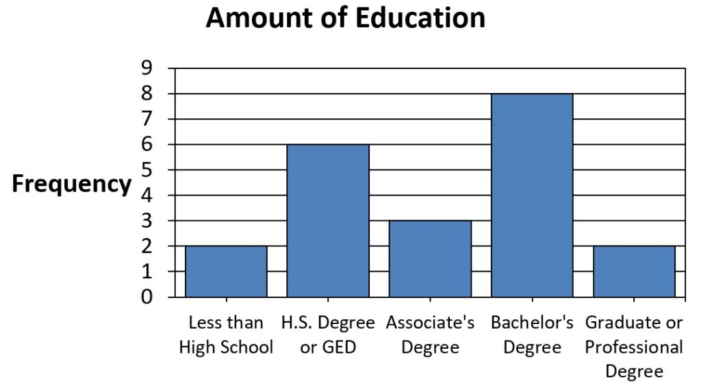
The amount of education variable is an ordinal scale because it includes categories and we know which group has more or less education, but we don’t know exactly how much more or less. As a result, we use a bar graph so that the gaps between the bars help to remind us that these five categories are not on equal intervals so we should treat the categories as separate or discrete, and not continuous.
Histograms with Grouped Data
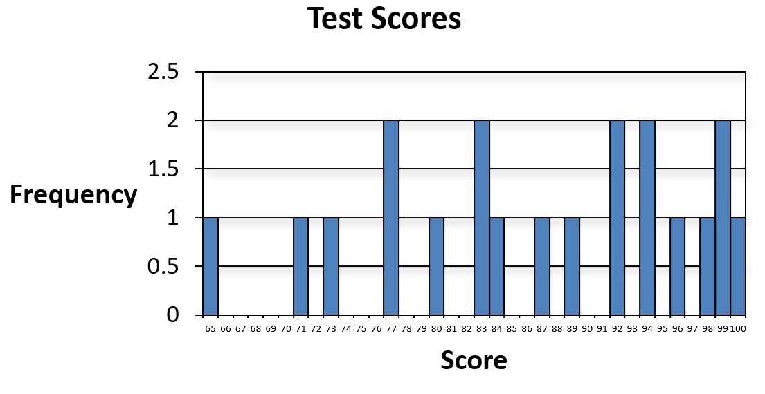
Like with frequency tables, sometimes we have data that includes so many categories that our graph may not make things more organized and understandable. Like this:
So we can again instead use groups of scores:
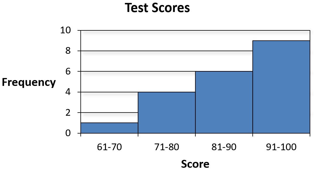
Again, remember that the goal of frequency distributions is to summarize and organize the data to make it more understandable. A quick glance at the above histogram gives us a good idea of how people did on the test.
Frequency Graphs with Relative Frequencies
Up until now, all of our frequency graphs have used frequencies that are technically called “absolute frequencies,” in that they are the actual counts of individuals from our collected data. However, as you will see in this textbook, statistics also uses frequency graphs to depict data that we haven’t actually collected but instead have a pretty good idea about what it looks like based on certain information. Typically, this arises when we want to create a frequency graph of a population for which it might be difficult if not impossible to get measures for everyone. In these situations, we will use “relative frequencies” instead of absolute frequencies.
Relative frequencies don’t use actual counts, but instead, use what are essentially relative percentages. In this way, while we don’t know exactly how many people are in each category, we can know roughly what percentage of people relative to other categories. Suppose, for example, that we want to create a frequency graph of the numbers of people on active duty with the different branches of the U.S. military, but we don’t have the actual numbers. If we know the rough percentages we can create a graph using relative frequencies:
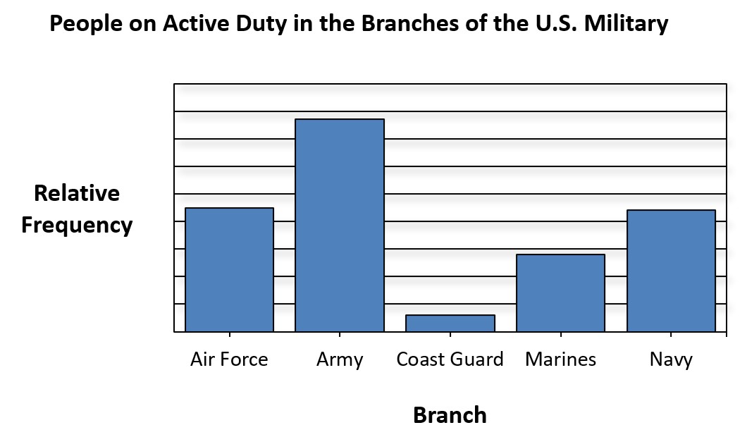 You can see that we used a bar chart because the data is on a nominal scale. Also, you can see that there are no numbers for the frequency, and that is because we don’t know the actual numbers. But, by looking at the height of the various bars you can get a sense of the relative frequencies. For example, the Army bar is a little less than twice the size of the Air Force bar. This indicates that there are almost twice as many people in the Army as in the Air Force. In other words, relative to the Air Force, there are twice as many people in the Army.
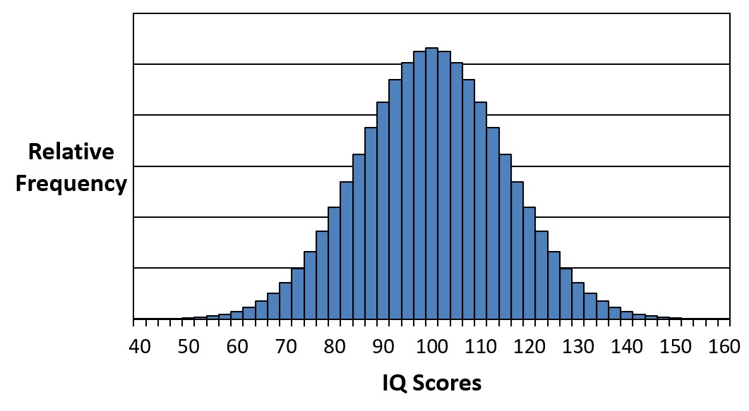
The most common place that we will use relative frequency in our graphs is when we are graphing frequency distributions for scores on different tests like an IQ test (intelligence test). In this situation, not everyone in the country has taken an IQ test, but based on how all the people who have taken the test have scored, we can know the relative frequencies. As a result, we can create the following histogram:
Now, if we replace the bars of the histogram with smooth curves, we get the following:
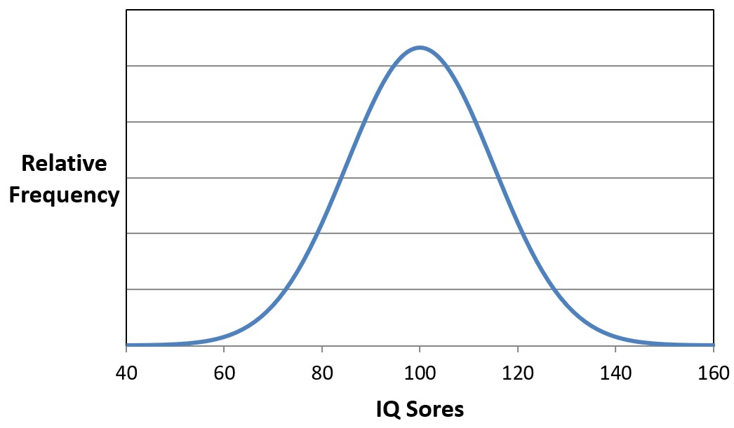
As you can see in this example, IQ scores form what is called a normal distribution. We will discuss normal distributions in more detail in later chapters, but at least for now we can see the relative frequencies of how many people get various scores on an IQ test. You can see that most people score at or around 100, while very few people score above 140 or below 60.
Using Relative Frequency Graphs in Statistics
The main advantage of these frequency graphs with relative frequencies for statisticians is that they can allow us to make predictions about our samples. Suppose we selected one person who is on active duty with the military. If you know nothing about them and had to predict, in which branch of the service do you think they serve? Using the bar graph above, you should guess the Army because there are more people serving in the Army than in any of the other branches.
Now, suppose we selected one person at random from the population and gave them an IQ test. If you know nothing about them and had to predict, what score do you think they earned on the test? Using the graph above, you should guess 100 because more people score 100 than any of the other scores.
If you understand this concept, then you are already starting to understand a part of the process we will use with inferential statistics. It is not necessary to fully understand it yet, but this will hopefully give you a chance to let this idea sink in before we dive into inferential statistics in earnest in Chapter 7. Sometimes these ideas just take a little time before they make much sense, so we will touch on them a little as we move closer to Chapter 7.

Feedback/Errata