
2.1 – Frequency Tables
As it sounds, frequency tables depict a frequency distribution in a table format. Suppose we had the following set of scores from a group of 20 people:
10, 9, 7, 6, 6, 7, 8, 10, 9, 9, 10, 8, 9, 8, 10, 9, 10, 7, 9, 8
It is difficult to have much of a sense of how people performed on the test because the data is disorganized. By creating a frequency table, we can organize it so that we can start having a better sense of the data. There are two columns in a frequency table: one for the categories, scores, or group of scores; the other for the frequency of individuals. Our data above would result in the following frequency table:
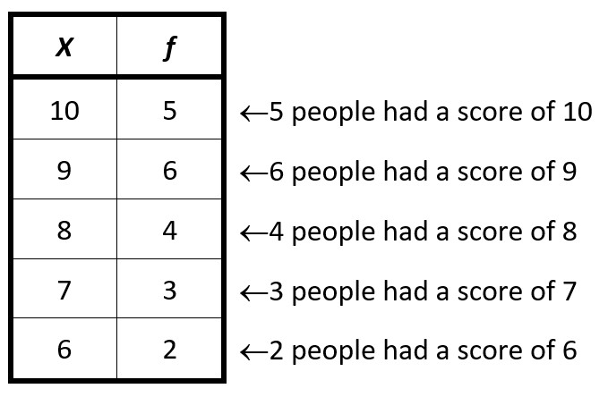
The “X” at the top of the first column is the symbol for an individual score. The “𝑓” at the top of the second column is the symbol for frequency. Thus, to read the frequency table, the 10 in the second row, under the X, indicates a value of 10 on the measure. The 5 to the right, under the 𝑓, indicates that 5 individuals had a score of 10. And so on.
Now, by just glancing at the frequency table we have a much better sense of how people scored on our measure. Suppose that the data depicts scores on a quiz that had a total of 10 points. With the table, we can see that a fair number of people performed reasonably well on the quiz.
Calculations with Frequency Tables
Another benefit of the frequency table is that you can do some calculations with it. For example, let’s say we wanted to find the average score on the quiz. To do that, we need to add up all the scores and divide them by the total number of scores. If we just had the original set of scores, we could add them up like this:
10 + 9 + 7 + 6 + 6 + 7 + 8 + 10 + 9 + 9 + 10 + 8 + 9 + 8 + 10 + 9 + 10 + 7 + 9 + 8 = 169
While this works, it takes a little more time and it is unfortunately easy to make mistakes. So instead we can use the frequency table. To do this, we multiply across each row to create a new column of X multiplied by 𝑓, or X𝑓. This represents the total of all the people who had that particular score. For example, we have 5 people who scored 10 on the quiz. We just multiply 10 by 5 and get 50, which is the total for all the individuals who had a 10 on the quiz.
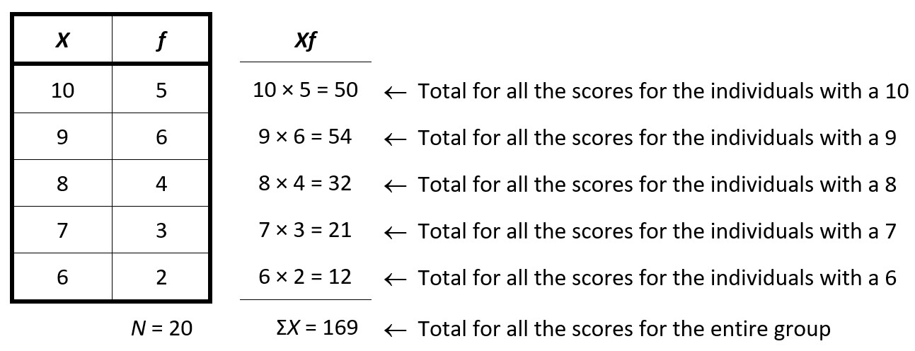
Then after we do that for all the rows, we can then add up all of the totals in the Xf column, and we will get the total for everyone in our group (𝛴X). Now, we can just divide that total by the number of people in the group. To get that, we just add up all the numbers in the 𝑓 column. Thus, we have an average score on the quiz of 169 divided by 20, or 8.45.
Another common calculation with frequency tables is to get the total for all of the scores squared (𝛴X²). This calculation requires us to square each score, and then add them up. Thus, we could again do that with the raw data:
102 + 92 + 72 + 62 + 62 + 72 + 82 + 102 + 92 + 92 + 102 + 82 + 92 + 82 + 102 + 92 + 102 + 72 + 92 + 82
Which would be:
100 + 81 + 49 + 36 + 36 + 49 + 64 + 100 + 81 + 81 + 100 + 64 + 81 + 64 + 100 + 81 + 100 + 49 + 81 + 64 = 1461
But again, this is a little difficult and susceptible to mistakes. Using the frequency table is a little easier, although you have to be a little careful to do the right calculations in the right order. The first thing we need to do is to square each person’s score. Then, and only then, we will again multiply that by the total number of people who had that score. Once we’ve done that for each score, we can then add all of those up and we will get the total for all the squared scores (𝛴X²).
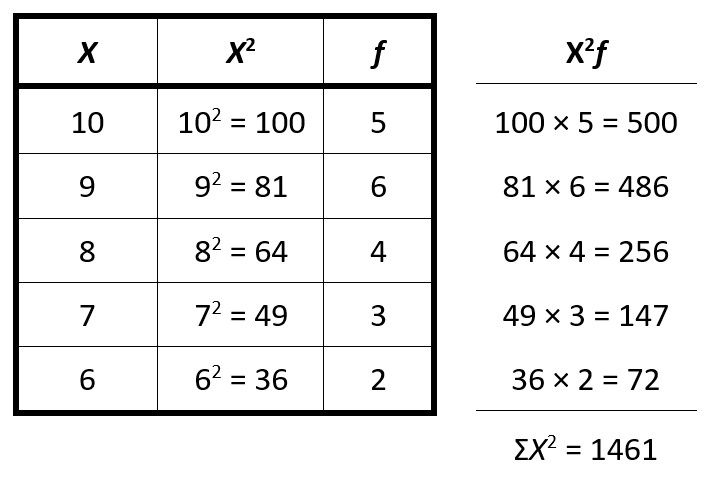
Thus, the total of all of the squared scores is 1461. This number will be useful for us later when we calculate a concept called variance.
Proportions and Percentages with Frequency Tables
Another thing that we can do with frequency tables is to calculate proportions and percentages, allowing us to answer questions like what percentage of the group passed the quiz? Proportions (p) are calculated by taking the frequency (𝑓), and dividing it by the total number of people in the group (N). Proportions are presented as either a fraction or a decimal. Percentages (%) are calculated by multiplying the proportion by 100. Percentages are presented as a number followed by the percentage symbol (%).
With our quiz scores, 5 out of 20 people earned a 10 on the quiz. We then just divide 5 by 20, and we see that the proportion of people who earned a 10 on the quiz is 5/20, or ¼, or 0.25. Then we multiply that by 100 to find that 25% earned a 10 on the quiz. We can then fill in the rest of the table:
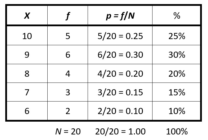
If we know that a 7 or better on the quiz is considered passing, then we just add up the percentages for the scores of 7 and higher. Thus, we know that 15% + 20% + 30% + 25%, or 90% passed the quiz.
Frequency Tables with Grouped Data
Sometimes when we are creating a frequency table, there are so many different scores that our table becomes very large. At this point, however, the table no longer helps to organize the data and make it easier to understand. In these situations, it can be helpful to group the scores to make the graph more useful.
For example, let’s say that we have test scores, and people scored anywhere between 41 and 100 on the test. If we created a table of individual scores, it would have 60 rows and wouldn’t do much to organize the data. So instead we can group the scores into chunks of 10 scores:
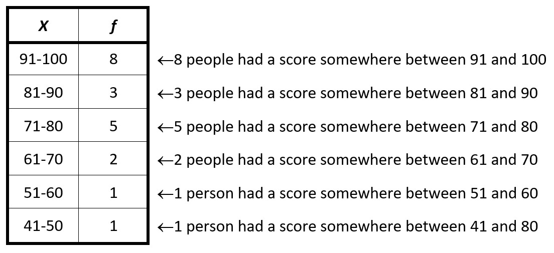
We have now organized the data in a more useful way to see pretty readily how people performed on the test. It looks like most people did reasonably well, on the test, although there were a few people who really struggled.
In general, when creating the groups, it is helpful to use the following guidelines:
- Don’t create too many or too few groups (remember that the goal is to organize in a useful way)
- Keep the widths of each group the same (in our example, all the groups are 10 points wide)
- Use a simple number for the widths such as 2, 5, or 10, rather than awkward numbers, such as decimals.
These guidelines are not set in stone. The idea is simply to make the table useful and organized.

Feedback/Errata