
8.7 – Step 3: Collect and Graph Data
3. Collect and Graph Data
As noted in the previous section, the first two steps of the hypothesis testing process should both be completed before running the study and collecting data. However, once those first two steps are completed, the research study can commence, and data can be collected.
While this textbook is not focused on the specifics of how a research study is conducted, known as the research methodology, the quality of a research study’s results is very dependent on the quality of that methodology. While there is no “perfect” way to run a research study, for the purposes of this textbook, we will assume that all of our research studies were run well so that we can focus on the meaning of the statistics. However, it is important to understand that effectively interpreting empirical research is only partly dependent on understanding the meaning of the statistics.
Once the research study has been completed and the data has been “cleaned” (checked for data entry mistakes and other issues), our next step is to graph the data so that we can visualize the results. This step of the hypothesis-testing process is often left out, but it is an important one because it can help researchers identify issues that might lead to misinterpretations of the data.
For example, let’s say that the researchers ran their study where 100 participants were brought in and experienced sleep deprivation through being woken up every hour during the night. Then, in the morning, they were given the Saenz Short-Term Memory Test (SSTMT). If sleep deprivation had an effect on memory, we would expect the sample to have a sample mean that is substantially different from the typical mean on the test, which the researchers know is a mean of μ = 50.
What if the sample has a mean mean for the 100 participants of M = 50.00 and a standard deviation of s = 4.26? Knowing what we know about means and standard deviations, we can imagine a group of 100 scores where they have a “center” around 50 and deviate from (both above and below) that center by a little more than 4 points on average. We can also see that the sample has a mean that is the same as the population mean of μ = 50, so the data would appear to support the null hypothesis. However, if the researchers graph the data using a histogram, they might get the following:
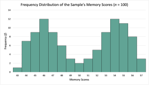
From looking at this graph, we can see that while the average score for the participants is 50.00, very few participants have scores near 50. Instead, the scores form a bimodal distribution with most of the participants’ scores clustering around 46 and 54. By graphing the scores, our interpretation of the data can be enhanced. In this case, the fact that our sample has a bimodal distribution might be an indication that our sample is made up of two different groups, and whatever distinguishes those groups also may interact with either of our variables. For example, our sample may have somehow ended up with roughly a 50-50 mix of college students and older adults, and as a result, the sleep deprivation impacted each group differently (maybe college students are used to being sleep-deprived). Alternatively, our sample may have somehow ended up with roughly 50-50 mix of people with excellent memory skills and people with average memory skills, and as a result, the sleep deprivation may have reduced memory scores for everyone, but the impairment of the people with excellent memory skills was not enough to make them below average.
This step is not typically shared when researchers publish their research findings. It is assumed that the researchers have performed this step, but this assumption may not always be reasonable. For the purposes of this textbook, we will endeavor to include the step where appropriate to reinforce its importance.
Why is this step important? Graphing the data helps researchers analyze their data to identify issues or potential misinterpretations.
- Visualizing the data helps researchers see problems with their data, such as outliers or data-entry mistakes. These issues can then be addressed before running any further statistics.
- Graphing the data may also provide nuanced interpretations of the data that are “missed” by statistical measurements.

Feedback/Errata