
7.6 – Finding Sample Means (M) from Percentages
In this section, we are going to essentially go in reverse from the previous section by starting with a percentage and then locating the sample mean cutoff or cutoffs. Again, this combination will allow us to answer more typical questions from the real world of research and practice. To do this, we just need to adjust the last group of steps from what we used in the previous section:
How to find sample mean cutoff(s) from percentages
(Note: Steps 1 through 4 are optional, but help to ground you in the particulars of the question.)
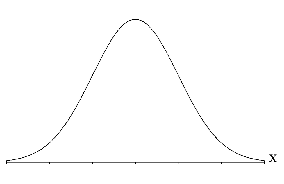
- Draw a picture of the normal distribution curve.
- Label the curve with an X to indicate it is a distribution of individual scores.
- Draw a vertical line in the middle of the distribution.
- Label this middle line with the population mean, ([latex]\mu[/latex]).
We can now apply the central limit theorem to draw the distribution of sample means of a given sample size and label its mean and standard deviation. This graph represents all of the samples we could get from the population if we were to sample thousands and thousands of samples of the given sample size.
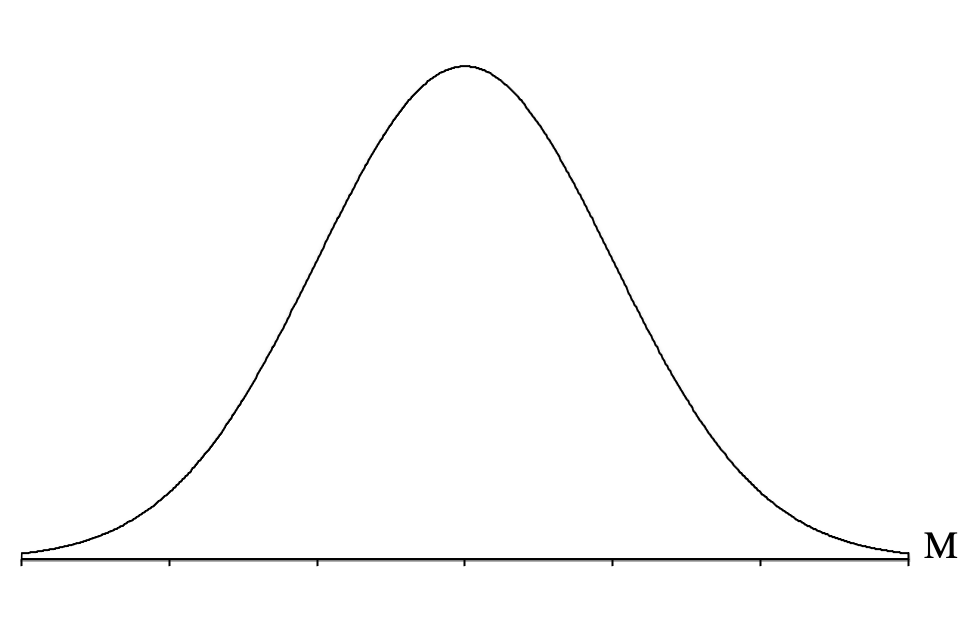
- Draw a second normal distribution curve.
- Label this curve with an M to indicate it is a distribution of sample means.
- Draw a verticle line in the middle of the distribution.
- Label this middle line with the population mean, ([latex]\mu[/latex]).
- Draw a horizontal line from the vertical line you just drew to the normal distribution curve on the right represent the standard error ([latex]\sigma_{\!{_{\!M}}}[/latex]), or standard deviation of the sample means.
- Label this horizontal line with the standard error symbol,[latex]\sigma_{\!{_{\!M}}}[/latex].
- Calculate the standard error using the formula: [latex]\sigma_{\!{_{\!M}}} = \frac{\sigma}{\sqrt n}[/latex].
We now will locate a range of these sample means based on the question we are attempting to answer.
- Identify the part of the distribution specified in the question (e.g., top, bottom, middle, extreme) and shade the specified percentage (e.g., top 25% means about 1/4 of the shape should be shaded on the right-hand side).
- Look at the shaded section and decide if it is a body, a tail, or a slice (if it’s not, you will need to be creative to turn it into a body, tail or slice).
- Convert the percentage from the question into a proportion by dividing by 100.
- Look up your proportion in the appropriate column of the Unit Normal Table (Body, Tail, or Slice).
- Then go across that row to the z-score column to get the z-score cutoff for that proportion.
- Add a second axis below the first, and label this axis with a z to indicate that the axis represents z-scores, and label the middle line with a zero.
- Label the z-score cutoff(s) on the distribution graph to help you determine if a z-score needs to be positive (above the mean of zero) or negative (below the mean of zero).
- Convert the z-score (z), or scores, into a sample mean (M), or means, using the formula: [latex]M = \mu + z\sigma_{_{\!M}}[/latex]
- Label the sample mean cutoff(s) on the axis for sample means (M).
From a Percentage to a Sample Mean (M)
Imagine you work in the healthcare field at a birthing clinic that serves low-income mothers. At work, you have begun to feel that most of the children who are born at the clinic have low birth weight, and you want to know if your suspicion is reasonable. If it is, you could investigate further and possibly develop an intervention. To get some empirical evidence regarding your suspicion, you decide to gather the birth weight data for the last n = 100 newborns, and you find that the average birth weight was a sample mean of M = 6.9 pounds. You decide that you want to see if that average is in the bottom 5% of birth weights. To explore this, you will want to answer the following question:
Being “normally distributed,” tells us that if you were to create a graph of the birth weights of all the newborns in the U.S., it would form a normal distribution, which means that most newborns tend to have birth weights near the mean and as you get farther from the mean, in either direction, you get fewer and fewer newborns. We also know that the average birth weight is 7.0 pounds, and individuals in the population deviate from that mean by an average of 0.5 pounds.
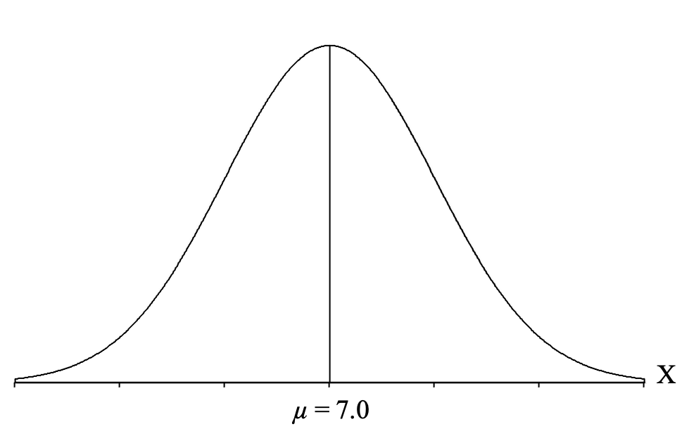
So now we can follow our steps and draw a normal distribution curve and label it on the side with an X to indicate that it is a distribution of individual scores:
Next, we draw a vertical line in the middle of the distribution and label it with the mean for birth weights (which is given to us in the question) of μ = 7.0 pounds:
Next, we need to apply the central limit theorem and draw a distribution of all the sample means we could get for a sample size of n = 100 (because that is the sample size from our question). The central limit theorem essentially predicts what the distribution of sample means would look like for thousands and thousands of samples of 100 U.S. newborns.
The first thing the central limit theorem predicts is the shape of the distribution of sample means. Remember that the distribution of sample means will form a normal distribution if you meet either of these two conditions:
- You are sampling from a population that is normally distributed.
- Your sample size is at least n = 30.
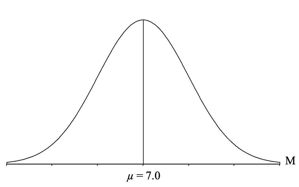
We meet both conditions because birthweights in the U.S. are normally distributed, and we have a sample size of n = 100, so our distribution of sample means will be normally distributed. Thus, we draw another normal distribution, but this time, we label it with an M to indicate that it is a distribution of sample means:
Next, we draw a vertical line in the middle of the distribution and label it with the mean of all the sample means ([latex]\mu_{_{\!M}}[/latex]), which, as we know from the central limit theorem is going to be equal to the population mean (which is given to us in the question) of μ = 7.0 pounds:
The second thing that the central limit theorem tells us is that this standard deviation of all of the sample means can be calculated using the formula for the standard error ([latex]\sigma_{\!{_{\!M}}}[/latex]), so we just plug in the population standard deviation (σ = 0.5) and sample size (n = 100) given to us in the question and calculate:
[latex]\sigma_{\!{_{\!M}}} = \frac{\sigma}{\sqrt n} = \frac{0.5}{\sqrt 100} = \frac{0.5}{10} = 0.05[/latex]
We can now draw a horizontal line from the vertical line representing the mean to the curve on the right. This will depict the standard deviation of all of the sample means in this distribution. We can then add the standard error to our graph:
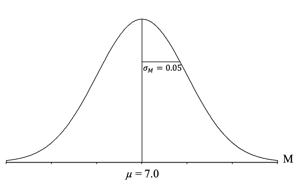
It can be very helpful to take a moment here and try to understand what this distribution depicts. It is a theoretical distribution of thousands and thousands of sample means, each coming from samples of n = 100 U.S. newborns, taken from the population of U.S. newborns (that are normally distributed, have a mean of μ = 7.0 pounds, and a standard deviation of σ = 0.5 pounds). These sample means form a normal distribution, have a mean of 7.0 pounds, and a standard deviation of 0.05 pounds, which indicates that most of the sample means center around 7.0 pounds and deviate from 7.0 pounds by about 0.05 pounds on average, with some above and some below 7.0 pounds. Many of the sample means tend to be near 7.0 pounds, and as you get farther from 7.0 pounds, in either direction, you get fewer and fewer sample means.
It is also worth noting that it is a theoretical distribution because we applied the central limit theorem to create it. We didn’t have to take thousands and thousands of samples to create it. If we had, it would look very, very close to this, but we don’t need to go through all that work. Instead, we can just do the calculations and draw it.
Now, let’s return to answering our question. Our next step is to locate the “bottom 5%” of this distribution of sample means. Since “bottom” refers to lower birth weights, we want to start at the left side of the distribution and shade to the right until we have shaded about 5% of the total shape:
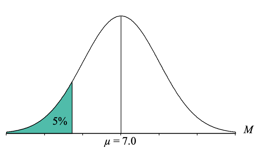
Looking at that picture, we can see that the shaded area is a “tail.” We then need to convert our percentage to a proportion. To convert our percentage of 5% to a proportion, we simply divide it by 100. Thus, we look for the proportion of 0.0500 (make sure to use four decimal places because the proportions in our Unit Normal Table go to four decimal places).
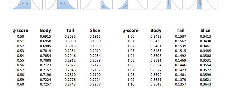
As you can see in the table, the exact proportion of 0.0500 actually does exist in the Tail column! So now we use the proportion of 0.0500 and simply go across that row to the z-score column to find the z-score cutoff. We have now determined that the z-score cutoff for the top 5% is at z = 1.96.
However, it is important to recognize that we are NOT looking for the z-score cutoff for the bottom 5%, but rather the birth weight sample mean for the bottom 5%. At this point, it is helpful to add a second axis to the bottom of the distribution graph and label it with a “z” to indicate that it is the z-score axis. We can also label the mean with a zero:
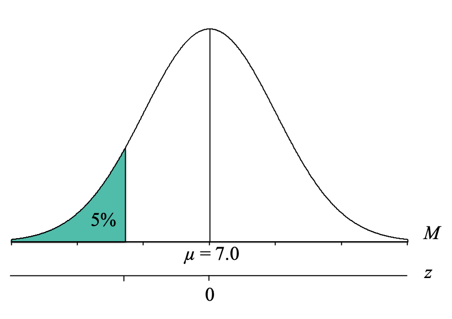
We can now label our distribution graph with the z-score cutoff for the top 10% of z = 1.96:
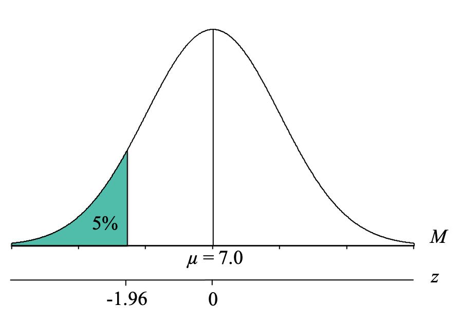
However, we can see that because the cutoff is below the mean of 0, our z-score cutoff should be negative, and thus is z = -1.96. As this demonstrates, it is so helpful to draw the distributions and label all of the parts because it helps prevent these kinds of mistakes because the Unit Normal Table does not tell us whether the z-score is positive or negative.
At this point, we know that the bottom 5% of a normal distribution lies below a z-score of z = -1.96. Our final step, then, is to convert the z-score cutoff for the bottom 5% into a birthweight sample mean (M). To do this, we simply use our z-score formula for sample means that solves for M and fill in the components:
[latex]M = \mu + z\sigma_{_{\!M}} = 7.0 + (-1.96) 0.05 = 7.0 - 0.098 = 6.902[/latex]
We now know that to be in the bottom 5% of birth weights, a sample of n = 100 newborns needs to have an average birth weight of 6.902 pounds or less:
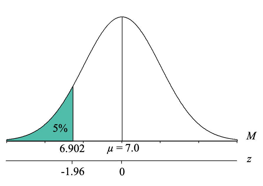
Because the sample of n = 100 newborns in the birthing clinic had an average birth weight of M = 6.90 pounds, which is less than the cutoff of 6.902 pounds, you can conclude that your suspicions appear to be supported by the empirical data and results. While this result doesn’t tell you why the birth weights are so low, it does support looking into it and possibly developing an intervention for the patients at this clinic.
Multiple Sample Mean (M) Cutoffs from Percentages
Now, imagine you are a statistics professor, and you want to have a sense of how a typical section of your class will score on the first exam in the class. This could let you know if any particular section is really struggling or not.
You know that the average Exam 1 score across all of the previous students you have had is a mean of μ = 80, with a standard deviation of σ = 10. You also know that each section of your class is typically around 25 students. You decide you want to find the average Exam 1 score cutoffs for the middle 50% of class sections of a size n = 25. In other words, you want to know the range of class averages you can expect to get 50% of the time.
To identify the range of Exam 1 averages, you ask the following question:
To answer this kind of question, we will use the same steps as above, although it will ultimately involve finding two sample mean boundaries.
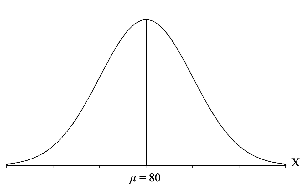
So, for our example, where we want to know the z-score cutoffs for the middle 50% of the distribution, we start by drawing the normal distribution and label it with an “X” to indicate that it is a distribution of individual scores on the exam. Then, we draw a vertical line in the middle to represent the mean of the exam scores, which is μ = 80. We can label this vertical line with a “μ = 80″ so that we can see from the distribution that most students are scoring near 80, and as you move farther away from 80 in either direction, you have fewer students:
Next, we need to apply the central limit theorem and draw a distribution of all the sample means we could get for a sample size of n = 25 (because that is the sample size from our question). The central limit theorem essentially predicts what the distribution of sample means would look like for thousands and thousands of samples of 25 students from my statistics classes.
The first thing the central limit theorem predicts is the shape of the distribution of sample means. Remember that the distribution of sample means will form a normal distribution if you meet either of these two conditions:
- You are sampling from a population that is normally distributed.
- Your sample size is at least n = 30.
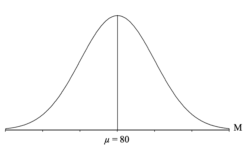
We meet the first condition because we are sampling from a population of individual scores that are normally distributed (the question states this, but we can always assume it for examples in this class), so our distribution of sample means will be normally distributed. Thus, we draw another normal distribution, but this time, we label it with an M to indicate that it is a distribution of sample means:
Next, we draw a vertical line in the middle of the distribution and label it with the mean of all the sample means ([latex]\mu_{_{\!M}}[/latex]), which, as we know from the central limit theorem is going to be equal to the population mean (which is given to us in the question) of μ = 7.0 pounds:
The second thing that the central limit theorem tells us is that this standard deviation of all of the sample means can be calculated using the formula for the standard error ([latex]\sigma_{\!{_{\!M}}}[/latex]), so we can plug in the population standard deviation (σ = 10) and sample size (n = 25) given to us in the question and calculate:
[latex]\sigma_{\!{_{\!M}}} = \frac{\sigma}{\sqrt n} = \frac{10}{\sqrt 25} = \frac{10}{5} = 2[/latex]
Now, we can draw a horizontal line from the middle line to the curve on the right. This will depict the standard error, which is the standard deviation of all of the sample means in this distribution. We can then add the standard error to our graph:
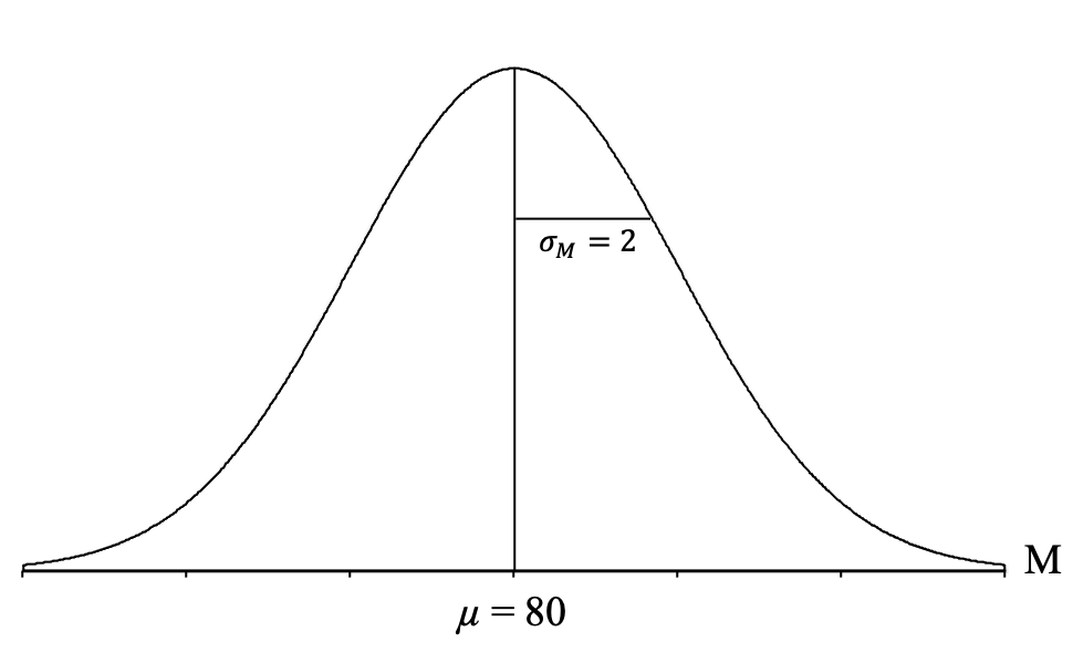
It can be very helpful to take a moment here and try to understand what this distribution depicts. It is a theoretical distribution of thousands and thousands of sample means, each coming from samples of n = 25 students from my statistics classes who took Exam 1 (which has scores that are normally distributed, have a mean of μ = 80, and a standard deviation of σ = 10). These sample means form a normal distribution, have a mean of 80, and a standard deviation of 2, which indicates that most of the sample means are centering around a score of 80 and deviate from 80 by about 2 points on average, with some above and some below 80. Many of the sample means tend to be near a score of 80, and as you get farther from 80, in either direction, you get fewer and fewer sample means.
It is also worth noting that it is a theoretical distribution because we applied the central limit theorem to create it. We didn’t have to take thousands and thousands of samples to create it. If we had, it would look very, very close to this, but we don’t need to go through all that work. Instead, we can just do the calculations and draw it.
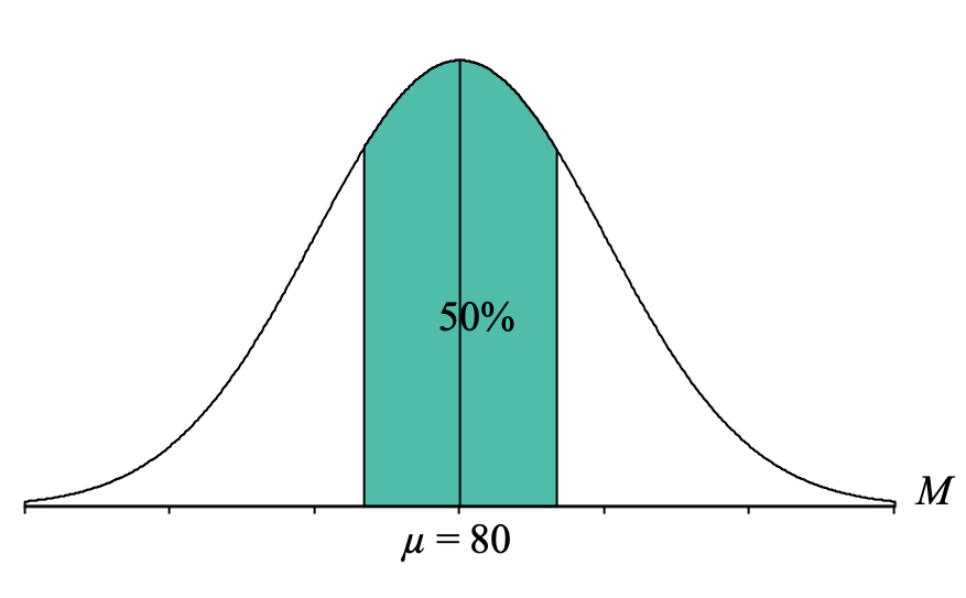
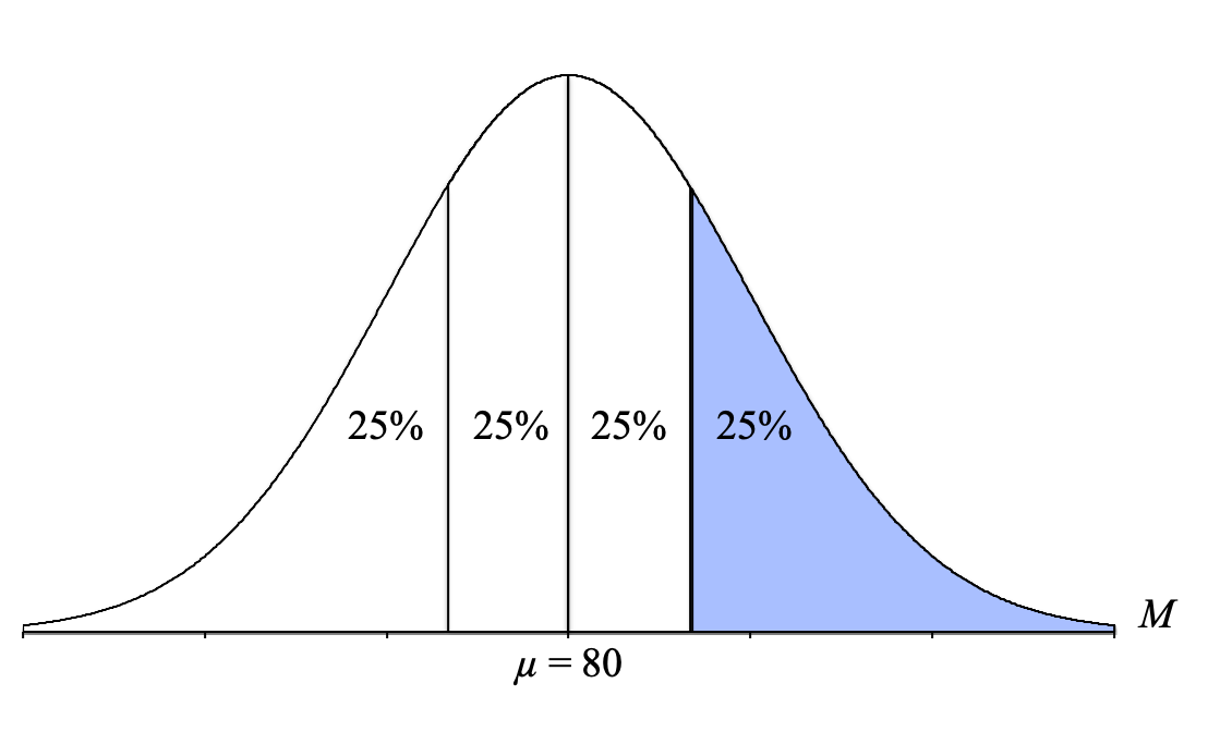
Now, we identify the part of the distribution specified in the question, which for our question is the “middle 50%.” “Middle” describes sample means in the middle of the distribution (near the mean), so we want to shade 50% of our distribution starting from the middle and going outward on both sides until we feel like we have 50% shaded:
Looking at that picture, the shaded area does not look exactly like a body, a tail, or a slice, so this is where we have to get a little creative. Because the Unit Normal Table only has proportion columns for the body, tail, or slice, we need to convert our middle 50% into a percentage that is either a body tail or slice.
One thing to remember is that normal distributions are symmetrical, so we can break up the 50% into two halves of 25% (just divide the percent by two: [latex]\frac{50}{2} = 25[/latex]. We also know that if there is 50% shaded in the middle, that means that there is 50% that is not shaded, and again, that outside 50% can be divided in half, resulting in 25% not shaded on either side. Thus, we get the following distribution:
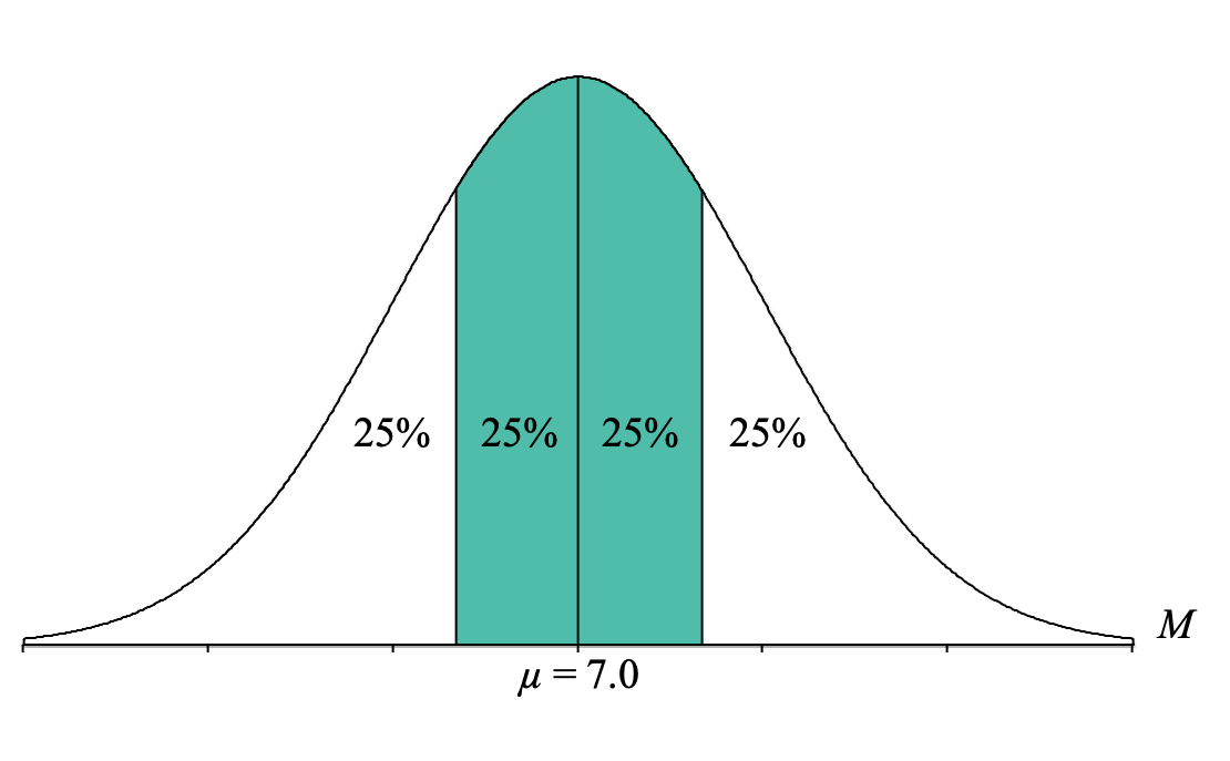
Hopefully, this helps us come up with possible paths to identify a body, tail, or slice. To help the process along, it can be useful to focus on that upper boundary for the middle 90%:
If we want to determine the percentages for the different proportion columns in the Unit Normal Table, we can do the following:
- Body: Add all the percentages to the left of that line: 25% + 25% + 25% = 75%
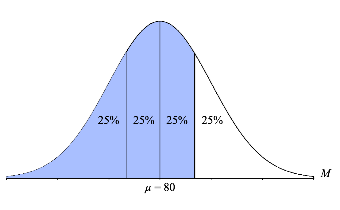
- Tail: Use the percentage to the right of that line: 25%
- Slice: Use the percentage between that line and the mean: 25%
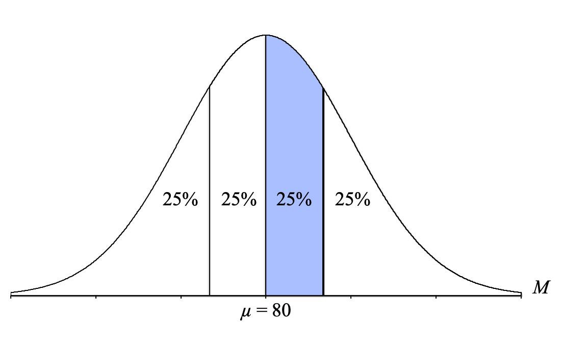
Ultimately, you can use any of these three solutions because they will all result in the same answer. (Note: It’s typically a good idea to choose whichever one makes the most sense to you.) Let’s use the slice option this time.
We then go to the Unit Normal Table and look in the Slice column. To convert our slice percentage of 25% to a proportion, we simply divide it by 100. Thus, we look for the proportion of 0.2500 (make sure to use four decimal places because the proportions in our Unit Normal Table go to four decimal places; thus, instead of 0.25, we will use 0.2500).
As you can see in the table, the exact proportion of 0.2500 does not exist in the Slice column. The two closest proportions to 0.2500 are 0.2486 and 0.2517.
At this point, we then need to pick the proportion that is the closest to our proportion. By subtracting each of the proportions in the table from our proportion of 0.2500:
0.2468 – 0.2500 = -0.0014
0.2517 – 0.2500 = 0.0017
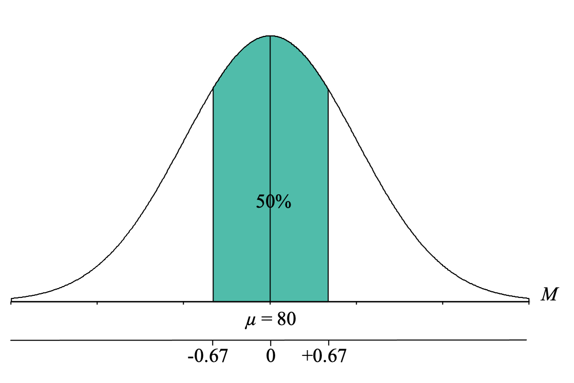
We find that the proportion of 0.2486 is just slightly closer (only a 0.0014 difference) than 0.2517 (a 0.0017 difference), and thus, we identify the z-score for that proportion, which is z = 0.67. So now we know that the z-score boundary (the upper boundary, for now) for the middle 50% of a normal distribution is a z-score of z = +0.67.
Thankfully, because the normal distribution is symmetrical, we don’t need to go through this whole process again to find the z-score cutoff for the lower boundary. It will just be the inverse of the z-score we just located and thus will be z = -0.67.
We can now interpret this to mean that 50% of z-scores from a normal distribution fall between z = -0.67 and z = +0.67.
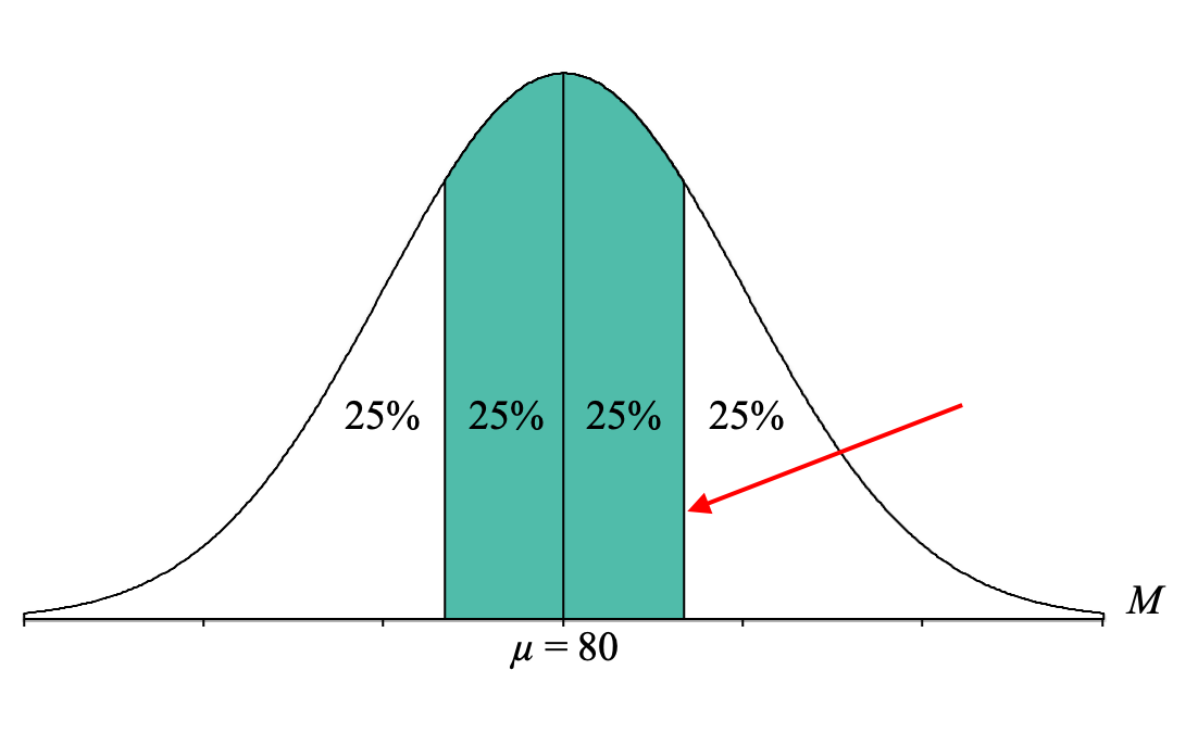
However, it is important to recognize that we are NOT looking for the z-score cutoff for the middle 50% but rather the Exam 1 class average cutoff for the middle 50%. At this point, it is very helpful to add a second axis to the bottom of the distribution graph and label this line with a “z” to indicate that it is the z-score axis. We can also now label the mean with a zero and the z-score cutoffs for the middle 50% of z = -0.67 and z = +0.67:
Our final step is to convert the z-score cutoffs for the middle 50% into sample mean (M) on Exam 1. To do this, we simply use our z-score formula for sample means that solves for M and fill in the components:
Lower Boundary: [latex]M = \mu + z\sigma_{_{\!M}} = 80 + (-0.67) 2 = 80 - 1.34 = 78.66[/latex]
Upper Boundary: [latex]M = \mu + z\sigma_{_{\!M}} = 80 + (+0.67) 2 = 80 + 1.34 = 81.34[/latex]
We now know that to be in the bottom 5% of birth weights, a sample of n = 100 newborns needs to have an average birth weight of 6.902 pounds or less:
To do this, we simply use our z-score formula for sample means that solves for X and fill in the components:
Lower Boundary: [latex]X = \mu + z\sigma = 80 + (-1.04)10 = 80 - 10.4 = 69.6[/latex]
Upper Boundary: [latex]X = \mu + z\sigma = 80 + (+1.04)10 = 80 + 10.4 = 90.4[/latex]
We now know that the extreme 30% of students on Exam 1 scored below 69.6 or above 90.4:
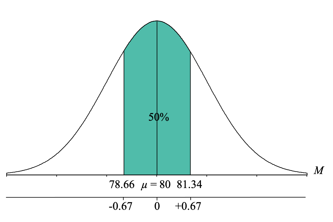
Now, if you are a statistics professor and you wanted to predict what the average score on Exam 1 would be for your current class of 25 students, and you want to be 50% sure (or in other words, have a 50-50 shot of being correct), you would guess that the class average would fall between 78.66 and 81.34.

Feedback/Errata