
6.2 – Probabilities and Frequency Distributions
Probability and Frequency Distributions
Using our formula for probabilities, we can also determine the probability of selecting someone from a group of scores. Suppose we had the following set of quiz scores:
10, 9, 7, 6, 6, 7, 8, 10, 9, 9, 10, 8, 9, 8, 10, 9, 10, 7, 9, 8
We can then ask the question: what is the probability of selecting an individual from this group that has a score of 10?
Using the probability formula, we need to count the number of people with a score of 10, as well as the total number of people. Using a frequency table can help us with that:
|
X |
f |
|
|
10 |
5 |
5 people had a score of 10 |
|
9 |
6 |
6 people had a score of 9 |
|
8 |
4 |
4 people had a score of 8 |
|
7 |
3 |
3 people had a score of 7 |
|
6 |
2 |
2 people had a score of 6 |
|
|
N = 20 |
|
Using our probability formula, we can determine:
PX=10=#ofpeoplewith10’s#ofpeopletotal=520=0.25or25%
If we select someone at random from this group, there is a 25% chance that they scored a 10.
If we wanted to know: what is the probability of selecting an individual who had a score greater than 7? We first count the number of people with a score greater than 7. Since there are 5 people with a 10, 6 people with a 9, and 4 people with an 8, we get a total of 20. Again, we then divide by the total number of people, which is 20.
PX>7=#ofpeoplewithX>7#ofpeopletotal=1520=0.75or75%
There is a 75% chance that the individual we select had a score greater than 7.
Not that these probabilities are also equal to the proportions of people with those scores. The proportion of people with a score greater than 7 is 0.75. And as you will see, these proportions are equal to the proportion of the frequency graphs.
Here is the frequency histogram for our data with the individuals who had a score of X > 7 shaded red:
As it turns out, exactly 0.75 or 75% of the histogram is now shaded red. In other words, the proportion of the histogram that is shaded is equal to the probability.
While this may not seem that useful given that it was pretty easy to just calculate the probability using the frequencies, it becomes much more useful when we start using population graphs that are based upon relative frequencies and smooth curves.
For example, what is the probability of selecting someone at random with a Verbal SAT score of 610 or higher? If we know that SAT subscores have a mean of μ = 500 and a standard deviation of σ = 100, and scores are normally distributed, we can create a graph of the scores using relative frequencies and smooth curves:
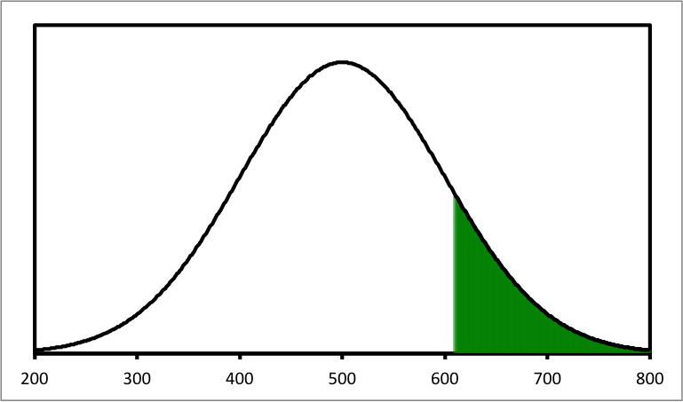
If we look at this graph, we can see that all the SAT verbal subtest scores above 610 are shaded. Now, to determine what percentage of the SAT scores in the entire distribution are shaded, we would simply need to figure out what percentage of the normal distribution bell-shape is shaded. Just taking a guess, it looks like maybe around 15-20%. We could then guess that if we selected an individual at random and asked them what their verbal SAT score was, there’s a 15-20% chance that they had a score above 610.
Fortunately, we can determine the exact percentage of the normal distribution that is shaded by converting scores to a z-score.

Feedback/Errata