Section 5.3: Quartiles, Five Number Summary, and Boxplots
SECTION 5.3 - QUARTILES, FIVE NUMBER SUMMARY, AND BOXPLOTS
The final measure of variability we must consider are the quartiles. Whereas the standard deviation was a measure of spread based around the mean, the quartiles are a measure of spread based around the median.
Quartiles
Quartiles are values that divide the data into quarters.
The first quartile (Q1) is the value so that 25% of the data values are below it; the third quartile (Q3) is the value so that 75% of the data values are below it. You may have guessed that the second quartile (Q2) is the same as the median, since the median is the value so that 50% of the data values are below it. This divides the data into quarters; 25% of the data is between the minimum and Q1, 25%is between Q1 and Q2 (the median), 25% is between Q2 and Q3, and 25% is between Q3 and the maximum value.
While quartiles are not a 1 ─ number summary of variation like the range or standard deviation, the quartiles are used with the median, minimum, and maximum values to form a 5 (five) number summary of the data.
Five Number Summary
The five number summary takes this form:
Minimum, Q1, Median (Q2), Q3, Maximum
To find the quartiles, we first start by finding the second quartile, Q2. Recall, Q2 is the same as the median since 50% of the data values are below Q2 and 50% of the data values are above it.
To find the quartiles:
1) Begin by ordering the data from smallest to largest
2) Find the position of Q2 (the median) using the formula [latex]\frac{n~+~1}{2}[/latex]
3) Find the value of Q2 (the median).
4) The median now divides your data set in half (if the original data set had an odd number of observations, exclude the median from both halves of your ordered list when you find Q1 and Q3).
5) To find Q1 simply find the median of the lower half of the ordered list.
6) To find Q3 simply find the median of the upper half of the ordered list.
Example 10
Suppose we had measured 9 females and their heights (in inches), sorted from smallest to largest are: 59 60 62 64 66 67 69 70 72. Give the five ─ number summary for this data set.
Solution: For this sample, the minimum value is 59, and the maximum is 72.
To find the second quartile, the median, we use the position formula [latex]\frac{n~+~1}{2}[/latex] = [latex]\frac{9~+~1}{2}[/latex] = [latex]\frac{10}{2}[/latex] = 5. The second quartile (median) will be the fifth data value: 66 inches.
Since the number of observations in the original data set was odd (n = 9), we exclude the median from both halves of the list to create:
Lower Half = 59, 60, 62, 64
Upper Half = 67, 69, 70, 72
To find the first quartile we find the median of the lower half of the ordered list. That list has 4 values, so n = 4, [latex]\frac{4~+~1}{2}[/latex] = [latex]\frac{5}{2}[/latex] = 2.5.
The first quartile will be the mean of the second and third data value in the lower half of the list: [latex]\frac{60~+~62}{2}[/latex] = 61 inches.
To find the third quartile, we find the median of the upper half of the ordered list. Since the upper half also has 4 values, this is still the mean of the 2nd and 3rd positions. The third quartile will be the mean [latex]\frac{69~+~70}{2}[/latex] = 69.5 inches.
The 5 number summary is: 59, 61, 66, 69.5, 72.
Note: The 5 number summary divides the data into four intervals, each of which will contain about 25% of the data. That does NOT mean that each of the four intervals will have the same width, just that each of the four intervals will contain 25% of the data.
It is often difficult to picture how the 5 number summary shows the variability in a data set. For visualizing data, there is a graphical representation of the 5 ─ number summary called a box plot, or box and whisker graph.
Boxplot (Box and Whisker Plot)
A boxplot is a graphical representation of a five ─ number summary.
To create a box plot, a number line is first drawn. A box is drawn from the first quartile to the third quartile, and a line is drawn through the box at the median. “Whiskers” are extended out to the minimum and maximum values.
Note: It is important to use consistent intervals of values on the number line in a boxplot. For example, if you start your number line at 0, you may want to make tick marks at 10, 20, 30, etc. You should never use different intervals on the same axis. For example, do not have your first tick mark at 10, your next at 15, then the next at 35, etc. This will counteract the entire purpose of a boxplot, which is to see how the spread differs within the data set.
Example 11
The box plot below is based on the 9 female height data with 5 number summary: 59, 62, 66, 69, 72.

Notice that the horizontal axis used consistently spaced units (increments of 1).
Example 12
The box plot below is based on the household income data with 5 number summary: 15, 27.5, 35, 40, 50.

Notice that the horizontal axis used consistently spaced units (increments of 5). This is an example where you can quickly see that each of the 4 segments of the boxplot are NOT of equal width. For example, the first 25% of the data values have a spread of 12.5 thousand dollars (15 to 27.5) while the third 25% of the data values have a spread of only 5 thousand dollars (35 to 40). This just means that the 25% of incomes between the median and the third quartile are more tightly clustered together than the 25% of incomes between the minimum and Q1.
Box plots are particularly useful for comparing data from two populations.
Example 13
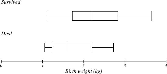
The boxplot below is based on the birth weights of infants with severe idiopathic respiratory distress syndrome (SIRDS)4. The boxplot is separated to show the birth weights of infants who survived and those that did not. Compare the boxplots.

Solution: Comparing the two groups, the boxplot reveals that the birth weights of the infants that died appear to be, overall, smaller than the weights of infants that survived. In fact, we can see that the median birth weight of infants that survived is the same as the third quartile of the infants that died.
Similarly, we can see that the first quartile of the survivors is larger than the median weight of those that died, meaning that over 75% of the survivors had a birth weight larger than the median birth weight of those that died.
Example 14
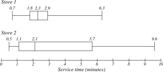
The box plot of service times for two fast food restaurants is shown below. Compare the boxplots.

Solution: While store 2 had a slightly shorter median service time (2.1 minutes vs. 2.3 minutes), store 2 is less consistent, with a wider spread of the data.
At store 1, 75% of customers were served within 2.9 minutes, while at store 2, 75% of customers were served within 5.7 minutes.
Which store should you go to in a hurry? That depends upon your opinions about luck – 25% of customers at store 2 had to wait between 5.7 and 9.6 minutes.
Percentiles
Percentiles are used in statistics to indicate a value below which a certain percentage of the data values fall. For example, if you score in the 60th percentile on a standardized test, it means that 60% of the other scores were lower than yours, (and 40% were higher).
Example 15
Answer the question below on percentiles.
A) What percentage of the values in a data set lie at or below the 30th percentile?
B) What percentage of the values in a data set lie at or above the 30th percentile?
C) If 500 measurements were taken, approximately how many would be at or below the 30th percentile?
D) If 500 measurements were taken, approximately how many would be at or above the 30th percentile?
Solutions:
a) By definition, 30% of the data values lie at or below the 30th percentile.
b) Since 30% lie below the 30th percentile, 100% ─ 30%= 70% of the data values lie above it.
c) 30% of 500 = .30(500) = 150 values lie below the 30th percentile.
d) 70% of 500 = .70(500) = 350 values lie above the 30th percentile.
In general, for any set of numerical data, 50% of the data values are below the median, so the median will always represent the 50th percentile. The lower quartile (Q1) would be the 25th percentile, and the upper quartile (Q3) would be the 75th percentile.
In this unit, we only examine the process of finding the 25th, 50th, and 75th percentiles. Using other statistical techniques it is possible to find the data value corresponding to any percentile in the data set.
Calculator Instructions for Finding Summary Statistics Using TI ─ 83/84:
1) Turn on the calculator
2) Press the “STAT” key
3) Hit “Enter” on option 1: “Edit”
This will bring you to a screen that contains lists: L1, L2, L3, etc.
4) Enter the data values (one value per row) into L1. For any negative values you need to use the ( ─ ) key, not the subtraction key. Continue until all data is entered into L1.
5) Press the “STAT” key again
6) Use the arrow key to scroll over to “CALC”.
7) Select option 1: “1 ─ Var Stats”
8) Indicate that the data is in L1
9) Scroll down to “Calculate” and hit “Enter”
The summary statistics should now be displayed. You may scroll down with your arrow key to get remaining statistics. Using “1 ─ Var Stats” you can get the sample mean, sample standard deviation, population standard deviation, and 5 number summary.
Calculator Instructions for Finding Summary Statistics Using Demos
1) Go to Desmos Calculator - https://www.desmos.com/calculator
2) How to create a table - https://youtu.be/TgYaBC_XUd0
3) How to create a boxplot - https://youtu.be/JQNKwUP-a6s?t=13
4) 5 Number Summary - https://youtu.be/OZXNm10DuFw?t=320 (only watch until 6:02)
5) Mean & Median - https://youtu.be/upFprrTmCK4?t=35
