Section 5.7 – Scatterplots and Linear Regression
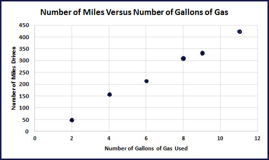
In the last example, the number of miles traveled and the number of gallons of gas used were positively correlated. The data without labels or connecting lines are shown below. This is called a scatterplot.

Observing the graph from left to right, as the number of gallons of gas used increases, the number of miles driven increases. The data do not fall exactly on a single line, but you can see that they are close to doing so. We say these data are approximately linear.
Earlier you computed what is called the average rate of change between a pair of points. This is the slope of the line segments between these points. The average rate of change between 8 and 9 gallons was 23 miles per gallon. The average rate of change between 4 and 6 gallons was 29 miles per gallon.
The chart below shows all the average rates of change between consecutive data points.
| Points (gallons, miles) |
Computation | Average Rate of Change |
| (2, 47) and (4, 156) | [latex]\frac{change~in~miles}{change~in~gallons}[/latex] = [latex]\frac{156~-~47}{4~-~2}[/latex] = [latex]\frac{109}{2}[/latex] = 54.5 | 54.5 miles per gallon |
| (4,156) and (6,214) | [latex]\frac{change~in~miles}{change~in~gallons}[/latex] = [latex]\frac{215~-~156}{6~-~4}[/latex] = [latex]\frac{58}{2}[/latex] = 29 | 29 miles per gallon |
| (6,214) and (8,307) | [latex]\frac{change~in~miles}{change~in~gallons}[/latex] = [latex]\frac{307~-~214}{8~-~6}[/latex] = [latex]\frac{93}{2}[/latex] = 46.5 | 46.5 miles per gallon |
| (8,307) and (9,330) | [latex]\frac{change~in~miles}{change~in~gallons}[/latex] = [latex]\frac{330~-~307}{9~-~8}[/latex] = [latex]\frac{23}{1}[/latex] = 23 | 23 miles per gallon |
| (9,330) and (11,424) | [latex]\frac{change~in~miles}{change~in~gallons}[/latex] = [latex]\frac{424~-~330}{11~-~9}[/latex] = [latex]\frac{94}{2}[/latex] = 47 | 47 miles per gallon |
There is variability in the miles per gallon over the time intervals. This could be due to highway versus city miles, traffic, air condition use, and many other factors of which we are not aware. Regardless, we would like a line that describes the data considering all of its points. The slope of this line will give us an idea of the rate of change for all the points. To do this we will find what is called the line of best fit model using least squares linear regression. Least squares linear regression finds the line that minimizes the sum of the squared vertical distances between the line and the data points. We will use computer applications to find this line.
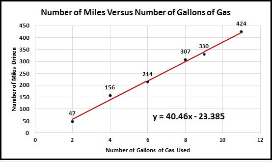
The red line below is the linear regression model for the data from above.

The equation given in the right lower hand corner is the equation for the least squares regression line. The variable x represents the variable on the horizontal axis and the variable y represents the variable of the vertical axis. We will rename these variables to correspond to our context below.
Let g = the number of gallons of gas used.
Let m = the number of miles driven.
m = 40.46g – 23.385
Interpreting the line: The slope is the number multiplied by g. We can interpret this as 40.46 miles per gallon.
The vertical intercept is (0, -23.385). This can be interpreted as, if you have 0 gallons of gas you can travel −23.385 miles. Which of course makes no sense!
A famous Statistician, George Box stated, “All models are wrong, but some are useful.” In statistics, you should never expect a perfect answer. You are finding a best approximation. The negative miles value for the vertical intercept is likely due to the variability we mentioned above; highway versus city miles, traffic, air condition use, and many other factors of which we are not aware. So our model is wrong, but it is a good approximation and it is useful.
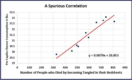
I would like you see what we call a spurious correlation. This is when two variables appear correlated, but they are not really directly related to one another. In the example below, both of the variables are increasing over time. When you plot the corresponding values by year, they are changing together though they are completely unrelated except by time.
This example serves as an important warning:
Correlation does not imply causation
Meaning, just because two variables are correlated it does not mean one is causing the other. Causation claims can only be justified when we run a properly designed experiment. An experiment cannot be done with the variables below (at least not ethically), but our common sense tells us this is not a useful correlation and definitely not a causal relationship.

A) Based on the regression line, as the number of people who died by becoming tangled in their bedsheets increases, the per capita cheese consumption in pounds increases.
Does this mean cheese consumption is causing people to die because they become tangled in their bedsheets??? NO!! This is a spurious correlation.
