
Readable Content – Text: Font, Type Legibility and Readability, and Links
Introduction
Readable content is text that can be easily understood and processed by all users, including those with disabilities. It involves careful consideration of typography, color, layout, and formatting to ensure information is accessible to people with various visual, cognitive, and reading abilities.
Good, readable content reduces cognitive load, improves comprehension, and ensures that everyone can access and understand your information regardless of their abilities or the assistive technologies they use.
In this section, our main topic is Text, which includes Font, Type Legibility & Readability, and Links.
How Readable Content Helps with Accessibility?
Readable content directly supports accessibility by 1) supporting users with visual impairments, 2) assisting cognitive accessibility, 3) improving screen reader experience, 4) reducing eye strain, and 5) enhancing mobile accessibility.
- Supporting Users with Visual Impairments: Clear typography and proper contrast help users with low vision, color blindness, or other visual disabilities read content more easily.
- Assisting Cognitive Accessibility: Simple, well-structured content helps users with dyslexia, ADHD, autism, or other cognitive differences process information more effectively.
- Improving Screen Reader Experience: Properly formatted content with clear headings, lists, and link text helps screen reader users navigate and understand content efficiently.
- Reducing Eye Strain: Good typography and color choices benefit everyone, including users who experience fatigue or have temporary vision issues.
- Enhancing Mobile Accessibility: Readable content is especially important on smaller screens, where text clarity becomes even more critical.
Fonts
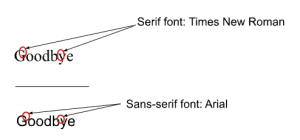
There are two types of basic font forms: Serif fonts and Sans-Serif fonts.
- Serif fonts have small decorative strokes, or “serifs,” at the ends of letterforms. Some examples of Serif fonts are Times New Roman, Garamond, Courier, and Georgia. These types of fonts can be a good choice for printed materials, but may not always translate well to digital screens.
- Sans-Serif fonts do not have serifs. “Sans” means without, which here means that the font is without any of the decorative elements. Some examples of Sans-serif fonts are Arial, Helvetica, Calibri, and Verdana. These types of fonts are often preferred for digital text due to their clean, simple letterforms, which can be easier to read on screens.
Font Selection
- Use simple, clean fonts: Sans-serif fonts like Arial, Helvetica, or system fonts are generally more readable on screens.
- Avoid decorative fonts: Script, handwriting, or overly stylized fonts can be difficult to read.
- Consider dyslexia-friendly fonts: OpenDyslexic or similar fonts can help some users with reading difficulties.
Font Size and Spacing
- Minimum font size: Use at least 12pt (16px) for body text on web pages and documents.
- Line height: Set line spacing to 1.5 times the font size for better readability.
- Letter spacing: Slight increases in letter spacing can improve readability for some users.
- Avoid all caps: Extended text in all capitals is harder to read than mixed case.
Emphasis Text
Emphasizing text can draw attention to specific content; however, it can also create confusion or a barrier for people with low vision. Here are some best practices for emphasizing text:
- Use bold for emphasis: Bold text (<strong>) makes the font thicker and is therefore more easily distinguishable from other text. Bold text conveys importance to screen readers.
- Avoid excessive italics: Italic text can be harder to read. Use it sparingly. Italic text creates angled letters and can be very difficult to read. There are some exceptions, such as citations, etc.
- Use bold italics text: In combination, bold and italics can be effective. Bolding italic text can make the text stand out more.
- Avoid underlined text: Underlining text can make certain lowercase letters difficult to read, for example, “y.” Additionally, underlined text can be interpreted as a hyperlink (clickable).
- Be consistent: Use the same emphasis styles throughout your content.
Type Legibility and Readability
Making text accessible should be part of everyday practice. However, general typographic practices of optimizing legibility and readability don’t necessarily go all the way toward making text accessible.
First, let’s make sure we define legibility and readability. Both are measures of clarity.
- Legibility measures how distinguishable individual characters and words are to the eye of the reader.
- Readability measures how easy it is to read the text overall (such as line spacing).
Legibility
Legibility describes how a typeface’s glyphs can be correctly identified as characters and words, including how individual characters can be distinguished from one another. Legibility should not be confused with readability, although legibility does affect readability.
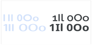
Some typefaces are inherently more legible than others, such as those with distinct shapes for “1,” capital “I,” and lowercase “l” (1Il); or “0” (zero), capital “O,” and lowercase “o” (0Oo). Still, the typography of the text (for example, choices of foreground and background color, font size, weight, tracking, and letter spacing) influences the legibility.
Legibility is a necessary prerequisite to readability; by affecting legibility, these factors also affect the readability of any type.
Readability
Readability describes how comfortable it is for a person to engage with text created with legible type. Three factors determine readability: The person’s unique attributes (visual acuity, disabilities, and other health factors), what the text itself says, and the typography—both the choice of typeface and how it’s used. Readability should not be confused with legibility, although legibility does affect readability.
Readability can be influenced by how interesting the text is for the person reading it, how complicated the topic and the syntax are, whether or not it’s written in an engaging style, how frequently certain words appear throughout the text, and how legible the typeface used is. Typographic characteristics influencing readability include font weight, character spacing, x-height, and line height.
“Type Legibility and Readability” was created by Melissa Martinez and Regina Harrison at Scottsdale Community College.
Links
About Links
We all know what “links” are, but let’s do some basic review to ensure we use shared terminology. A unique web address is called a URL, which stands for Uniform Resource Locator. Web addresses can range in length and complexity. To make a URL easier to consume and understand, we use a hyperlink or link text, which is short descriptive text that points to the URL. Linking to documents, websites, tutorials, or a host of other resources is common and necessary for online education.
How Do Links Impact Accessibility?
When a screen reader is used to read a page with links, it reads the link verbatim. Here are a few things to consider when using links:
- Avoid using the full URL, especially when it is not descriptive and/or excessively long.
- Avoid creating link text with phrases like “click here” or “read more” because these approaches do not tell users where the link will take them.
- When you want users to learn a website URL that is short and descriptive, it is acceptable to provide the full link.
- Using a long and/or difficult to understand URL as link text is fine if required for a research citation.
Bad Examples of Link Text
Review the following bad examples to understand what to avoid when creating links:
- To access Making Sense of Universal Design for Learning video, click here.
- More information about the Making Sense of Universal Design for Learning.
- Read more about the Making Sense of Universal Design for Learning here.
Good Examples of Link Text
Review the following good examples of links. Please note that where the links go is unimportant. It’s important to determine if the link is presented in an accessible manner.
- Watch Alberta Education’s Making Sense of Universal Design video, part of her series about inclusive education topics.
- Visit Maricopa Community Colleges at https://www.maricopa.edu/ to learn more about our colleges and programs.
How To Create Accessible Links
When providing links in a document, use link text to explain the function, resource, or task so users and screen readers know where they will be taken.
- How to create a hyperlink in the Rich Content Editor (written instructions)
- How to create a hyperlink in MS Word 2016 (written instructions and video tutorial)
“Links” was created by Melissa Martinez and Regina Harrison at Scottsdale Community College.
Summary
Creating readable content is one of the most impactful ways to improve accessibility for all users. This guide covered the essential elements of text that make content accessible: choosing appropriate fonts and sizing, using effective emphasis techniques, and writing descriptive links. By implementing these practices, you create content that works for users with visual impairments, cognitive differences, and various assistive technologies, while also improving the experience for all users. Remember that accessible design is universal design. When you make content more readable for users with disabilities, you make it better for everyone.
