
Readable Content – Color
Introduction
Readable content is text that can be easily understood and processed by all users, including those with disabilities. It involves careful consideration of typography, color, layout, and formatting to ensure information is accessible to people with various visual, cognitive, and reading abilities.
Good, readable content reduces cognitive load, improves comprehension, and ensures that everyone can access and understand your information regardless of their abilities or the assistive technologies they use.
In this section, our main topic is Color, which includes Color Contrast, Chrome Extensions for Sampling Color, Chrome Extensions for Simulating Visual Impairments, Chrome Extensions for Web Page Accessibility, and how to use color in Google Docs, Canvas, and MS Word.
How Readable Content Helps with Accessibility?
Readable content directly supports accessibility by 1) supporting users with visual Impairments, 2) assisting cognitive accessibility, 3) improving screen reader experience, 4) reducing eye strain, and 5) enhancing mobile accessibility.
- Supporting Users with Visual Impairments: Clear typography and proper contrast help users with low vision, color blindness, or other visual disabilities read content more easily.
- Assisting Cognitive Accessibility: Simple, well-structured content helps users with dyslexia, ADHD, autism, or other cognitive differences process information more effectively.
- Improving Screen Reader Experience: Properly formatted content with clear headings, lists, and link text helps screen reader users navigate and understand content efficiently.
- Reducing Eye Strain: Good typography and color choices benefit everyone, including users who experience fatigue or have temporary vision issues.
- Enhancing Mobile Accessibility: Readable content is especially important on smaller screens, where text clarity becomes even more critical.
Color
Color choices for text directly impact readability and accessibility. Poor color contrast is one of the most common accessibility barriers, affecting users with various visual impairments as well as those viewing content in different lighting conditions. Using just color will not convey information in an accessible manner. Just like font styles, such as bold, underlining, etc., color is often meaningless to screen readers.
Additionally, when using color, consider people with color blindness. They cannot perceive the difference between certain colors, depending on the type of color blindness. Here are two examples of color-coded menus. The first one shows how the menu appears to a user with normal vision. The second one shows what a user with a visual color deficiency sees.
Color-Coded Menu (normal vision)

Color-Coded Menu (visual color deficiency)

Some people cannot see any color. They only see in grayscale. Below is an image of the color-coded menu from the perspective of a person who can only see in grayscale.

The color-coded menu images were created by Melissa Martinez and Regina Harrison at Scottsdale Community College.
All this does not mean you cannot or should not use colors! Color can increase readers’ attention span, engagement, comprehension, and recall. Ensure that you do not just use color to convey important information. You can add a text label, distinct icons, patterns, and use strong color contrasts.
Color Contrast
When creating accessible documents, color contrast plays a vital role in ensuring that all readers, regardless of visual ability, can access and understand content effectively. Good color contrast refers to the difference in light between text and its background, which helps the text stand out clearly (for example, black text on a white background or vice versa). Without sufficient contrast, individuals with low vision, color blindness, or aging eyes may struggle to read or interpret the information, leading to exclusion or misunderstanding.
Imagine reading dark gray text on a black background or pale yellow text on a white Google or PowerPoint slide. These combinations may seem modern or stylish, but are difficult or even impossible for many people to read. According to Web Content Accessibility Guidelines (WCAG), standard body text should have a contrast ratio of at least 4.5:1. These guidelines ensure that content remains legible across a variety of visual abilities.
Color should also never be the only means of conveying information. For example, using red to indicate errors or green for success messages might be missed entirely by someone with red-green color blindness. Instead, pair color with symbols or text labels, like using a red exclamation point or the word “Error” next to a message, to reinforce meaning.
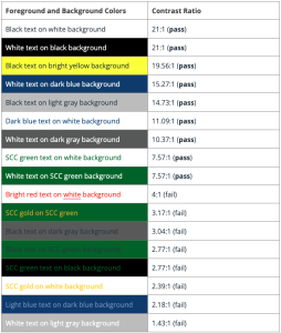
Below are some examples of colors and their contrast ratio. Making note of these will help you make decisions when designing content.
The examples of colors and their contrast ratio were created by Melissa Martinez and Regina Harrison at Scottsdale Community College.
Chrome Extensions for Sampling Colors
A Chrome extension is a small software program added to the Google Chrome web browser to supply new features or tools to your browser, change how websites look or work, or do things automatically while you browse. These extensions are installed from the Chrome Web Store and appear as icons in your browser’s toolbar.
Two extensions that can help you sample colors from a webpage are ColorPick Eyedropper and ColorZilla. Using these extensions, we can obtain the Hexadecimal (Hex) code for any color that appears on the page and then use that Hex code in another Chrome extension to check contrast.
Extension: ColorPick Eyedropper

ColorPick Eyedropper examines the pixels of images or photographs on any webpage, allowing you to see the color value of each pixel. It provides both Hex and Red, Green, Blue (RGB) values. This is helpful if you want to check the color contrast using WebAIM (which we’ll cover below).
Duration 2:33 | Click the CC icon to display closed captions.
Extension: ColorZilla

ColorZilla allows you to sample any web color. The default value copied when a color is selected is Hex (or web color), but users can also choose to copy the RGB value from the tool’s option panel. The built-in palette browser allows you to choose colors from pre-defined color sets and save the most used colors in custom palettes.
Duration 2:02 | Click the CC icon to display closed captions.
“Chrome Extension for Sampling Colors” was created by Melissa Martinez and Regina Harrison at Scottsdale Community College.
Chrome Extensions for Simulating Visual Impairments
A Chrome extension is a small software program added to the Google Chrome web browser to supply new features or tools to your browser, change how websites look or work, or do things automatically while you browse. These extensions are installed from the Chrome Web Store and appear as icons in your browser’s toolbar.
The Chrome extensions below enable users to simulate what it looks like to view content with a visual impairment. Let’s get color blind allows users to see like those with color blindness, and Funkify Disability Simulator enables users to view content from one of six different types of visual impairments.
Let’s Get Color Blind

Let’s get color blind simulates information a color-blind person receives and/or adds a daltonization filter. Color vision is unfortunately not granted to everyone. Approximately 10% are affected by a reduced ability to perceive colors. Let’s get color blind tries to raise awareness by letting you simulate colorblindness.
Duration 1:29 | Click CC to view the closed captions.
Funkify Disability Simulator
![]()
Funkify Disability Simulator helps you experience the web through the eyes of users with different abilities and disabilities, including:
- Blurry Vision
- Color Vision Deficiency
- Dyslexia
- Trembling
- Tunnel vision
- Peripheral (loss of central vision)
Duration 4:52 | Click CC to view the closed captions.
“Chrome Extension for Simulating Visual Impairments” was created by Melissa Martinez and Regina Harrison at Scottsdale Community College.
Chrome Extension for Web Page Accessibility
A Chrome extension is a small software program added to the Google Chrome web browser to supply new features or tools to your browser, change how websites look or work, or do things automatically while you browse. These extensions are installed from the Chrome Web Store and appear as icons in your browser’s toolbar.
WAVE Evaluation Tool

The WAVE Evaluation Tool is a Chrome extension that allows you to evaluate web content for accessibility issues. It helps identify and fix accessibility issues on web pages. This extension provides visual feedback by adding icons and tags to a page. If you host or manage web pages, watch the video below for a demonstration of the tool.
Duration 11:20 | Click the CC icon to view the closed captions
WAVE® Web Accessibility Evaluation Tools is a suite of evaluation tools that helps authors make their web content more accessible to individuals with disabilities. There are more tools available in the suite than just the Chrome extension.
“Chrome Extension for Web Page Accessibility” was created by Melissa Martinez and Regina Harrison at Scottsdale Community College.
How Do I Know If My Colors Are Accessible?
A simple way to check contrast is to print in black and white and confirm the document is legible.
Another more effective option is to use online tools to help you test your current colors and identify a color palette of accessible colors. There are two excellent web accessibility tools available to assist you with accessible color contrast in your content.
- Color Safe helps you find accessible color palettes for your designs.
- WebAIM Color Contrast Checker lets you test colors you have already chosen.
WebAIM Color Contrast Checker
The WebAIM Color Contrast Checker allows users to check the contrast between text and background text. This tool helps digital content creators ensure that the text on their content pages is readable for all users, including those with visual impairments. The primary goal is to check if the contrast between text and its background meets accessibility standards, particularly the Web Content Accessibility Guidelines (WCAG).
The Web Content Accessibility Guidelines (WCAG) are a set of standards for making web content, including e-learning courses, more accessible to people with disabilities. The World Wide Web Consortium (W3C) maintains the WCAG standards, which are optional best practices. WCAG 2.0 is the version that schools are required to meet, and it includes recommendations for making online content more accessible for people with different types of disabilities. WCAG 2.0 level AA requires a contrast ratio of at least:
- 4.5:1 for normal text (12 pt)
- 3:1 for large text (14 pt bold or 18 pt or larger)
- 3:1 for graphics and user interface components (such as form input borders)
The video below demonstrates how to use the WebAIM Contrast Checker. The video includes closed captioning, but you can also access a Video Transcript.
Duration 2:04 | Click CC icon to display closed captions
Color Safe
Color Safe is a website that helps you find accessible color palettes for your content. You can enter the background color, your font family, and font size. Once this information is entered, the Color Safe website will display a rectangle with text and show the current ratio of background color to text color. When you click Generate Color Palette, it provides blocks of colors to choose from that meet the contrast ratio requirement for the text on that background color.
The video includes closed captioning, but you can also access a Video Transcript.
Duration 2:12 | Click the CC icon to display closed captions
“How do I know if My Colors Are Accessible,” “WebAIM Color Contrast Checker,” and “Color Safe” were created by Melissa Martinez and Regina Harrison at Scottsdale Community College.
How to Find Color Codes
You can use RGB and hexadecimal codes to check color contrast with the WebAIM Contrast Checker. Obtaining these color codes is different in various software or websites. The following information addresses how to obtain color codes in the various programs.
Microsoft Word and PowerPoint
This video demonstrates how to get the RGB or Hex color codes for text in a Word and a PowerPoint file. It also demonstrates how to get the color code for a grouped shape.
Duration 1:40 | Click the CC icon to display closed captions.
The video includes closed captioning, but you can also access a Video Transcript.
Google Docs or Slides
This video demonstrates how to get the Hex color codes for text and table fill in a Google Doc and a Google Slides file. It also demonstrates how to get the color code for grouped shapes.
Duration 1:24 | Click the CC icon to display closed captions
The video includes closed captioning, but you can also access a Video Transcript.
Canvas
This video demonstrates how to get the Hex color codes for text and table fill on a Canvas page.
Duration 2:28 | Click the CC icon to display closed captions
The video includes closed captioning, but you can also access a Video Transcript.
“How to Find Color Codes” and all the videos were created by Melissa Martinez and Regina Harrison at Scottsdale Community College.
Summary
Creating readable content is one of the most impactful ways to improve accessibility for all users. This guide covered the essential elements that make content accessible: ensuring proper color contrast for text and backgrounds, how to ensure color is being used properly, and how to use color in Google Docs, Canvas, and MS Word. By implementing these practices, you create content that works for users with visual impairments, cognitive differences, and various assistive technologies, while also improving the experience for all users. Remember that accessible design is universal design. When you make content more readable for users with disabilities, you make it better for everyone.
Resources
(2017). PennState Accessibility: Color Deficient Vision (Color Blindness). Retrieved May 21, 2018.
(2005). 20 Ways to Share the Color Knowledge – Xerox. Retrieved April 2, 2016.
(2006). WebAIM: Visual Disabilities – Color-blindness. Retrieved November 15, 2015.
