
33 Presentation Aids
Learning Objectives
- Explain reasons to use presentation aids.
- Differentiate between different types of presentation aids.
- Consider effective design for presentation aids.
- Utilize best practices for designing and using presentation aids.
Presentation Aids
If you have prepared and rehearsed your speech adequately, shouldn’t a good speech with a good delivery be enough to stand on its own? While it is true that impressive presentation aids will not rescue a poor speech, it is also important to recognize that a good speech can often be made even better by the strategic use of presentation aids.
Presentation aids are designed to enhance your presentation. We often fall into the “I’ll just make a slide show” mentality. However, this is not always the best choice for a presentation aid. This section will explore reasons to use presentation aids, different types, and tips on how to prepare them.
Slide and slide show design have a major impact on your ability to get your message across to your audience. Numerous books address various design fundamentals and slide design, but there isn’t always consensus on what is “best.” What research has shown, though, is that people have trouble grasping information when it comes at them simultaneously. “They will either listen to you or read your slides; they cannot do both.” This leaves you, the presenter, with a lot of power to direct or scatter your audience’s attention. This section will serve as an overview of basic design considerations that even novices can use to improve their slides.
First and foremost, design with your audience in mind. Your slide show is not your outline. The show is also not your handout. As discussed earlier, you can make a significantly more meaningful, content-rich handout that complements your presentation if you do not try to save time by making a slide show that serves as both. Keep your slides short, create a separate handout if needed, and write as many notes for yourself as you need.
All decisions, from the images you use to their placement, should be done with a focus on your message, your medium, and your audience. Each slide should reinforce or enhance your message, so make conscious decisions about each element and concept you include and edit mercilessly. Taken a step further, graphic designer Robin Williams suggests each element be placed on the slide deliberately in relation to every other element on the slide.
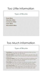
Providing the right amount of information, neither too much nor too little, is one of the key aspects in effective communication. See Figure 3.1 as an example of slides with too little or too much information. The foundation of this idea is that if the viewers have too little information, they must struggle to put the pieces of the presentation together. Most people, however, include too much information (e.g., slides full of text, meaningless images, overly complicated charts), which taxes the audience’s ability to process the message. “There is simply a limit to a person’s ability to process new information efficiently and effectively.” As a presenter, reducing the amount of information directed at your audience (words, images, sounds, etc.) will help them to better remember your message. In this case, less is actually more.
The first strategy to keeping it simple is to include only one concept or idea per slide. If you need more than one slide, use it, but don’t cram more than one idea on a slide. While many have tried to proscribe the number of slides you need based on the length of your talk, there is no formula that works for every presentation. Use only the number of slides necessary to communicate your message, and make sure the number of slides corresponds to the amount of time allotted for your speech. Practice with more and fewer slides and more and less content on each slide to find the balance between too much information and too little.
With simplicity in mind, the goal is to have a slide that can be understood in 3 seconds. Think of it like a billboard you are passing on the highway. You can achieve this by reducing the amount of irrelevant information, also known as noise, in your slide as much as possible. This might include eliminating background images, using clear icons and images, or creating simplified graphs. Your approach should be to remove as much from your slide as possible until it no longer makes any sense if you remove more.
What is the purpose?
Effective presentation aids are used for a specific purpose. They can help to clarify and emphasize ideas, increase audience recall, and increase interest in your speech. Your job as a speaker is to choose the correct presentation aid to enhance your speech.
Clarify
Clarification is important in a speech because if some of the information you convey is unclear, your listeners will come away puzzled or possibly even misled. Presentation aids can help clarify a message if the information is complex or if the point being made is a visual one.
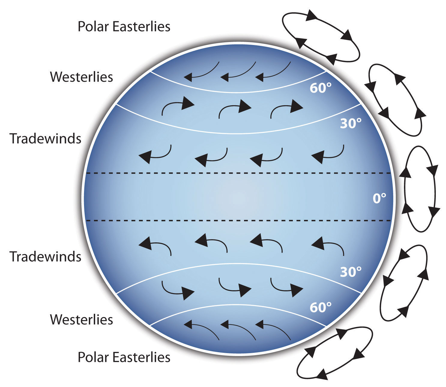
If your speech is about the impact of the Coriolis effect on tropical storms, for instance, you will have great difficulty clarifying it without a diagram because the process is a complex one. The diagram below may be an effective presentation aid because it shows the audience the interaction between equatorial wind patterns and wind patterns moving in other directions. The diagram allows the audience to process the information in two ways: through your verbal explanation and through the visual elements of the diagram.

Another example of clarifying occurs when a speaker wants to visually help audience members understand a visual concept. For example, if a speaker is talking about the importance of petroglyphs in Native American culture, just describing the petroglyphs won’t completely help your audience to visualize what they look like. Instead, showing an example of a petroglyph can more easily help your audience form a clear mental image of your intended meaning.
Emphasize
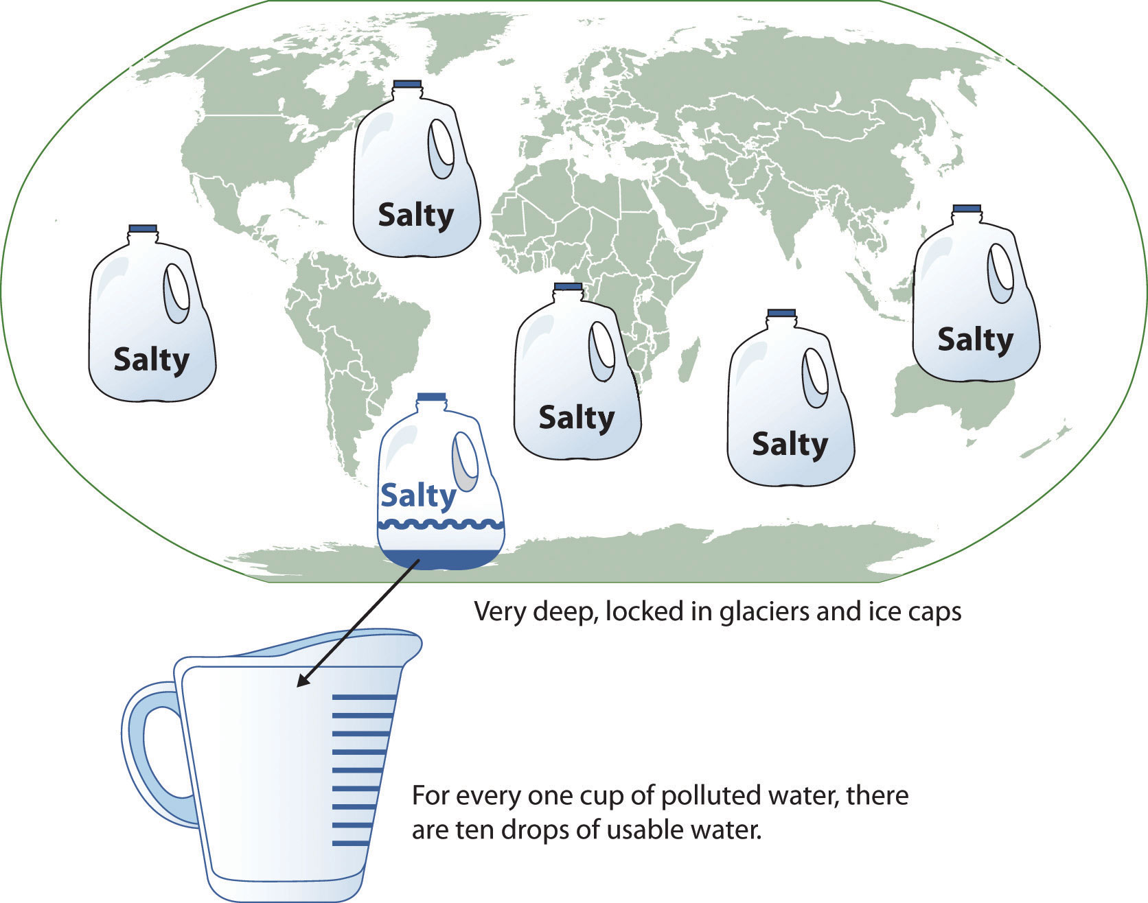
When you use a presentational aid for emphasis, you highlight the importance of an idea. In a speech on water conservation, you might try to show the environmental proportions of the resource. When you use a conceptual drawing like the one below, you show that if the world water supply were equal to ten gallons, only ten drops would be available and potable for human or household consumption. This drawing is effective because it emphasizes the scarcity of useful water and thus draws attention to this important information in your speech.
Recall
Visual images can serve as a memory aid to your listeners. When your graphic images deliver information effectively and when your listeners understand them clearly, audience members are likely to remember your message long after your speech is over.
An added plus of using presentation aids is that they can boost your memory while you are speaking. Using your presentation aids while you rehearse your speech will familiarize you with the association between a given place in your speech and the presentation aid that accompanies that material.
Variety and Interest
Presentation aids make your speech more interesting. While it is true that a good speech and a well-rehearsed delivery will already include variety in several aspects of the presentation, in many cases, a speech can be made even more interesting by the use of well-chosen presentation aids.
For example, you may have prepared a very good speech to inform a group of gardeners about several new varieties of roses suitable for growing in your local area. Although your listeners will undoubtedly understand and remember your message very well without any presentation aids, wouldn’t your speech have a greater impact if you accompanied your remarks with a picture of each rose? You can imagine that your audience would be even more enthralled if you had the ability to display an actual flower of each variety in a bud vase.
Remember, as you are thinking about possible presentation aids, they should be purposeful. You should not have a presentation aid you do not directly use just to have one. If you do not have a purpose for the presentation aid, leave it out.
What should I consider before choosing a presentation aid?
With a little forethought and adequate practice, you can choose presentation aids that enhance your message and boost your professional appearance in front of an audience.
Less is more: One principle to keep in mind is to use only as many presentation aids as necessary to present your message.
- The number and the technical sophistication of your presentation aids should never overshadow your speech. Your presentation aid must deliver clear information, and it must not distract from the message.
- Avoid overly elaborate presentation aids because they can distract the audience’s attention from your message. Instead, simplify as much as possible, emphasizing the information you want your audience to understand.
Technology: You will need to keep presentation aids within the limits of the working technology available to you.
- Know the physical context of the room. Will there be a projector, computer with internet, and sound system? Knowing what is available will help you to plan effective aids.
- Have a back up plan. Whether or not technology works on the day of your speech, you will still have to present. What will you do if the computer file containing your slides is corrupted? You must be prepared to adapt to an uncomfortable and scary situation.
It is an AID: Presentation aids do not “speak for themselves.” You need to use it. Don’t think you can just show it and it makes the point you want it to make. If you do not use it, then it probably isn’t necessary.
- When you display a visual aid, you should explain what it shows, pointing out and naming the most important features.
- If you use an audio aid such as a musical excerpt, you need to tell your audience what to listen for.
- If you use a video clip, it is up to you as the speaker to point out the characteristics in the video that support the point you are making.
Best Choice: Think about the purpose of your presentation aid (see above) to help you determine which is the best option.
What types of presentation aids can I use?
Now that you know why you are using a presentation aid, let’s look at your options.
Slideshows
In most careers in business, industry, and other professions for which students are preparing themselves, computer-based presentation aids are the norm today. Whether the context is a weekly department meeting in a small conference room or an annual convention in a huge amphitheater, speakers are expected to be comfortable with using slideshow software to create and display presentation aids.
Slides show design and theme should be consistent. It should be easy to read, free of clutter, and enhance your message. Below are several common slideshow software programs.
| Name | Website | Price |
|---|---|---|
| Google Presentations | https://www.google.com/slides/about/ | Free |
| Harvard Graphics | http://www.harvardgraphics.com | $ |
| Keynote | http://www.apple.com/keynote | $ |
| OpenOffice Impress | http://www.openoffice.org/product/impress.html | Free |
| PowerPoint | https://products.office.com/en-us/powerpoint | $ |
| PrezentIt | http://prezentit.com | Free |
| Prezi | http://prezi.com | Free/$ |
| ThinkFree Show | http://member.thinkfree.com | Free |
| Zoho Show | http://show.zoho.com | Free |
Slide Layout
It is easy to simply open up your slideware and start typing in the bullet points that outline your talk. If you do this, you will likely fall into the traps for which PowerPoint is infamous. Presentation design experts Reynolds and Duarte both recommend starting with paper and pen. This will help you break away from the text-based, bullet-filled slide shows we all dread. Instead, consider how you can turn your words and concepts into images. Don’t let the software lead you into making a mediocre slide show.
Regarding slide design, focus on simplicity. Don’t over-crowd your slide with text and images. Cluttered slides are hard to understand (see Figure 3.1). Leaving empty space, also known as white space, gives breathing room to your design. The white space actually draws attention to your focus point and makes your slide appear more elegant and professional. Using repetition of color, font, images, and layout throughout your presentation will help tie all of your slides together. This is especially important if a group is putting visuals together collaboratively. If you have handouts, they should also match this formatting in order to convey a more professional look and tie all your pieces together.
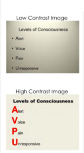
Another general principle is to use contrast to highlight your message. Contrast should not be subtle. Make type sizes significantly different. Make contrasting image placements, such as horizontal and vertical, glaringly obvious. A general principle to follow: if things are not the same, then make them very, very different, as in Figure 3.3.
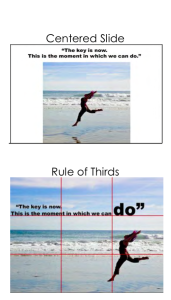
A common layout design is called the rule of thirds. If you divide the screen using two imaginary lines horizontally and two vertically, you end up with nine sections. The most visually interesting and pleasing portions of the screen will be at the points where the lines intersect.
Aligning your text and images with these points is preferred to centering everything on the screen. See Figure 3.4. Feel free to experiment with the right and left aligned content for contrast and interest. Sticking with a centered layout means more work trying to make the slide interesting.
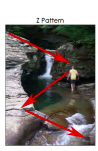
Understanding how people view images (and thus slides) can help you direct the viewer’s attention to the main point of your slide. In countries that read text from left to right and top to bottom, like English-speaking countries, people tend to also read images and slides the same way. Starting in the upper left of the screen, they read in a Z pattern, exiting the page in the bottom right corner unless their vision is side-tracked by the objects they are looking at (as in Figure 3.5).
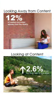
Viewers’ eyes are scanning from focus point to focus point in an image, so you need to consciously create visual cues to direct them to the relevant information. Cues can be created subtly by the placement of objects in the slide, by showing movement, or more obviously by using a simple arrow. Make sure all people and pets are facing into your slide and preferably at your main point, as in Figure 3.6. If your slide contains a road, path, car, plane, etc., have them also facing into your slide. When the natural motion or gaze of your images points away from your slide, your viewers look that way too. Being aware of this and addressing the natural tendencies of people when viewing images can help you select images and design slides that keep the viewer engaged in your message.
Text
Nothing is more hotly debated in slide design than the amount of text that should be on a slide. Godin says “no more than six words on a slide. EVER.” Other common approaches include the 5×5 rule—5 lines of text, 5 words per line—and similar 6×6 and 7×7 rules. Even with these recommendations, it is still painfully common to see slides with so much text on them that they can’t be read by the audience. The type has to be so small to fit all the words on the slide that no one can read it. Duarte keenly points out that if you have too many words, you no longer have a visual aid. You have either a paper or a teleprompter, and she recommends opting for a small number of words.
Once you understand that the words on the screen are competing for your audience’s attention, it will be easier to edit your slide text down to a minimum. The next time you are watching a presentation and the slide changes, notice how you aren’t really grasping what the speaker is saying, and you also aren’t really understanding what you are reading. Studies have proved this split-attention affects our ability to retain information; so when presenting, you need to give your audience silent reading time when you display a new slide. That is: talk, advance to your next slide, wait for them to read the slide, and resume talking. If you consider how much time your audience is reading rather than listening, hopefully you will decide to reduce the text on your slide and return the focus back to you, the speaker, and your message.
There are several ways to reduce the number of words on your page, but don’t do it haphazardly. Tufte warns against abbreviating your message just to make it fit. He says this dumbs down your message, which does a disservice to your purpose and insults your audience’s intelligence. Instead, Duarte and Reynolds recommend turning as many concepts as possible into images. Studies have shown that people retain more information when they see images that relate to the words they are hearing. And when people are presented information for a very short time, they remember images better than words.
The ubiquitous use of bulleted lists is also hotly debated. PowerPoint is practically designed around the bulleted-list format, even though is it regularly blamed for dull, tedious presentations with either overly dense or overly superficial content. Mostly this format is used (incorrectly) as a presenter’s outline. “No one can do a good presentation with slide after slide of bullet points. No One.” Reserve bulleted lists for specifications or explaining the order of processes. In all other cases, look for ways to use images, a short phrase, or even no visual at all.
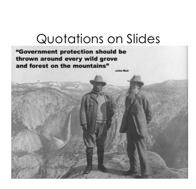
Quotes, on the other hand, are not as offensive to design when they are short, legible, and infrequently used. They can be a very powerful way to hammer a point home or to launch into your next topic. See Figure 3.10 for an example. If you do use a quote in your slide show, immediately stop and read it out loud or allow time for it to be read silently. If the quote is important enough for you to include it in the talk, the quote deserves the audience’s time to read and think about it. Alternately, use a photo of the speaker or of the subject with a phrase from the quote you will be reading them, making the slide enhance the point of the quote.
Images
Images can be powerful and efficient ways to tap into your audience’s emotions. Use photographs to introduce an abstract idea, to evoke emotion, to present evidence, or to direct the audience attention, just make sure it is compatible with your message. Photos aren’t the only images available. You might consider using simplified images like silhouettes, line art, diagrams, enlargements, or exploded views, but these should be high quality and relevant. Simplified can be easier to understand, particularly if you are showing something that has a lot of detail. Simple images also translate better than words to a multicultural audience. In all cases, choose only images that enhance your spoken words and are professional-quality. This generally rules out the clip art that comes with slideware, whose use is a sign of amateurism. Select high-quality images and don’t be afraid to use your entire slide to display the image. Boldness with images often adds impact.
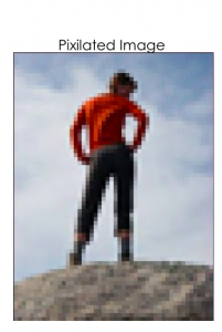
When using images, do not enlarge them to the point that the image becomes blurry, also known as pixelation. Pixelation, (Figure 3.11) is caused when the resolution of your image is too low for your output device (e.g. printer, monitor, projector). When selecting images, look for clear ones that can be placed in your presentation without enlarging them. A good rule of thumb is to use images over 1,000 pixels wide for filling an entire slide. If your images begin to pixelate, either reduce the size of the image or select a different image.
Never use an image that has a watermark on it, as in Figure 3.2. A watermark is text or a logo that is placed in a digital image to prevent people from re-using it. It is common for companies that sell images to have a preview available that has a watermark on it. This allows you, the potential customer, to see the image, but prevents you from using the image until you have paid for it. Using a watermarked image in your presentation is unprofessional. Select another image without a watermark, take a similar photo yourself, or pay to get the watermark-free version.

You can create images yourself, use free images, or pay for images from companies like iStockphoto for your presentations. Purchasing images can get expensive quickly, and searching for free images is time consuming. Be sure to only use images that you have permission or rights to use and give proper credit for their use. If you are looking for free images, try searching the Creative Commons database for images from places like Flickr, Google, and others. The creators of images with a Creative Commons License allow others to use their work, but with specific restrictions. What is and isn’t allowed is described in the license for each image. Generally, images can be used in educational or non-commercial settings at no cost as long as you give the photographer credit. Also, images created by the U.S. government and its agencies are copyright free and can be used at no cost.
One final consideration with using images: having the same image on every page, be it part of the slide background or your company logo, can be distracting and should be removed or minimized. As mentioned earlier, the more you can simplify your slide, the easier it will be for your message to be understood.
Backgrounds and Effects
PowerPoint and other slideware has a variety of templates containing backgrounds that are easy to implement for a consistent slide show. Most of them, however, contain distracting graphics that are counter to the simplicity you are aiming for in order to produce a clear message. It is best to use solid colors, if you even need a background at all. For some slide shows, you can make the slides with full-screen images, thus eliminating the need for a background color.
Graphic design is the paradise of individuality, eccentricity, heresy, abnormality, hobbies and humors. ~ George Santayana
Should you choose to use a background color, make sure you are consistent throughout your presentation. Different colors portray different meanings, but much of this is cultural and contextual, so there are few hard and fast rules about the meaning of colors. One universal recommendation is to avoid the color red because it has been shown to reduce your ability to think clearly. Bright colors, such as yellow, pink, and orange, should also be avoided as background colors, as they are too distracting. Black, on the other hand, is generally associated with sophistication and can be a very effective background as long as there is sufficient contrast with the other elements on your slide.
When designing your presentation, it is tempting to show off your tech skills with glitzy transitions, wipes, fades, moving text, sounds, and a variety of other actions. These are distracting to your audience and should be avoided. They draw attention away from you and your message, instead focusing the audience’s attention on the screen. Since people naturally look at what is moving and expect it to mean something, meaningless effects, no matter how subtle, distract your audience, and affect their ability to grasp the content. Make sure that all your changes are meaningful and reinforce your message.
Graphs and Charts
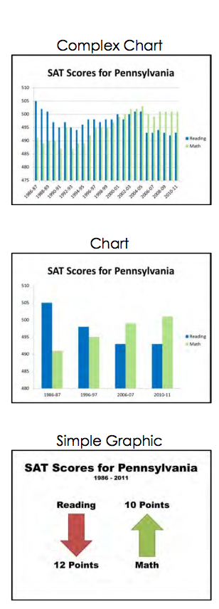
If you have numerical data that you want to present, consider using a graph or chart. You are trying to make a specific point with the data on the slide, so make sure that the point—the conclusion you want your audience to draw—is clear. This may mean that you reduce the amount of data you present, even though it is tempting to include all of your data on your slide.
It is best to minimize the amount of information and focus instead on the simple and clear conclusion. You can include the complete data set in your handout if you feel it is necessary. Particularly when it comes to numerical data, identify the meaning in the numbers and exclude the rest. “Audiences are screaming ‘make it clear,’ not ‘cram more in.’ You won’t often hear an audience member say, ‘That presentation would have been so much better if it were longer.” In some cases you can even ditch the graph altogether and display the one relevant fact that is your conclusion.
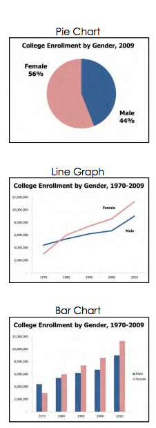
Different charts have different purposes, and it is important to select the one that puts your data in the appropriate context to be clearly understood. Pie charts show how the parts relate to the whole and are suitable for up to eight segments, as long as they remain visually distinct. Start your first slice of the pie at 12:00 with your smallest portion and continue around the circle clockwise as the sections increase in size. Use a line graph to show trends over time or how data relates or interacts. Bar charts are good for showing comparisons of size or magnitude and for showing precise comparisons. There are other types of charts and graphs available, but these are the most common.
When designing charts, one should use easily distinguishable colors with clear labels. Be consistent with your colors and data groupings. For clarity, avoid using 3-D graphs and charts, and remove as much of the background noise (lines, shading, etc.) as possible. All components of your graph, once the clutter is removed, should be distinct from any background color. Finally, don’t get too complex in any one graph, make sure your message is as clear as possible, and make sure to visually highlight the conclusion you want the audience to draw.
Charts
A chart is commonly defined as a graphical representation of data (often numerical) or a sketch representing an ordered process. A chart can take the form of a diagram or a picture or a graph.
A decision tree is one example of a chart. Decision trees are useful for showing the relationships between ideas. The below example shows how a decision tree could be used to determine the appropriate weather for playing baseball. As with the other types of charts, you want to be sure that the information in the chart is relevant to the purpose of your speech and that each question and decision is clearly labeled.
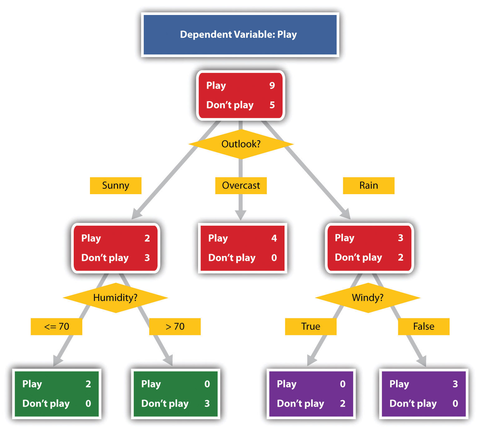
Wikimedia Commons – public domain.
Graphs
A graph is considered a type of chart illustrating a pictorial representation of the relationships of quantitative data using dots, lines, bars, pie slices, and the like. Graphs show the variation in one variable in comparison with that of one or more other variables. Where a statistical chart may report the mean ages of individuals entering college, a graph would show how the mean age changes over time. A statistical chart may report the number of computers sold in the United States, while a graph will show the breakdown of those computers by operating systems such as Windows, Macintosh, and Linux. Public speakers can show graphs using a range of different formats. Some of those formats are specialized for various professional fields. Very complex graphs often contain too much information that is not related to the purpose of a student’s speech. If the graph is cluttered, it becomes difficult to comprehend.
In this section, we’re going to analyze the common graphs speakers utilize in their speeches: line graphs, bar graphs, and pie graphs.
Line Graph
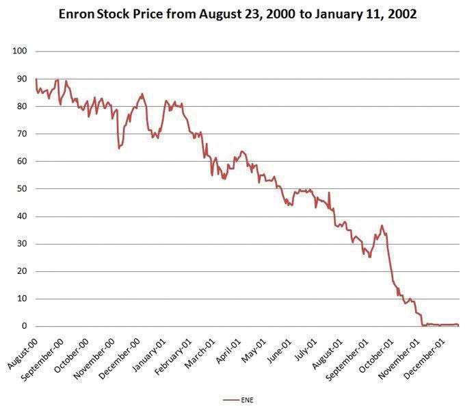
A line graph is designed to show trends over time. The example to the left depicts the fall of Enron’s stock price from August 2000 to January 2002. Notice that although it has some steep rises, the line has an overall downward trend clearly depicting the plummeting of Enron’s stock price. Showing such a line graph helps the audience see the relationships between the numbers, and audiences can understand the information by seeing the graph much more easily than they could if the speaker just read the numbers aloud.
Bar Graph
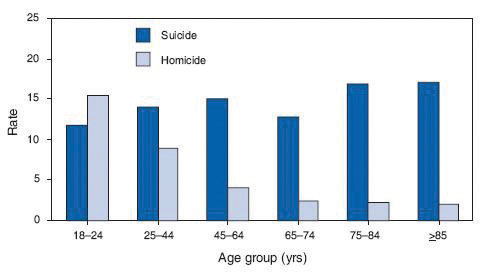
Bar graphs are useful for showing the differences between quantities. They can be used for population demographics, fuel costs, math ability in different grades, and many other kinds of data.
The graph to the right is well designed. It is relatively simple and is carefully labeled, making it easy for you to guide your audience through the quantities of each type of death. The bar graph is designed to show the difference between natural deaths and homicides across various age groups. When you look at the data, the first grouping clearly shows that eighteen- to twenty-four-year-olds are more likely to die because of homicide than any of the other age groups.
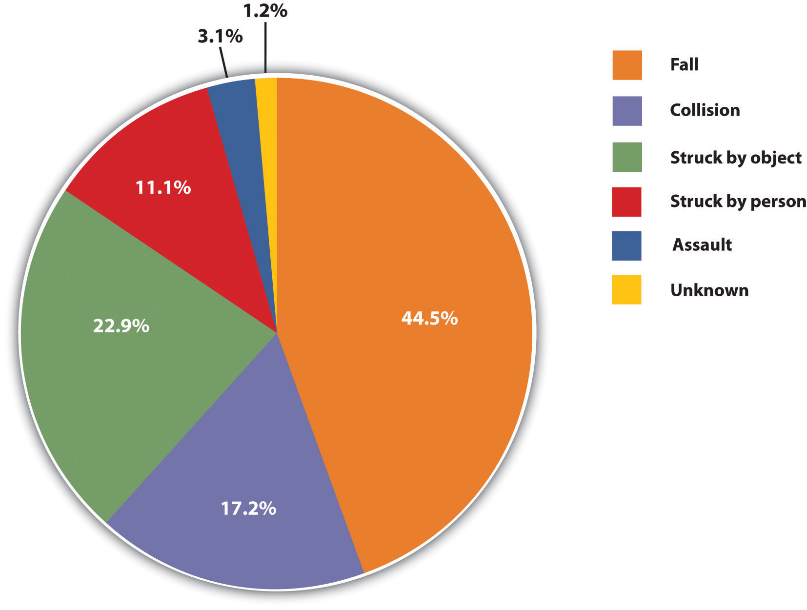
Pie Graph
Pie graphs should be simplified as much as possible without eliminating important information. As with other graphs, the sections of the pie need to be plotted proportionally. In the pie graph shown, we see a clear and proportional chart that has been color-coded. Color-coding is useful when it’s difficult to fit the explanations in the actual sections of the graph; in that case, you need to include a legend, or key, to indicate what the colors in the graph mean. In this graph, audience members can see very quickly that falls are the primary reason children receive concussions.
In the world of presentation aids, representations are designed to represent real processes or objects. Often, speakers want to visually demonstrate something that they cannot physically bring with them to the speech. Maybe you’re giving a speech on the human brain, and you just don’t have access to a cadaver’s brain. Instead of bringing in a real brain, you could use a picture of a brain or an image that represents the human brain. In this section, we’re going to explore four common representations: diagrams, maps, photographs, and video or recordings.
Diagrams
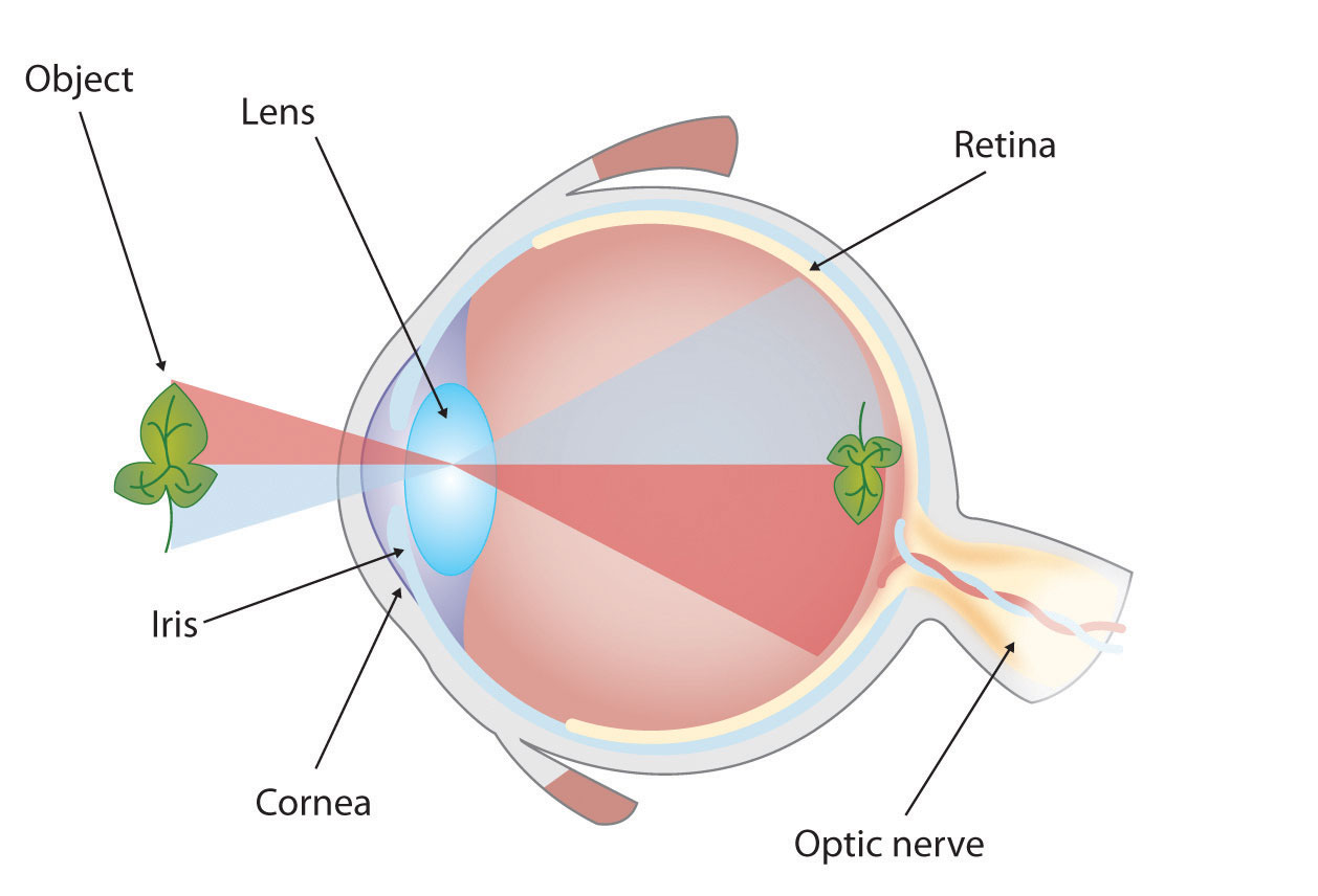
Diagrams are drawings or sketches that outline and explain the parts of an object, process, or phenomenon that cannot be readily seen. When you use a diagram, be sure to explain each part of the phenomenon, paying special attention to elements that are complicated or prone to misunderstanding. In the example shown, you might wish to highlight that the light stimulus is reversed when it is processed through the brain or that the optic nerve is not a single stalk as many people think.
Maps


Maps are extremely useful if the information is clear and limited. There are all kinds of maps, including population, weather, ocean current, political, and economic maps, but you should be able to find the right kind for the purpose of your speech. Choose a map that emphasizes the information you need to deliver.
The African Map with Nigerian Emphasis is simple, showing clearly the geographic location of Nigeria. This can be extremely valuable for some audiences who might not be able to name and locate countries on the continent of Africa. The Road Island map emphasizes the complicated configuration of islands and waterways that characterize this state’s geography. Although the map does not list the names of the islands, it is helpful in orienting the audience to the direction and distance of the islands to other geographic features, such as the city of Providence and the Atlantic Ocean.
Photographs and Drawings


Sometimes a photograph or a drawing is the best way to show an unfamiliar but important detail. The first photograph is of a wigwam – a living dwelling used by Native Americans in the North East. In this photograph you can see the curved birchbark exterior, which makes this dwelling ideal for a variety of weather conditions. The photograph of the tall ship emphasizes the sheer amount and complexity of the ship’s rigging.
Video or Audio Recordings
Another very useful type of presentation aid is a video or audio recording. Whether it is a short video from a website such as YouTube or Vimeo, a segment from a song, or a piece of a podcast, a well-chosen video or audio recording may be a good choice to enhance your speech.
Imagine, for example, that you’re giving a speech on how “Lap-Band” surgeries help people lose weight. One of the sections of your speech could explain how the Lap-Band works, so you could easily show the following forty-three-second video to demonstrate the medical part of the surgery.
Or maybe you are talking about Midevil Folkrock Songs and want to play a short clip for the audience so they have an idea of what the music sounds like.
There is one major caveat to using audio and video clips during a speech: do not forget that they are supposed to be aids to your speech, not the speech itself! In addition, be sure to avoid these three mistakes that speakers often make when using audio and video clips:
- Avoid choosing clips that are too long for the overall length of the speech. If you are giving a five-minute speech, then any audio or video clip you use should be thirty seconds or under in length.
- Don’t fail to practice with the audio or video equipment prior to speaking. If you are unfamiliar with the equipment, you’ll look foolish trying to figure out how it works. This fiddling around will not only take your audience out of your speech but also have a negative impact on your credibility.
- Don’t fail to cue the clip to the appropriate place prior to beginning your speech. You will need to forward through any advertisements and/or previous parts of the video so that when you press play you begin exactly where you want your audience to start watching.
Objects or Models
Objects and models are other forms of presentation aid that can be very helpful in getting your audience to understand your message. Objects are anything you could hold up and talk about during your speech. If you’re talking about the importance of not using plastic water bottles, you might hold up a plastic water bottle and a stainless steel water bottle as examples. If you’re talking about the percussion family of musical instruments and you own (and can play) several different percussion instruments, you can show your audience in person what they look like and how they sound.
Models are re-creations of physical objects that you cannot have readily available with you during a speech. If you’re giving a speech on heart murmurs, you may be able to show how heart murmurs work by holding up a model of the human heart.
Animals
When giving a speech on a topic relating to animals, it is often tempting to bring an animal to serve as your presentation aid. While this can sometimes add a very engaging dimension to the speech, it carries some serious risks that you need to consider.
Unpredictable behavior: You may think this won’t be a problem if your presentation aid animal is small enough to be kept confined throughout your speech—for example, a goldfish in a bowl or a lizard or bird in a cage. However, even caged animals can be very distracting to your audience if they run about, chirp, or exhibit other agitated behavior. The chances are great that an animal will react to the stress of an unfamiliar situation by displaying behavior that does not contribute positively to your speech.
Negative response: In addition to common fears and aversions to animals like snakes, spiders, and mice, many people have allergies to various animals.
Restrictions: Some locations may have regulations about bringing animals onto the premises. If animals are allowed, the person bringing the animal may be required to bring a veterinary certificate or may be legally responsible for any damage caused by the animal.
Before you decide to use an animal, ask yourself if you could make your point equally well with a picture, model, diagram, or other representation of the animal in question.
People
People can be helpful to demonstrate things such as dance or yoga moves or procedures such as first aid. A few considerations if you decide this is your best option:
- You should arrange ahead of time for a person (or persons) to be an effective aid—do not assume that an audience member will volunteer on the spot. If you plan to demonstrate how to immobilize a broken bone, your volunteer must know ahead of time that you will touch him or her as much as necessary to splint their foot.
- Discuss how they should dress. You want them to arrive dressed presentably and ensure they will not draw attention away from your message through their appearance or behavior.
- The transaction between you and your human presentation aid must be appropriate, especially if you are going to demonstrate something like a dance step. Use your absolute best judgment about behavior, and make sure that your human presentation aid understands this dimension of the task.
Dry-Erase Board
Typically, these speakers use the chalk or dry-erase board for interactive components of a speech. For example, maybe you’re giving a speech in front of a group of executives. You may have a PowerPoint all prepared, but at various points in your speech, you want to get your audience’s responses. Chalk or dry-erase boards are very useful when you want to visually show information that you are receiving from your audience. If you use a dry-erase board, follow these three simple rules:
- Write large enough so that everyone in the room can see.
- Print legibly; don’t write in cursive script.
- Write short phrases; don’t take time to write complete sentences.
Flipchart
A flipchart is useful when you’re trying to convey change over a number of steps. For instance, you could use a prepared flipchart to show dramatic population shifts on maps. In such a case, you should prepare highly visible, identical maps on three of the pages so that only the data will change from page to page. Each page should be neatly titled, and you should actively point out the areas of change on each page. You could also use a flip chart to show stages in the growth and development of the malaria-bearing mosquito. Again, you should label each page, making an effort to give the pages a consistent look.
Organize your flip chart in such a way that you flip pages in one direction only, front to back. It will be difficult to flip large pages without damaging them, and if you also have to “back up” and “skip forward,” your presentation will look awkward and disorganized. Pages will get damaged, and your audience will be able to hear each rip.
In addition, most flip charts need to be propped up on an easel of some sort. If you arrive for your speech only to find that the easel in the classroom has disappeared, you will need to rig up another system that allows you to flip the pages.
Poster or Foam Board
Foam board consists of a thin sheet of Styrofoam with heavy paper bonded to both surfaces. It is a lightweight, inexpensive foundation for information, and it will stand on its own when placed in an easel without curling under the bottom edge. Poster board tends to be cheaper than foam board, but it is flimsier, more vulnerable to damage, and can’t stand on its own.
If you plan to paste labels or paragraphs of text to foam or poster board, for a professional look you should make sure the color of the poster board matches the color of the paper you will paste on. You will also want to choose a color that allows for easy visual contrast so your audience can see it, and it must be a color that’s appropriate for the topic. For instance, hot pink would be the wrong color on a poster for a speech about the Protestant Reformation.
Avoid producing a presentation aid that looks like you simply cut pictures out of magazines and pasted them on. Slapping some text and images on a board looks unprofessional and will not be viewed as credible or effective. Instead, when creating a poster you need to take the time to think about how you are going to lay out your aid and make it look professional. You do not have to spend lots of money to make a very sleek and professional-looking poster.
Some schools also have access to expensive, full-color poster printers where you can create a large poster for pasting on a foam board. In the real world of public speaking, most speakers rely on the creation of professional posters using a full-color poster printer. Typically, posters are sketched out and then designed on a computer using a program like Microsoft PowerPoint or Publisher (these both have the option of selecting the size of the printed area).
Handouts
Handouts are appropriate for delivering information that audience members can take away with them. However, they require a great deal of management if they are to contribute to your credibility as a speaker.
Considerations for handouts:
- Bring enough copies of the handout for each audience member to get one. Having to share or look on with one’s neighbor does not contribute to a professional image. Under no circumstances should you ever provide a single copy of a handout to pass around. There are several reasons this is a bad idea. You will have no control over the speed at which it circulates or the direction it goes. Moreover, only one listener will be holding it while you’re making your point about it and by the time most people see it, they will have forgotten why they need to see it. In some cases, it might not even reach everybody by the end of your speech. Finally, listeners could still be passing your handout around during the next speaker’s speech.
- There are three possible times to distribute handouts: before you begin your speech, during the speech, and after your speech is over. Naturally, if you need your listeners to follow along with a handout, you will need to distribute it before your speech begins. If you have access to the room ahead of time, place a copy of the handout on each seat in the audience. If not, ask a volunteer to distribute them as quickly as possible while you prepare to begin speaking. If the handout is a “takeaway,” leave it on a table near the door so that those audience members who are interested can take one on their way out; in this case, don’t forget to tell them to do so as you conclude your speech. It is almost never appropriate to distribute handouts during your speech, as it is distracting and interrupts the pace of your presentation.
- Handouts should include only the necessary information to support your points, and that information should be organized in such a way that listeners will be able to understand it. For example, in a speech about how new health care legislation will affect small business owners in your state, a good handout might summarize key effects of the legislation and include the names of state agencies with their web addresses where audience members can request more detailed information.
- If your handout is designed for your audience to follow along, you should tell them so. State that you will be referring to specific information during the speech. Then, as you’re presenting your speech, ask your audience to look, for example, at the second line in the first cluster of information. Read that line out loud and then go on to explain its meaning.
- Handouts are not a substitute for a well-prepared speech. Ask yourself what information your audience really needs to be able to take with them and how it can be presented on the page in the most useful and engaging way possible.
Pro Tips for Preparing and Using Presentation Aids
Text:
- Use text only when you must.
- Carefully limit the amount of text on a presentation aid – less is more. Other than direct quotes, you should only have keywords.
- Do not use “fancy” font. Keep it simple and readable.
- The type must be big, simple, and bold with white space around it to separate it from another graphic element or cluster of text that might be on the same presentation aid.
- When you display text, refer to it as you are speaking.
- Under no circumstances should you merely read what’s on your text aids and consider that a speech.
Graphics:
- Graphic elements in your presentation aids must be large enough to be seen by the entire audience.
- You should cite your source with an added caption.
- On a poster or a slide, a graphic element should take up about a third of the area. This leaves room for a small amount of text, rendered in a large, simple font. The textual elements should be located closest to the part of your graphic element they refer to.
Additional tips for Slides:
- Color is very important and can definitely make a strong impact on an audience. However, don’t go overboard or decide to use unappealing combinations of color. For example, you should never use a light font color (like yellow) on a solid white background because it’s hard for the eye to read.
- While colors may be rich and vibrant on your computer screen at home, they may be distorted by a different monitor. Check your presentation out on multiple computers to see if the slide color is being distorted in a way that makes it hard to read.
- Avoid animation – this can be distracting unless it is relevant to the speech content.
In general:
- It is vital to practice with your presentation aids.
- Always have a back up plan. The show must go on. Decide in advance what you will do if your visual is not accessible or does not work the way you planned.
- You should always arrive at least fifteen minutes ahead of your scheduled speaking time to test the equipment. As the speaker, you are responsible for arranging the things you need to make your presentation aids work as intended. Good speakers carry a roll of duct tape so they can display your poster even if the easel is gone and always have a back up virtual presentation copy – just in case. The more sophisticated the equipment is, the more you should be prepared with an alternative, even in a “smart classroom.”
- What you choose should be easily seen and heard by your audience.
- You should be able to easily handle your presentation aid.
Key Takeaways
- Presentation aids must be organized and simple.
- Presentation aids are supposed to aid a speech, not become the speech itself.
- When presentation aids look unprofessional, they can decrease a speaker’s credibility.
- Always practice with your presentation aids, and be prepared for unexpected problems.
- Each presentation aid vehicle has advantages and disadvantages. As such, speakers need to think through the use of visual aids and select the most appropriate ones for their individual speeches.
- Every presentation aid should be created with careful attention to content and appearance.
References
Association for Psychological Science. (2011, May 28). Miracle fruit and flavor: An experiment performed at APS 2010 [Video file]. Retrieved from http://www.psychologicalscience.org/index.php/publications/observer/obsonline/miracle-fruit-and-flavor-an-experiment-performed-at-aps-2010.html
Lauer, D. A., & Pentak, S. (2000). Design basics (5th ed.). Fort Worth, TX: Harcourt College Publishers.
Lockard, J., & Sidowski, J. R. (1961). Learning in fourth and sixth graders as a function of sensory mode of stimulus presentation and overt or covert practice. Journal of Educational Psychology, 52(5), 262–265. doi: 10.1037/h0043483
Macworld. (2010, June 7). WWDC: Steve Jobs’ iPhone 4 launch glitches [Video file]. Retrieved from http://www.youtube.com/watch?v=yoqh27E6OuU
Stoner, M. (2007). Uncovering the powers within PowerPoint. Communication Currents, 2(4). Retrieved from http://www.natcom.org/CommCurrentsArticle.aspx?id=819
