
4.1 The Cartographic Process
The Cartographic process is the process you should follow when you want to go from unmapped data to a map form. The cartographic process is not a rigid processing you need to follow step-by-step, however, it is a recommended set of steps that you should follow in order to properly create a map.
The Cartographic process is composed of five steps. Step one is to define purpose and meaning of the map. Step two is to choose the scale of the map. The third step is to determine the map format, printing limitations you may have, and the economics of production and reproduction of the map. Step four is to abstract and generalize the data. And finally step five is the design and the layout of the map.
Once you reach step five you will often need to make changes, evaluate those changes, and possibly start one of the previous steps in the cartographic process. Also note that the cartographic process does not need to be followed in this particular order. Designing a map is often a dynamic and iterative process which requires you to bounce back and forth between steps in order to produce a cartographically sound map. We will now go over each one of the five steps in the cartographic process in more detail.
Step 1: Define Purpose and Meaning
The first step in the cartographic process, define purpose and meaning, means that you should interpret the requirements of the user when you’re thinking about the design of the map. You need to answer two important questions.
The first question is “what needs to be communicated?” In order to answer this question you need to make sure you have a thorough understanding of what you want to convey to the map user, who is a map user is going to be, and what you expect the map user to gain from viewing your map.
The second question to answer is “how to best facilitate the communication of ideas?” Once you determine what needs to be communicated you can then determine the best way to communicate that information. Things to think about here are if you’re going to make a tangible or virtual map, what category of map you will create, and how you will produce and deliver the map.
Step 2: Choose Scale
The second step in the cartographic process is to choose the scale of the map. Defined, map scale is the ratio of map distance to earth distance. In other words it is the ratio at which the earth has been reduced to fit on the map. Map scale operates along a continuum from large-scale too small scale.
There are no hard rules for exactly what constitutes a large scale, medium scale, or small scale map. Therefore we will present the rules of thumb for determining which category of scale your map falls within. A large scale map is a map it is produced at 1 to 0 all the way through 1 to 600,000. A medium scale map is a method is produced from one to 600,001 through 1 to 2,000,000. A small scale map is a map that is produced from the scale 1 to 2,000,001 through 1 to infinity. A large scale map shows a very small geographic area while a small scale map shows a very large geographic area. While this may seem counterintuitive, we call a large scale map a large scale map because of the relative size of the fraction. For instance the fraction 1/600,000 is a significantly larger number than 1/2,000,000, therefore, the scale 1:600,000 is considered to be a large scale compared to 1:2,000,000.
Because scale is going to have such a bearing on the look of your map, what data will be required, and how much detail you can show on the map, selection of scale is possibly the most important decision a cartographer makes. If you choose the correct scale at the beginning it will make your life quite a bit easier when you run to the iterative cartographic process. However, it is common to slightly change the scale as you work through the map design process, but it is best if you try to decide if you are making a small, medium, or large scale map early.
Step 3: Format, Printing, and Economics
The third step in the cartographic process is considering the format, printing, and economics of map production. There are three questions you must answer in this step: The first question is what kind of map will you create a reference or thematic map? If you decide to make a thematic map, what type of thematic map will it be?
The second question to answer is how will the map be displayed? Will the map be printed on 8.5 inch by 11inch piece of paper? Will the map be viewable on a mobile device? Will the map be viewed by a pilot in the cockpit of a helicopter? Answering this question will help determine the options you have for producing the map.
The third question to answer in this step is how much will it cost to create the map? Depending on your format restrictions, whether you are going to use color or not, and many other decisions, these all factor into the cost of creating a map you should check this cost against your budget.
Step 4: Abstract and Generalize
The fourth step in the cartographic process is the abstraction and generalization of data. Once you have determined the purpose, scale, format, and type of map, you then need to determine which data sets are required and how to appropriately abstract and generalize them so that you have a unified look on your map.
Additionally you should only show information on the map that is potentially meaningful to the context. That means you should ignore placing data on the map just because it looks pretty or because you have the data. You should critically analyze every piece of data you place in the map to determine whether it is useful to the map reader and the purpose of the map.
As you were making an abstraction of reality at a reduced scale of the size of the earth you will need to appropriately reduce the amount of detail in the data so that the map will be a simple visual image. Should you use data that is too detailed for the scale of which you are producing the map, the map will appear very busy, cluttered, and will be difficult to use.
Broadly speaking, there are four methods to abstract and generalize data for display on a map.
Selection
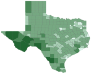
The first method is the selection of data. Selection is when you choose a subset of data that you wish to display on the map. For example, if you are showing the roads across the state of Texas you may only want to select the major roads and highways as showing every street in Texas would make the map look like a mass you cannot show that much detail at that scale.

Classification
The second method is classification. Classification is when you combine observations into a larger group or class to simplify the data so that it can be displayed easier on the map.
Simplification
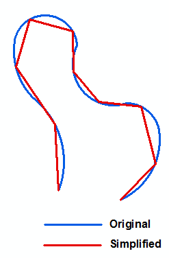
The third method is simplification. If the data you wish to use for your map contains too much geometric detail you should simplify the geometry so that it looks smoother and appropriate for the scale which you are mapping. This can be done manually or through the use of algorithms.
Symbolization
The fourth method when abstracting and generalizing is the use of symbolization on the map. Symbolization is when we use representative shapes or pictures to represent items or spatial phenomena.
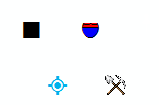
When choosing symbols for your map, there are a few things that you should keep in mind. The first is to use universally accepted symbols when possible. There is no need to reinvent the wheel and it may only lead to confusing your user. For instance if you want to show the location of an airport on a map, a universal symbol is an airplane. If instead of an airplane you chose to represent an airport terminal this may not be instantly recognizable to the user and will require them to visit the legend unnecessarily.
Second you should make sure that you use discrete and continuous symbols appropriately. This is actually fairly hard to do as continuous symbols are typically represented by rasters or surfaces. To be thorough it is important that discrete objects be displayed as discrete. Third, use universally accepted colors when possible. For example, hospital symbols are typically blue, and parks are typically green. As people are used to seeing these categories of items in these particular colors, if you adopt those color conventions, it will make your map easier to use as things will be more readily identifiable by your map reader.
Step 5: Design Layout
The fifth step in the cartographic process is designing the maps layout. In this section we will only speak about design layout in general terms, but will soon discuss the map elements and map design principles in more detail.
When designing your map layout the first bit of advice is that you should always experiment with your map design! Rarely should you accept your first design. It is recommended that once you have created one map design you drastically rearrange elements to see if there any other layouts that may work better. Do not be afraid to start over from scratch if a map design is not working for you. Remember that cartography is a creative process that often requires multiple iterations of design.
For each map design you create you should critically evaluate the map for the following. First, you should make sure that in its current design, the map is still suited to the needs of its users and is not overly complicated, or too simplistic in nature. You should also make sure that you have included all relevant information that the map user will need to reference when viewing your map.
Second, the map should be easy to use. If you have included unnecessary detail, placed elements in awkward locations, used nonstandard symbols or colors, among other issues, the map will be difficult to use in your user will get quickly frustrated.
Last, you should always make sure that your map is an accurate representation of reality. You should double check to make sure that you have not included any false information or displayed the data in such a way that the user could easily arrive at an incorrect conclusion.
As you continue to evaluate your map design you should also consider these qualities. The language of the map should relate to elements or qualities represented. This means that the language of the map should not be stating one thing, when the map clearly points toward a contrary position. Both the visual portion and language portion of the map should have a cohesive and consistent message.
You should also consider whether the map is clear, legible, and attractive. This is often harder to determine therefore it is recommended that you show your map design to colleagues, friends, or family to get their opinion and see what they think about the map. Last, you should see if your map will permit interaction with the user and engage the user in a meaningful manner.
You should try to make sure that your map is as interesting as possible and has an important message to convey. If the map is boring, not visually attractive, or does not show any useful information, your map will not be useful to the map user.
Element Considerations
As you create your map design you should aim to design a map that is a functional visual communication device that is visually pleasing and is truthful and accurate. This is quite a tall order, however as you work iteratively through the cartographic process, you will achieve this goal.
Harmony, Composition, and Clarity
Broadly speaking, a cartographically well-designed map will have harmony, composition, and clarity. A map is harmonious with the map elements looking like they belong together, which means all map elements have the same feel to them and the same style. No one element looks to be out of place or “pasted on”. A well-designed map also has good composition. This speaks to the structural balance of the map. Does the map “feel” off balanced or do the map elements look to be placed very poorly?
Ideally the positioning of the map elements will be in accordance with their importance on the map and will be easy to reference in support of the main map body. Lastly, a well-designed map has clarity. This means that the map reader can instantly recognize elements on the map and can easily recognize and use all the elements you placed around the map for reference.
Map Aesthetics
Wright, in 1942 stated this about map aesthetics: “The quality of a map is also in part an aesthetic matter. Maps should have harmony within themselves. An ugly map, with crude colors, careless line work, and disagreeable, poorly arranged lettering may be intrinsically as accurate as a beautiful map, but it is less likely to inspire confidence.” What Wright is alluding to is that in order for map to be effective in the eyes of a map user, the map must not only be accurate, but it must also have harmony, good composition, and clarity.
A recommended set of steps that you should follow in order to properly create a map, composed of five steps: define purpose and meaning of the map; choose the scale of the map; determine the map format, printing limitations you may have, and the economics of production and reproduction of the map; abstract and generalize the data; the design and the layout of the map.
The ratio between the distance between two locations on a map and the corresponding distance on Earth’s surface.
When you choose a subset of data that you wish to display on the map.
When you combine observations into a larger group or class to simplify the data so that it can be displayed easier on the map.
Simplifying complex geometric detail so that it looks smoother and appropriate for the scale which you are mapping.
To use representative shapes, icons, or pictures to represent items or spatial phenomena.
