
5.2 Big Lies
There are other mapping lies that are not so innocent. In the remainder of this section, we are going to focus on some examples of maps that are lying more deliberately—or working hard to represent a very particular story. Keep in mind, though, that there is a fine line between the map-maker intending clarity vs. pushing an agenda. The first example addresses the ways that aggregation and zonation are manipulated to achieve a particular political end.
5.2.1 Political Lies: Gerrymandering
There are many ways that maps are modified in order to promote particular political perspectives or outcomes. Political lies in mapping take the form of propaganda, campaign advertisements, and politically-motivated resource maps. One particularly important political lie is gerrymandering, the manipulation of the boundaries of an electoral constituency in order to favor a particular political party or group. Because US Congressional districts are reapportioned in the years following the decennial census, political leaders in power at that time may take the opportunity to redraw borders—even convoluted gerrymandered borders—that favor their party’s continued political success.
Gerrymandering has been an important and highly contested part of the US political process for quite some time. The term was coined in the Boston Gazette in reference to the contrived redistricting schemes designed to secure the political power of Massachusetts Governor Elbridge Gerry’s Democratic-Republican Party. In 1812, the Gazette published the illustration seen below comparing Gerry’s convoluted redistricting to the image of a salamander-like creature. Thus, “gerrymandering” was born. This political technique has a storied history, and is a powerful way of lying with maps: gerrymandering works to consolidate or distribute political power, with such tactics as isolating opponents (known as packing) and breaking up areas of opposition (cracking).
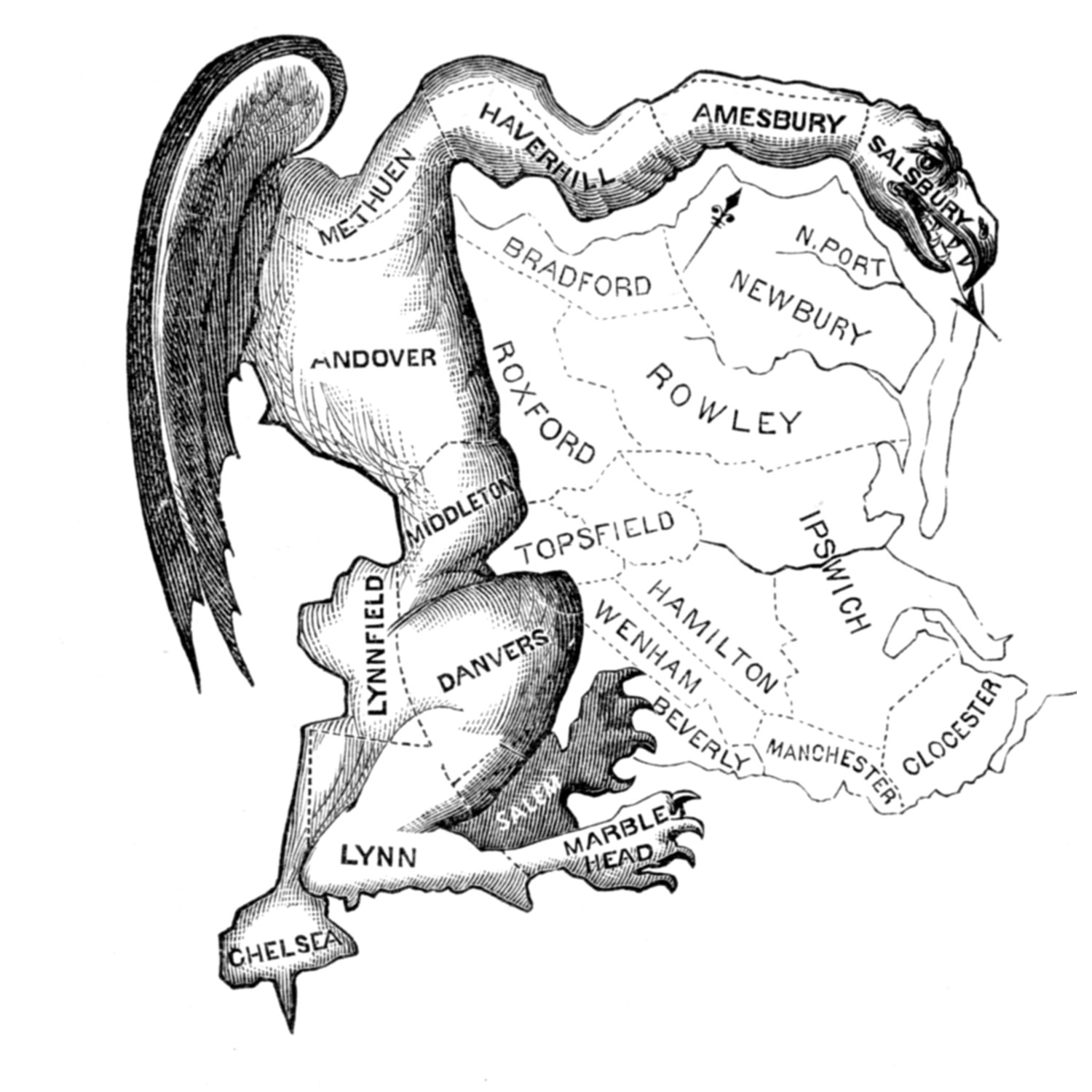 Gerrymandering. The term gerrymandering was coined by Elkanah Tisdale in the Boston Gazette in 1812. The newspaper published an editorial cartoon that showed the elongated shape of the aggregated areas in the form of a salamander. [1]
In the figure below, there are fifty precincts (the smallest area in which votes are tallied) that can be distributed among five districts. At the precinct level, there are proportionally more green voters than yellow (60% versus 40%), and so all other things being equal, you would expect non-gerrymandered districts to reproduce a proportionate outcome. Out of the five total districts, you would expect three to vote majority green and two majority yellow, which corresponds to the 60% versus 40% split of the underlying precincts. Grouping precincts into districts yield different outcomes if principles of gerrymandering are used, namely packing and cracking. Under Districting A, the number of districts won by each party is proportional to the number of voters for each party: 60% for green and 40% for yellow. Districting B cracks the yellow precincts in a way that allows green to dominate all districts, yielding 100% for green and 0% for yellow. Districting C packs and cracks green in a way that lets yellow eke out an upset win with three districts, which is the reverse of the underlying voting patterns of the precincts.
 Packing and cracking. Overall, at the precinct level, there are proportionally more green voters than yellow (60% vs. 40%). Three different ways of grouping precincts into districts yield different outcomes. Under Districting A, the number of districts won by each party is proportional to the number of voters for each party. Districting B cracks the yellow precincts in a way that allows green to dominate all districts. Districting C packs and cracks green in a way that lets yellow gain an upset win with three districts. [2]
Gerrymandering is alive and well today. It is widely practiced in the US, as you can see by some of the more outrageous examples of congressional gerrymandering in the figure below. This type of redistricting and reapportionment can have very real consequences for people who live in these areas, limiting their representation, protecting incumbent seats, and compromising access to federal funding. Some have argued that gerrymandering is akin to legal election rigging.
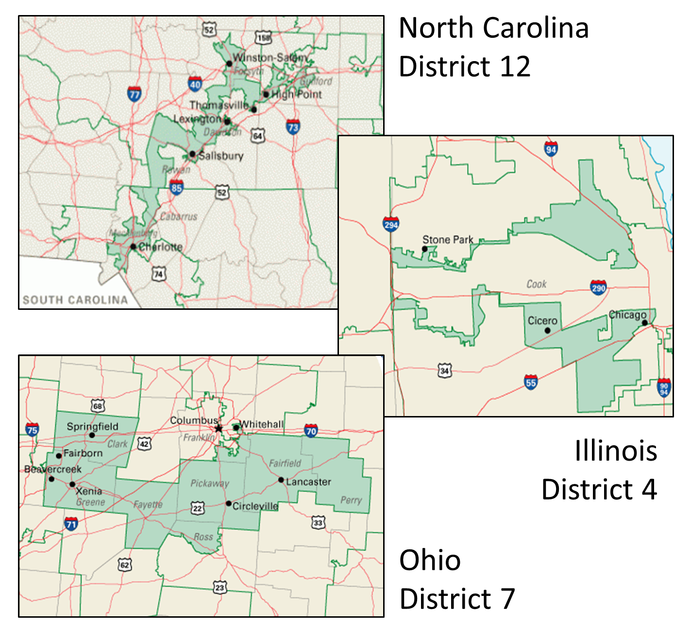 Gerrymandering in the United States. These maps show examples of gerrymandered districts in the United States; these are just a few of many. North Carolina’s 12th congressional district in 2016 was an example of packing, with predominantly African-American residents (top). Illinois’s 4th congressional district packs two Hispanic areas while meeting the requirement for contiguity running along Interstate 294 (middle). Ohio’s 7th is an example of “cracking” where the urban population of Columbus, Ohio is split off into more conservative suburbs. [3]
For incarcerated populations and those who live in districts where prisons are located, gerrymandering may have an even bigger impact. In order to understand how prison-based gerrymandering works, you’ll have to think back to what you learned about how census data is collected, analyzed, and aggregated. For certain data categories, the Census Bureau counts incarcerated people as residents of the town where their prison is located, rather than the town where they resided prior to their imprisonment. Because census data are currently used for redistricting at all levels of federal, state, and local governance, the particular cities and census tracts where people are counted is very important for ensuring representation and apportionments.
In the US, the prison population has risen significantly in the past few decades. Advocates for ending prison-based gerrymandering argue that counting prisoners based on their incarceration location—particularly when those prisoners are barred from voting in 48 states—gives exponential political power to the small non-incarcerated population in the area, and their representatives. When this happens, advocates argue, the practice siphons political representation and funding from other districts in the state—particularly those districts that bear the greatest costs of crime.
The prison gerrymandering dynamic is evident in existing census maps. Let’s return to the Los Angeles area income and education maps that you encountered earlier. The figure below contains details about Los Angeles County Census Tract 2060.20. The map shows us that income and education are not correlated in this area. Looking at the data, we see that only 5.328% of the population in this tract has a Bachelor’s degree, but 91.453% has an annual income of $75,000+. Only when we dig a little deeper does this particular tract begin to make a little more sense. Census Tract 2060.20 is home to the Twin Towers Correctional Facility and the Men’s Central Jail. The ACS and census currently tabulate all of the prisoners who live in the Twin Towers and Men’s Central jail as residents and takes into account their education level. However, the census does not include incarcerated populations in household income or poverty calculations, so the map on the right only takes into account the incomes of the surrounding community. You can see how this kind of data collection method might make it very difficult to adequately account for population, ensure reasonable representation, and manage appropriations in prison-based communities, as well as the communities from which incarcerated populations come.
 Prison gerrymandering. This detail of Census Tract 2060.20 shows income and education (Left: Income More than $75,000; Right: Education Bachelor’s Degree or More). These maps show us that income and education are not correlated in this area. [4]
5.2.2 Geopolitical Lies: Contested Territories
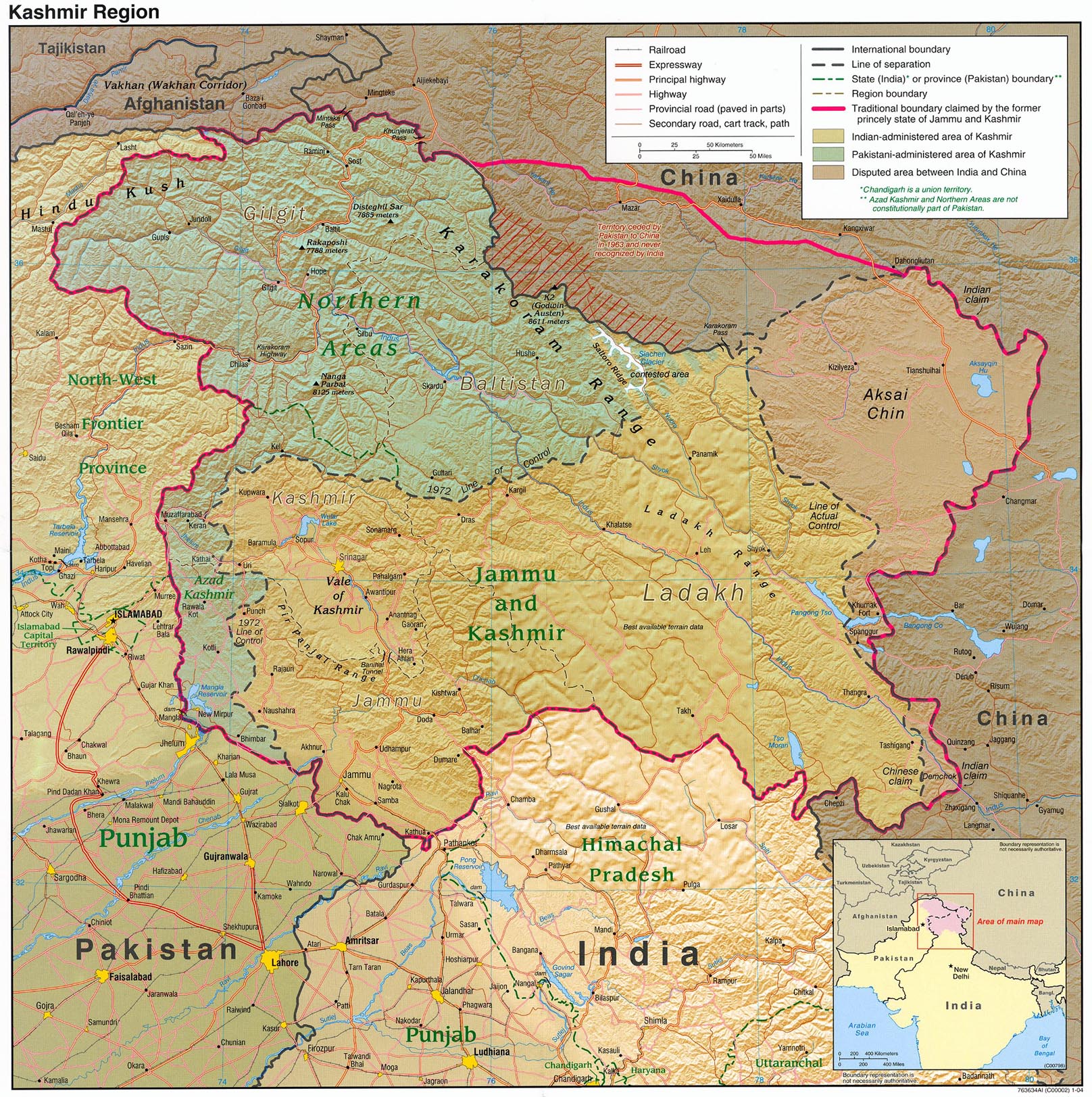
There are other types of lies that have more to do with navigating the complexities of international geopolitics. For instance, in many parts of the world, there are territories that are contested between two or more states. Depending on the political considerations of the mapmaker and the audience, regional maps may represent these territories very differently. Jammu & Kashmir is a territory in the northwestern region of South Asia along the borders of India, Pakistan, and China. Since the 1947 partition of British India created the contemporary states of India and Pakistan, the two countries have been engaged in a territorial dispute over the region. Jammu and Kashmir are geopolitically significant and are the source of the Indus River and its tributaries, which sustain India and Pakistan’s water supplies.
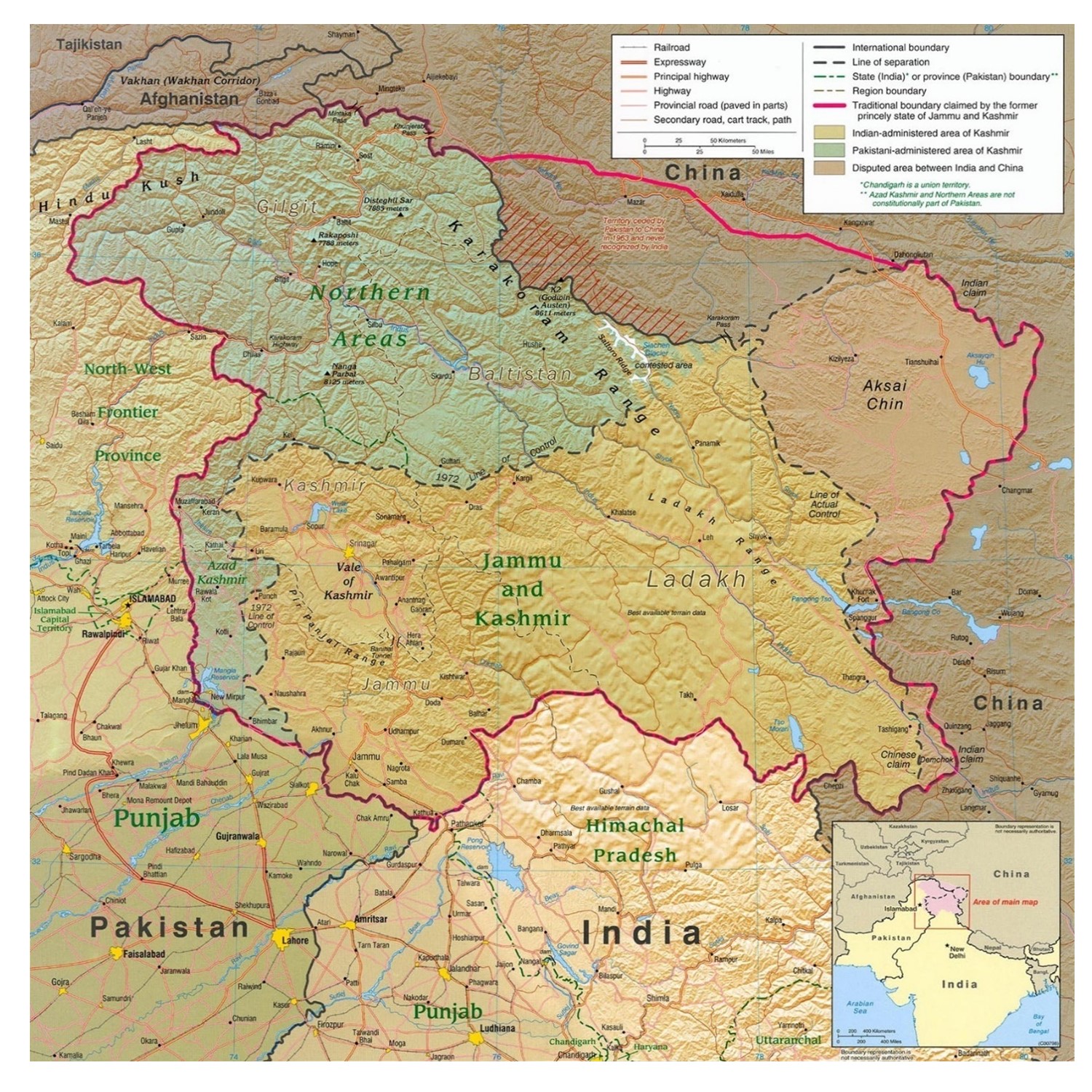 Situating Kashmir. Jammu & Kashmir is a territory in the northwestern region of South Asia along the borders of India, Pakistan, and China. [5]
India and Pakistan both claim Jammu and Kashmir. The figure below shows how Google Maps images of the region appear differently whether the search is conducted in the US (which considers the two states’ territorial claims on Jammu and Kashmir to be unsettled) or India (which reasserts its claim to Jammu and Kashmir in the map).
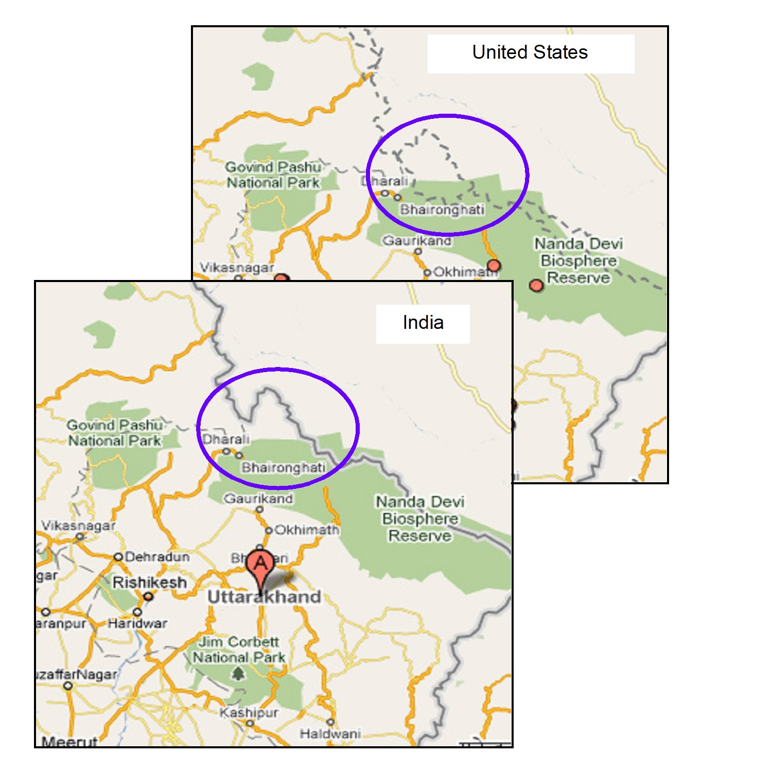 Contested Kashmir. Google Maps will show the contested Kashmir region differently depending on whether the user is in the United States or India.[6]
Different media organizations have also favored different representations of Jammu and Kashmir, as seen below.
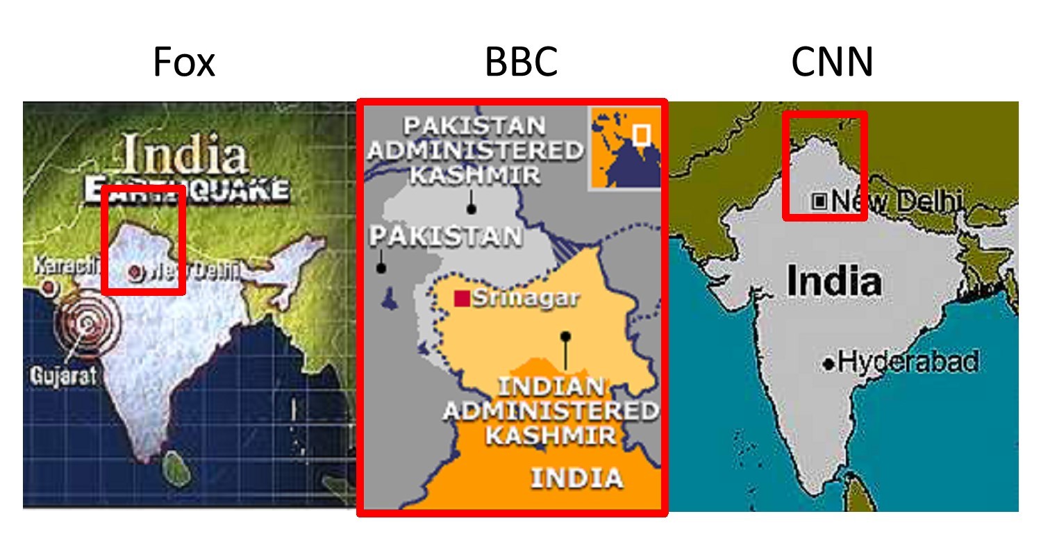 Kashmir in the news. Competing media representations of Kashmir. Different media organizations favor different representations of Jammu and Kashmir. [7]
5.2.3 Commercial Lies: Advertising
In 2009, AT&T filed a lawsuit in federal court against Verizon. The complaint? AT&T alleged that a Verizon ad campaign featuring coverage maps of each carriers’ 3G cellular data service misrepresented the actual reach of AT&T’s wireless service and misled customers. AT&T sued Verizon over a “lying map.” AT&T was concerned that the map would make customers think that its entire wireless network was reflected in the spotty map below, while Verizon contended that the map accurately reflected the differences between the two carriers’ 3G networks. AT&T dropped the suit about a month after it was filed, but it raises some important questions about lying maps in advertising.
 Lying competition. AT&T alleged that a Verizon ad campaign “There’s a Map for That” featured coverage maps of each carrier’s cellular data service that misrepresented the actual reach of AT&T’s wireless service and misled customers. [8]
For mobile service providers, maps that demonstrate extensive coverage are becoming increasingly important as companies like Verizon and AT&T compete for larger shares of the marketplace. However, many consumers have expressed frustration over what they perceive as inaccurate coverage maps in the advertising materials of mobile phone service providers. In recent years, a number of apps and websites have popped up to crowd-source mobile phone coverage data across the US and paint a more accurate picture of mobile network coverage. The figure below shows a crowd-sourced map from one such site, OpenSignal.com.
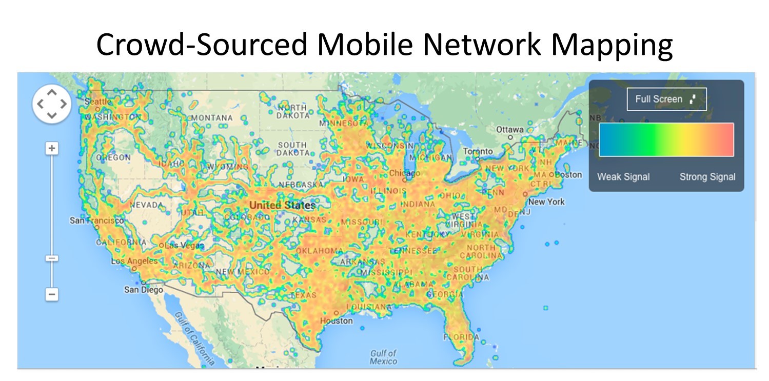 Open mapping. This crowd-sourced mobile network coverage map from OpenSignal.com is arguably less biased than those offered by companies because firms have a vested interest in making their product seem better than competing offerings. [9]
- Public domain. By Elkanah Tisdale (1771-1835) Originally published in the Boston Centinel, 1812. https://commons.wikimedia.org/w/index.php?curid=6030613 ↵
- CC BY-SA 4.0. Adapted from Steven Nass - https://commons.wikimedia.org/wiki/File:How_to_Steal_an_Election_-_Gerrymandering.svg, https://commons.wikimedia.org/w/index.php?curid=60129008 ↵
- Public domain. Adapted from nationalatlas.gov. Accessed 2013. ↵
- CC BY-NC-SA 4.0. Sara Nelson and Steven Manson 2015 ↵
- Public domain. CIA and U of Texas http://www.lib.utexas.edu/maps/middle_east_and_asia/kashmir_region_2004.jpg, https://commons.wikimedia.org/w/index.php?curid=618641 ↵
- CC BY-NC-SA 4.0. Sara Nelson and Steven Manson 2015 ↵
- Fair use. Steven Manson 2015 Maps from bbc.com, foxnews.com, cnn.com ↵
- Fair use. Steven Manson 2015 ↵
- CC BY-NC-SA 4.0. Steven Manson 2015 ↵
To achieve a result by manipulating the boundaries of an electoral constituency.
