
4.3 Map Examples
These images are two examples of maps: one with good structure, and one with poor structure.
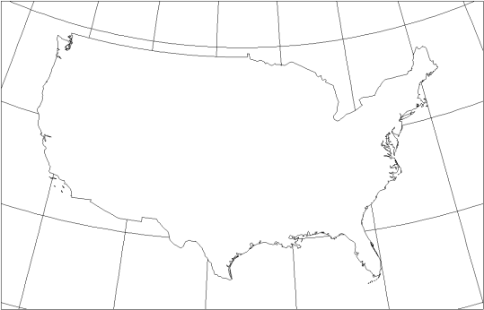
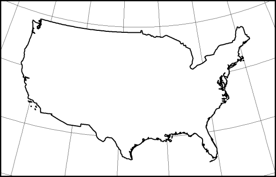
Things that change between these two maps are the line thickness of the outline of the United States of America. Basically by increasing the line weight of the national outline, the map now has a strong visual contrast between the focus features in the background features and thus a good structure.
We can also modify texture to achieve contrast. Texture contrast is typically used more with grayscale mapping to show differences whereas on a color map texture is used less because color is typically a more attractive option. One thing to be careful about when considering use of texture to show contrast is that texture can be visually irritating to the eye and may confuse the readers.
We can also use value to create contrast. Brighter areas on map tend to attract the eye more than dark areas; therefore, brighter areas are considered to be more interesting and are placed towards the top of the visual hierarchy.
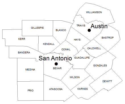
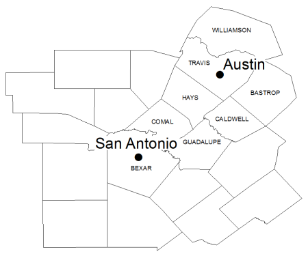
Another method to show contrast is to vary the amount of detail on the map. Reader’s eyes are naturally attracted areas of a map of the most amount of detail. Therefore, we want the reader to focus on an area of the map which can be done when you increase the amount of detail and remove detail in unimportant areas.
Here is an example of how the variation of detail on a map provides a visual hierarchy. In Figure 4.36 all counties surrounding San Antonio and Austin are labeled which does not allow the eye to focus in any one particular area. In Figure 4.37, only the counties that are between San Antonio and Austin and around Austin are labeled which allows our eyes to focus on the northeast corner of the map and the other counties that are not labeled to fall into the background and be considered less important for the purposes of this map.
Finally, we can vary the color of features to create contrast. By changing the color, or hue, of the feature, it allows us to differentiate between the features and kinds of features. If we have multiple features that are of the same kind, but have a different value, you can use a single hue, but change the value for that hue to represent different quantities.
Hierarchical Organization
Visual hierarchy is the intellectual plan for the map and the eventual graphic solution that satisfies the plan. In this section you will learn about strategies for planning and executing a visual hierarchy format.
Customary Positions in Hierarchy
When planning the hierarchy for your map design, there are some customary positions we may want to consider adopting. Assume that a map has five visual levels, visual level one being at the top of the visual hierarchy and immediately viewable and visual level five being de-emphasized, something map user may have to search for briefly.
On visual level one, first and foremost, the map reader should immediately see the thematic symbols that create the map. Next, the map reader should easily see the title, legend, other symbols on a map, and labels on the map. On level two of a visual hierarchy, the user should become aware of the base map which may include land areas, and water features. In level three of the visual hierarchy, the map user should see the scale, graticule, inset map, and North arrow.
These items are important to the overall map layout; however, they are considered aids for the map that the map reader will rely on only when they need them so they do not need to be readily apparent. On visual level four we see the metadata which is typically de-emphasized, the smallest text on a map, and which are is placed along the bottom edge. Finally, on level five is the neat line. With the neat line it is extremely important to help focus the reader to the center of the map. The neat line itself should not draw any attention.
|
Visual Level |
Object |
|
1 |
Thematic Symbols |
|
1 |
Title, legend, symbols, and labels |
|
2 |
Base map – land areas: political and physical |
|
2 |
Base map – water features |
|
3 |
Scale, graticule, inset map, north arrow |
|
4 |
Metadata |
|
5 |
Neatline |
Symbols
It is important to note that symbols on the thematic map are almost always at the top rank in the visual hierarchy. Even the enumeration units in which the symbols’ data are aggregated to should take a lower rank than the thematic symbols themselves.
Figures and Grounds
An important concept in visual hierarchy is the concept of figures and grounds. When we design a map we design elements on the map into two categories: category one is for the figures of the map and category two is for the grounds. Figures are items that have “thing” qualities and are important to the map.
Figures should have solid lines and bright colors to attract attention. Grounds should be formless and lost in perception when the map reader is viewing the figures. Grounds are typically considered the background or supporting figures on the map. Ground should have gray or pastel colors and weaker lines. Grounds are considered to be unbroken behind the figure so there is no need to make the figure semitransparent so the map reader can see the grounds unless the ground is significantly obscured by the figures.
Figure and Ground example
In Figure 4.38 there is a strong figure, ground relationship. The United States has a strong outline that allows the eye to focus on the country. The graticule is considered to be the ground, has weaker lines, and is interrupted by the United States polygon, but the map reader can assume that the graticule continues uninterrupted by the figure.
How to Achieve Visual Hierarchy
To achieve a visual hierarchy you can employ perceptual grouping. In a perceptual group the viewer spontaneously combines elements that share similar properties. Elements can be grouped by shape or by size. In this example you will most likely consider the group of the three triangles together and the three circles together as two separate things.

The large circles will naturally be grouped together as will the medium and small circles since they all share the same size properties.

In addition to perceptual grouping by shape or size, users tend to group elements together based on proximity. For example, without explicitly stating so, they saw the proximity of the circles to each other, three groups of circles are perceived here.

Figure Closure
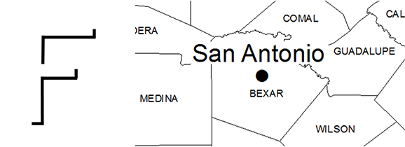
Another concept related to visual hierarchy is figure closure. Figure closure is the tendency for the viewer to complete unfinished objects or objects that may be obscured by other elements. For example, in Figure 4.42 the left image includes a portion of the letter F, but we naturally will complete the outline of the letter F even though it is not drawn. In Figure 4.42, the image on the right is illustrates how the San Antonio label obscures multiple segments of outlines for multiple counties. We will assume that the county outlines exist beneath the label and will consider those items to be closed.
Strong Edges
Now consider the edge of objects and how they relate to visual hierarchy. Crisp edges help to define an object as a figure and visually set it apart from other objects. Reducing the edge definition of an object weakens it. Edges result from a contrast of brightness, texture, or line type.
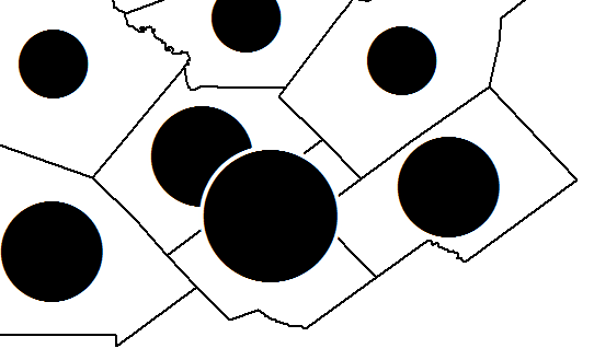
In Figure 4.43, the counties are well-defined as they have solid, strong edges. The circles are also well-defined as they have crisp edges. Where the two circles overlap in the center, the larger circle has been given a white edge so that it is visually distinct from the circle and county outlines that lie underneath.
Interposition
The next topic in visual hierarchy is interposition. Interposition is the interrupting of the edge of one object with another object that causes the object to appear on top and closer to the viewer. If you do overlap two objects, be careful to not overlap the two objects too much especially with quantitative data. The rule of thumb is that there should be no more than 1/3 overlap between the objects.
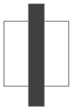
To illustrate this point consider these two interposition examples. In Figure 4.44, the northernmost square is overlapping the southernmost square. As the northernmost square is complete and the southernmost square is being interrupted, we visually perceive the northernmost square as closer to us in the southernmost square as further away. In Figure 4.45, the black bar is obscuring the white box. Because of this, the black bars perceived to be closer to us.

Water
Water plays an important part in establishing a visual hierarchy. Water provides significant geographic clues as to where landmasses begin and end and also often serve to be the base for all other objects in the map. On thematic maps it is commonplace to leave the water off of the map. We shall include water on a map if it is important to the thematic variable. This also goes for other general reference features such as roads, locations of towns, or locations of parks for example.
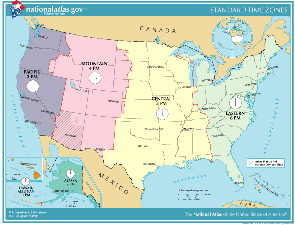
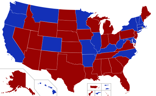
Here we see a thematic map. Figure 4.46 is the Standard Time Zones map which includes water. The waters considered a ground on this map and serves to punctuate the location of landmasses. Figure 4.47 shows election results by state but without water. Water is not included on this map because it is not an important indicator for election results.
Example Map Critique
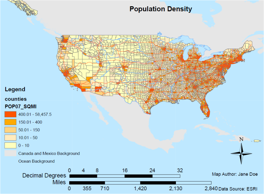
This is a map that may be considered typical for someone who is new at making maps. Some of the undesirable characteristics of the map result from the map author choosing not to alter the default behavior of the mapping software. Other issues with the map are probably due to the map author not knowing any better. In either case look at the map and determine how the map design could be improved. As the title is often the first thing a map user reads, and provides a concise description of the map, you can examine that first.
Map Title
The map is simply current entitled population density, map title. While at its core the map is about population density, the title is still fairly vague. It does not answer the question of when the population was that dense, and why we are only seeing the lower 48 states of United States. Why were Alaska and Hawaii left off the map? Additionally the title is slightly off center. It would be much better if the title was centered on the top of the page.
North Arrow
Now take a look at the North arrow. The North Arrow is way too large for this map. Remember that items should be sized relative to their importance. The North arrow is not so important for this map that it needs to stand out that much. Additionally, assuming that the audience for this map would be Americans, the North arrow might not even be necessary since Americans are used to seeing United States, and having north be up on a map, making the north arrow redundant. If the North arrow is to be left on this map, it should be made considerably smaller, and placed out-of-the-way.
Metadata
If you look right below the North arrow you have the metadata showing the map author and the data source. There are two problems here. One, the text is too large. Map readers will look for the metadata if they want to see it, but it should not jump out this much. The font size should be reduced for the metadata. For the data source, ‘ESRI’ is not very descriptive. It doesn’t tell us what year the data set was created, and a majority of map users would not be able to track down the original data source simply by ‘ESRI’.
Scale Bars
The next elements to consider are the scale bars. The scale bars have multiple problems. First, one of the scale bars represents the distance in decimal degrees. Decimal degrees are not a useful unit to measure distances on a map. Second the divisions and end points of the scale bars are not in meaningful, easy-to-use numbers. Instead of 0 to 32, why not 0 to 30? Instead of 0 to 2,840, why not 0 to 3,000? Using round numbers on your scale bars, make it easy for the map reader to scale distances. Third the scale bars are too wide. The scale bars could easily be one third their width and be just as useful, and not so visually dominate the map. Remember the scale bars in this map are not that important and should be deemphasized so as to not attract the eye from the map body. The last problem is that the scale bars are too tall. Again, having scale bars that large detract from the map too much. The scale bars are emphasized too much.
Legend
As a matter of style, you should not title the legend with the word legend. Map readers know that this is the legend, and you could use that space better by replacing it with a descriptive title for the legend. One exception would be for, say, elementary school children who are not familiar with the components of a map yet and therefore need this instruction about what a legend is and looks like. Next the description of the population density data is not well formed and provides the column name from the attribute table which is not useful to the map reader. Instead of the word counties, and POP07_SQMI, a more appropriate legend title would be ‘Persons per square mile’. Looking at the numbers to the right of each patch in the legend, it is not consistent with the number of decimal places.
For instance, the bottom entry has no decimal places and is simply the entry 0 – 10. The next three entries above it have two decimal places for the lower number and no decimal places for the higher number, while the top entry has two decimal places for the lower number, and one decimal place for the higher number. Since we are talking about persons, we should round to the nearest whole person. The bottom two entries referring to Canada and Mexico background, and the ocean background, are not required for this legend, as the water and surrounding countries features aren’t unfamiliar for the map reader, and therefore, do not need to be placed on the legend. Additionally, the symbol for the ocean background on the legend blends in with the actual ocean background behind it, therefore, making it look like there is no legend entry for the ocean background.
Overall Map
Now you can look at the map itself. The United States is slightly off center and could be made quite a bit larger to fill the page. There is quite a bit of white space above and below the main feature of the map, which is considered wasteful. Additionally only the Southern tail of Alaska is shown on the map which looks sloppy and makes the map reader wonder why only a portion of Alaska was shown. By enlarging the contiguous United States the tail of Alaska would not be shown.
If we consider the features included on the map, we have county outlines, roads, and rivers. The question becomes: “Are roads and rivers really necessary to show a map of population density?” Perhaps the roads, and/or rivers should be left off the map so that it is less cluttered and simpler to read. Additionally, the color of the roads is very close to the color of the most densely populated area, which makes it hard to see exactly what is going on in the counties underneath the roads, and smaller counties may be completely covered by road lines, therefore making it look like a county is densely populated when it is not. Moving to the map projection, it’s clear that this map is not any particular projection based on the flatness of the northern boundary line of the United States.
As the data that we are showing is based off of population per square mile, an equal area projection should be applied to this map as relative size is important when determining how dense counties are. Another thing to note about the map is that although Canada and Mexico are included, South America is not. If you’re going to include surrounding countries, you need to include all of the surrounding countries that my show up on the map. Lastly, there is no neat line surrounding the map. In order to provide a nice frame for the map, and to have it stand out against its surroundings, a neat line should be included.
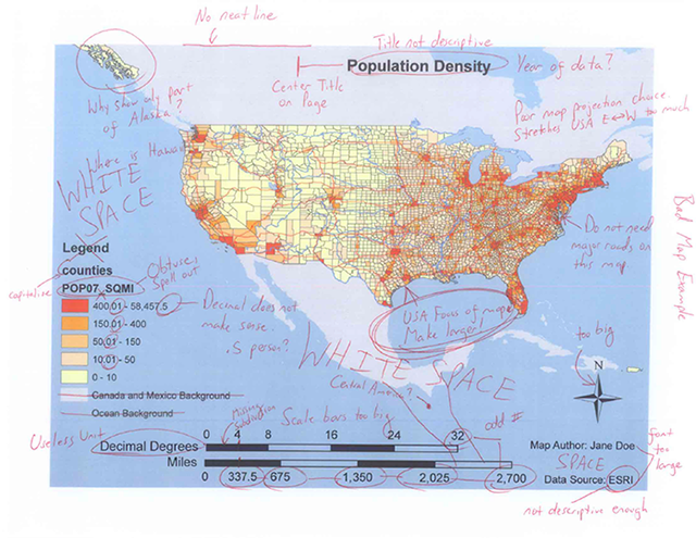
Issues Highlighted
Figure 4.49 is the same map with all the issues highlighted. As you can see what may initially look like an ‘OK’ map really has many problems.
Redesigned Map
Figure 4.50 is a redesign of the map.
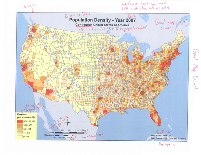
This redesign took about five minutes of time, made the map significantly more attractive, and useful. Consider the following updates that were made.
- Note that the title is much more descriptive. It states that it is the population density for the year 2007, and specifically notes that it is for the contiguous United States of America which lets the map reader know that Alaska and Hawaii are purposely excluded from the map.
- The projection is changed to an equal area projection that allows for the map reader to make proper areal comparisons between counties.
- The roads have also been taken off the map which allows for the counties to be the main focus of the map and not be obscured.
- The scale bars have been greatly reduced in size and are using round numbers in meaningful units.
- The North arrow has been greatly reduced in size and placed in a better location.
- The metadata is more descriptive and is a good size.
- The legend has been reduced in size has been given a descriptive title, and the numbers are now consistent with respect to the number of decimal places and included around the map is a nice frame.
Even with this redesign one could argue there are still a few issues. For instance, the metadata is placed on top of some background data which makes it a little difficult to read. Additionally, the scale bars are half on and half off of Mexico and rivers are still included on the map, which might be a feature that is not required. However with just a little extra work and careful consideration the map has gone from a very poorly designed map that was hard to read, not pleasing to the eye, to a well-designed map that is much easier to read and is pleasing to the eye. Remember, map design is an iterative process, so do not be afraid to radically redesign your map a few times to see how you might improve it. Also show your map to a friend, family member, or colleague and get feedback. Even though they may not be trained in cartography people can often easily identify an ugly map, and might provide an important perspective on your map design.
The state of being strikingly different from something else in juxtaposition or close association.
The compactness of the marks that make up the symbol; also referred to as spacing.
The amount of white or black and is often synonymous with contrast.
The dominant wavelength or color associated with a reflecting object.
The intellectual plan for the map and the eventual graphic solution that satisfies the plan.
A map of small scale used for general planning purposes.
Items that have “thing” qualities and are important to the map.
The background or supporting figures on the map.
In a perceptual group the viewer spontaneously combines elements that share similar properties; elements can be grouped by shape or by size.
The tendency for the viewer to complete unfinished objects or objects that may be obscured by other elements.
Thick drawn edges that help define an object as a figure.
The interrupting of the edge of one object with another object that causes the object to appear on top and closer to the viewer.
Gives the reader geographic references to help recognize landmasses.
A title for the map to be called, and relates to the data being shown.
An arrow on a map telling the reader which way is north.
Purpose is to cite the source of data sets used to create the map. Can contain the map author’s information, such as their name, and contact information; should also include the date the map was created and other explanatory information about the creation of the map such as the map projection used.
A bar representing a certain distance on the map; often divided at meaningful intervals to assist the map reader in measuring.
Provides users with information about how geographic information is represented graphically. Usually consist of a title that describes the map, as well as a clear definition of various symbols, colors, and patterns that are used on the map.
