
3 Chapter 3: Describing Data using Distributions and Graphs
Using Visuals to Understand Data
Statistics that are used to organize and summarize the information so that the researcher can see what happened during the research study and can also communicate the results to others are called descriptive statistics. Let us assume that the data are quantitative and consist of scores on one or more variables for each of several study participants. Although in most cases the primary research question will be about one or more statistical relationships between variables, it is also important to describe each variable individually. We will look at some of the most common techniques for describing single variables including:
- Frequency distributions
- Measures of Central Tendency
- Measures of Dispersion
The first step in understanding data is using tables, charts, graphs, plots, and other visual tools to see what our data look like. This is known as data visualization.
We will begin with frequency distributions which are visual representations and include tables and graphs. We will conclude with some tips for making graphs some principles for good data visualization!
Data Visualization
On January 28, 1986, the Space Shuttle Challenger exploded 73 seconds after takeoff, killing all 7 of the astronauts on board. As when any such disaster occurs, there was an official investigation into the cause of the accident, which found that an O-ring connecting two sections of the solid rocket booster leaked, resulting in failure of the joint and explosion of the large liquid fuel tank (see figure 1).
![An image of the solid rocket booster leaking fuel, seconds before the explosion. The small flame visible on the side of the rocket is the site of the O-ring failure. By NASA (Great Images in NASA Description) [Public domain], via Wikimedia Commons](https://open.maricopa.edu/app/uploads/sites/199/2021/06/file9.jpg) Figure 1: An image of the solid rocket booster leaking fuel, seconds before the explosion. The small flame visible on the side of the rocket is the site of the O-ring failure. By NASA (Great Images in NASA Description) [Public domain], via Wikimedia Commons[/footnote]
Figure 1: An image of the solid rocket booster leaking fuel, seconds before the explosion. The small flame visible on the side of the rocket is the site of the O-ring failure. By NASA (Great Images in NASA Description) [Public domain], via Wikimedia Commons[/footnote]
The investigation found that many aspects of the NASA decision-making process were flawed, and focused in particular on a meeting between NASA staff and engineers from Morton Thiokol, a contractor who built the solid rocket boosters. These engineers were particularly concerned because the temperatures were forecast to be very cold on the morning of the launch, and they had data from previous launches showing that performance of the O-rings was compromised at lower temperatures. In a meeting on the evening before the launch, the engineers presented their data to the NASA managers, but were unable to convince them to postpone the launch. Their evidence was a set of hand-written slides showing numbers from various past launches.
The visualization expert Edward Tufte has argued that with a proper presentation of all of the data, the engineers could have been much more persuasive. In particular, they could have shown a figure like the one in Figure 2, which highlights two important facts. First, it shows that the amount of O-ring damage (defined by the amount of erosion and soot found outside the rings after the solid rocket boosters were retrieved from the ocean in previous flights) was closely related to the temperature at takeoff. Second, it shows that the range of forecasted temperatures for the morning of January 28 (shown in the shaded area) was well outside of the range of all previous launches. While we can’t know for sure, it seems at least plausible that this could have been more persuasive.

Figure 2: A replotting of Tufte’s damage index data. The line shows the trend in the data, and the shaded patch shows the projected temperatures for the morning of the launch. (Source)
Graphing Qualitative & Quantitative Variables
We’ll learn some general lessons about how to graph data that fall into a small number of categories. A later section will consider how to graph numerical data in which each observation is represented by a number in some range. Qualitative variables can be summarized by frequency (how often) and researchers can then use frequency tables and bar charts to show frequencies for categorized responses, but we are limited in graphing them due to the data not be numerically based. The key point about the qualitative data is they do not come with a pre-established ordering (the way numbers are ordered).
We are focused on quantitative variables. Quantitative data, such as a person’s weight, are naturally ordered with respect to people of different weights. Often we wish to know if there are any scores that might look a bit out of place. A frequency distribution is a way to take a disorganized set of scores and places them in order from highest to lowest and at the same time grouping everyone with the same score. Frequency distributions can help researchers identify outliers. An outlier is an observation of data that does not fit the rest of the data. An outlier is sometimes called an extreme value. When you graph an outlier, it will appear not to fit the pattern of the graph. Some outliers are due to mistakes (for example, writing down 50 instead of 500) while others may indicate that something unusual is happening.
Frequency Tables
All of the graphical methods shown in this section are derived from frequency tables. Table 1 shows a frequency table for the results of a study on students’ preferred ways of celebrating cultural events. It displays the frequencies of the various response categories. It also shows the relative frequencies, which are the proportion of responses in each category. For example, the relative frequency for “Attending community festivals” of 0.28 = 140/500.
|
Preferences for Cultural Gatherings |
Frequency |
Relative Frequency |
|
Attending community festivals |
140 |
0.28 |
|
Hosting family gathering |
160 |
0.32 |
|
Participating in online event |
100 |
.20 |
|
Volunteering |
100 |
0.20 |
|
Total |
500 |
1 |
Table 1. Frequency Table for Preferences for Cultural Gatherings
Below is a table (Table 2) showing a hypothetical distribution of scores on the Rosenberg Self-Esteem Scale for a sample of 40 college students. The Rosenburg Self-Esteem Scale is one way to operationalize (define) self-esteem in a quantitative way. Participants rate each of the 10-items from strongly disagree to strongly agree. All items are then scored yielding an overall self-esteem score that would be a numerical value to represent one’s self-esteem.
- Column one lists the values of the variable – the possible scores on the Rosenberg scale
- Column two lists the frequency of each score
| Self-Esteem Scores | Frequency |
| 24 | 3 |
| 23 | 5 |
| 22 | 10 |
| 21 | 8 |
| 20 | 5 |
| 19 | 3 |
| 18 | 3 |
| 17 | 0 |
| 16 | 2 |
| 15 | 1 |
Table 2. Frequency Table for Rosenburg Self-Esteem Scale Scores.
Table 2 shows that there were three students who had self-esteem scores of 24, five who had self-esteem scores of 23, and so on. From a frequency table like this, one can quickly see several important aspects of a distribution, including the range of scores (from 15 to 24), the most and least common scores (22 and 17, respectively), and any extreme scores that stand out from the rest.
Considerations
There are a few other points worth noting about frequency tables. First, the levels listed in the first column usually go from the highest at the top to the lowest at the bottom, and they usually do not extend beyond the highest and lowest scores in the data. For example, although scores on the Rosenberg scale can vary from a high of 30 to a low of 0 only includes levels from 24 to 15 because that range includes all the scores in this particular data set. All scores within the data set must be presented. For example, no one received a score of 17 on the Rosenberg Self-esteem scale; it is still represented in the table.
Additionally, when there are many different scores across a wide range of values, it is often better to create a grouped frequency table, in which the first column lists ranges of values and the second column lists the frequency of scores in each range. In a grouped frequency table, the ranges must all be of equal width, and there are usually between five and 15 of them. Finally, frequency tables can also be used for categorical variables, in which case the levels are category labels. The order of the category labels is somewhat arbitrary, but they are often listed from the most frequent at the top to the least frequent at the bottom. Table 3 shows an example for majors where majors is a categorical (nominal) variable.
| Majors | Frequency |
| Business | 30 |
| Psychology | 50 |
| Nursing | 102 |
| Nutritional Sciences | 10 |
| Communications | 5 |
| English | 3 |
| Computer Science | 13 |
Graphs
A statistical graph is a tool that helps you learn about the shape or distribution of a sample or a population. A graph can be a more effective way of presenting data than a mass of numbers because we can see where data clusters and where there are only a few data values. Statisticians often graph data first to get a picture of the data; then, more formal tools may be applied.
Some of the types of graphs that are used to summarize and organize quantitative data are the dot plot, the bar graph, the histogram, the stem-and-leaf plot, the frequency polygon (a type of broken line graph), the pie chart, and the box plot. In this lesson, we will briefly look at bar graphs, histograms, and frequency polygons.
Bar charts
Bar charts can also be used to represent frequencies of different categories. Bar charts may be appropriate for qualitative data (categorical variables) that use a nominal or ordinal scale of measurement. A bar chart of the preferences for cultural gatherings (same data from table 1) is shown in Figure 2. Frequencies are shown on the Y- axis and the preference categories are shown on the X-axis. Typically, the Y-axis shows the number of observations in each category (rather than the percentage of observations in each category as is typical in pie charts).
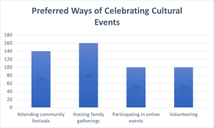
Figure 2. Bar chart of preferences for cultural gatherings
Often we need to compare the results of different surveys, or of different conditions within the same overall survey. In this case, we are comparing the “distributions” of responses between the surveys or conditions. Bar charts are often excellent for illustrating differences between two distributions. Figure 3 shows the number of players participating in popular online games on Wednesday and Sunday in 2024. The data reveals interesting patterns in gaming behavior between weekdays and weekends. Fortnite emerges as the most popular game, with approximately 35,000 players on Sunday and 30,000 on Wednesday. This higher weekend participation is consistent across all games in the dataset. The visualization makes it easy to compare participation rates across different games and days, similar to how the original card game example demonstrated player preferences. This modern example reflects current gaming trends while maintaining the same clear comparative structure of the original visualization.
Comparing Distributions
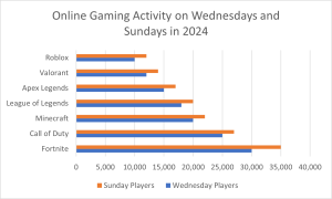
Figure 3. A bar chart of the number of number of players participating in popular online games on Wednesday and Sunday in 2024.
The bars in Figure 3 are oriented horizontally rather than vertically. The horizontal format is useful when you have many categories because there is more room for the category labels. We’ll have more to say about bar charts when we consider numerical quantities later in this chapter.
Some graphical mistakes to avoid with bar charts
Don’t get fancy! People sometimes add features to graphs that don’t help to convey their information. See the examples below as things not to do! Three-dimensional figures are less clear than 2-d. Further, don’t get creative as show below! Use plain bars, as tempting as it is to substitute meaningful images. The MacIntosh is out of proportion to the None and Windows categories. Edward Tufte coined the term “lie factor” to refer to the ratio of the size of the effect shown in a graph to the size of the effect shown in the data. If a graphic has a lie factor near 1, then it is appropriately representing the data, whereas lie factors far from one reflect a distortion of the underlying data. The computer monitor bar figure has a lie factor of about 8! He suggests that lie factors greater than 1.05 or less than 0.95 produce unacceptable distortion-so just keep it simple with plain bars!
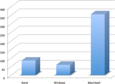
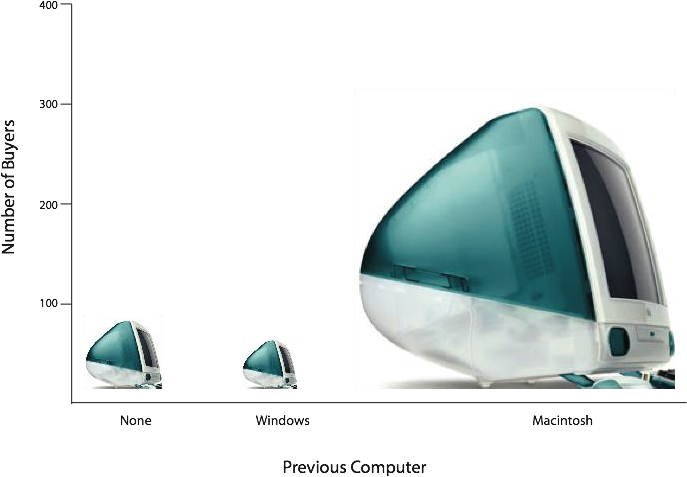
Figures 4 & 5. A three-dimensional version of Figure 2 and a redrawing of Figure 2 with disproportionate bars.
Here is another example, Figure 3.6 (created using Microsoft Excel) plots the relative popularity of different religions in the United States. There are at least three things wrong with this figure -can you identify them?
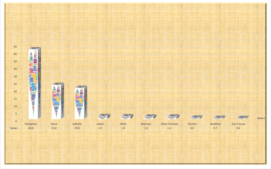
Figure 6. A bad chart graph
Did you figure it what is wrong?
- it has graphics overlaid on each of the bars that have nothing to do with the actual data
- it has a distracting background texture
- it uses three-dimensional bars, which distort the data
Another distortion in bar charts results from setting the baseline to a value other than zero. The baseline is the bottom of the Y-axis, representing the least number of cases that could have occurred in a category. Normally, but not always, this number should be zero.
Finally, we note that it is a serious mistake to use a line graph when the X-axis contains merely qualitative (or categorical) variables. A line graph is essentially a bar graph with the tops of the bars represented by points joined by lines (the rest of the bar is suppressed). Figure 7 inappropriately shows a line graph of the card game data from Yahoo. The drawback to Figure 7 is that it gives the false impression that the games are naturally ordered in a numerical way when, in fact, they are ordered alphabetically.
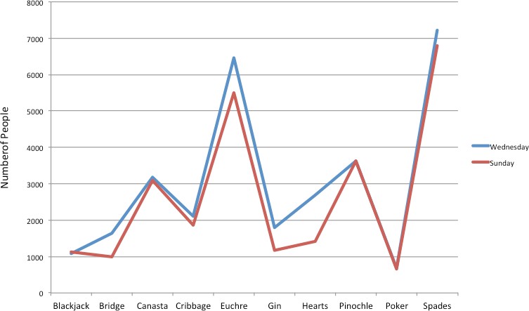
Figure 7. A line graph used inappropriately to depict the number of people playing different card games on Sunday and Wednesday.
Recap
Bar charts can be effective methods of portraying qualitative data. Bar charts are better when there are more than just a few categories and for comparing two or more distributions. Be careful to avoid creating misleading graphs.
Graphing Quantitative Variables
As discussed in the section on variables in Chapter 1, quantitative variables are variables measured on a numeric scale. Height, weight, response time, subjective rating of pain, temperature, and score on an exam are all examples of quantitative variables. Quantitative variables are distinguished from categorical (sometimes called qualitative) variables such as favorite color, religion, city of birth, favorite sport in which there is no ordering or measuring involved.
There are many types of graphs that can be used to portray distributions of quantitative variables. We already reviewed bar charts. The upcoming sections cover the following types of graphs: (1) histograms, (2) frequency polygons, (3) stem and leaf displays, (4) box plots, (5) more bar charts, (6) line graphs, and (7) scatter plots (discussed in a different chapter). Some graph types such as stem and leaf displays are best suited for small to moderate amounts of data, whereas others such as histograms are best- suited for large amounts of data. Graph types such as box plots are good at depicting differences between distributions. Scatter plots are used to show the relationship between two variables.
Histograms
A histogram is a graphic version of a frequency distribution. It helps to display the shape of a distribution. The graph consists of bars of equal width drawn adjacent to each other and has both a horizontal axis and a vertical axis. The horizontal axis (x-axis) is labeled with what the data represents (for instance, distance from your home to school). The vertical axis is labeled either frequency or relative frequency (or percent frequency or probability). The histogram shows the distribution of the values including the highest, middle, and lowest values.
Sometimes we need to group scores if the data has a large distribution. For example, if I wanted to create a frequency distribution of 642 students’ scores on a psychology test, that would be a big frequency table. For reference, the test consists of 197 items each graded as “correct” or “incorrect.” The students’ scores ranged from 46 to 167. A simple frequency table would be too big, containing over 100 rows. To simplify the table, we group scores together as shown in Table 4. A basic rule for grouping data is to make sure each group (or class) has the same grouping amount (in this example it is grouped in 10s), and to make sure you have the lowest category including your lowest value to make sure all scores are included.
|
Interval’s Lower Limit |
Interval’s Upper Limit |
Class Frequency |
|
39.5 |
49.5 |
3 |
|
49.5 |
59.5 |
10 |
|
59.5 |
69.5 |
53 |
|
69.5 |
79.5 |
107 |
|
79.5 |
89.5 |
147 |
|
89.5 |
99.5 |
130 |
|
99.5 |
109.5 |
78 |
|
109.5 |
119.5 |
59 |
|
119.5 |
129.5 |
36 |
|
129.5 |
139.5 |
11 |
|
139.5 |
149.5 |
6 |
|
149.5 |
159.5 |
1 |
|
159.5 |
169.5 |
1 |
Table 4. Grouped Frequency Distribution of Psychology Test Scores
In a histogram, the class intervals are represented by bars. The height of each bar corresponds to its class frequency. A histogram of these data is shown in Figure 9.
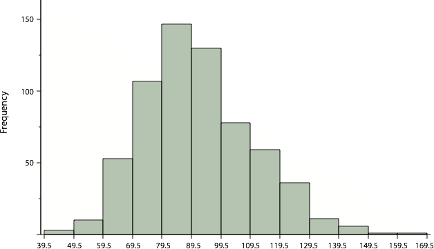
Figure 9. Histogram of scores on a psychology test.
There is more to be said about the widths of the class intervals, sometimes called bin widths. Your choice of bin width determines the number of class intervals. This decision, along with the choice of starting point for the first interval, affects the shape of the histogram. The best advice is to experiment with different choices of width, and to choose a histogram according to how well it communicates the shape of the distribution.
Frequency Polygons
Frequency polygons are a graphical device for understanding the shapes of distributions. They serve the same purpose as histograms, but are especially helpful for comparing sets of data. Frequency polygons are also a good choice for displaying cumulative frequency distributions.
A frequency polygon for 642 psychology test scores shown in Figure 12 was constructed from the frequency table shown in Table 5.
|
Lower Limit |
Upper Limit |
Count |
Cumulative Count |
|
29.5 |
39.5 |
0 |
0 |
|
39.5 |
49.5 |
3 |
3 |
|
49.5 |
59.5 |
10 |
13 |
|
59.5 |
69.5 |
53 |
66 |
|
69.5 |
79.5 |
107 |
173 |
|
79.5 |
89.5 |
147 |
320 |
|
89.5 |
99.5 |
130 |
450 |
|
99.5 |
109.5 |
78 |
528 |
|
109.5 |
119.5 |
59 |
587 |
|
119.5 |
129.5 |
36 |
623 |
|
129.5 |
139.5 |
11 |
634 |
|
139.5 |
149.5 |
6 |
640 |
|
149.5 |
159.5 |
1 |
641 |
|
159.5 |
169.5 |
1 |
642 |
|
169.5 |
170.5 |
0 |
642 |
Table 5. Frequency Distribution of Psychology Test Scores
You can easily discern the shape of the distribution from Figure 10. Most of the scores are between 65 and 115. It is clear that the distribution is not symmetric inasmuch as good scores (to the right) trail off more gradually than poor scores (to the left). We call this skew and we will study shapes of distributions more systematically later in this chapter.
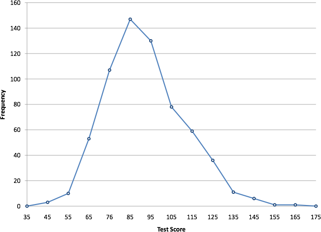
Figure 10. Frequency polygon for the psychology test scores.
A cumulative frequency polygon for the same test scores is shown in Figure 11. The graph is the same as before except that the Y value for each point is the number of students in the corresponding class interval plus all numbers in lower intervals. For example, there are no scores in the interval labeled “35,” three in the interval “45,” and 10 in the interval “55.” Therefore, the Y value corresponding to “55” is 13. Since 642 students took the test, the cumulative frequency for the last interval is 642.
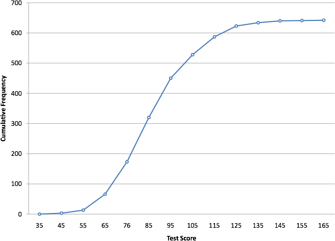
Figure 11. Cumulative frequency polygon for the psychology test scores.
Frequency polygons are useful for comparing distributions. This is achieved by overlaying the frequency polygons drawn for different data sets. Figure 12 provides an example. The data come from a task in which the goal is to move a computer cursor to a target on the screen as fast as possible. On 20 of the trials, the target was a small rectangle; on the other 20, the target was a large rectangle. Time to reach the target was recorded on each trial. The two distributions (one for each target) are plotted together in Figure 15. The figure shows that, although there is some overlap in times, it generally took longer to move the cursor to the small target than to the large one.
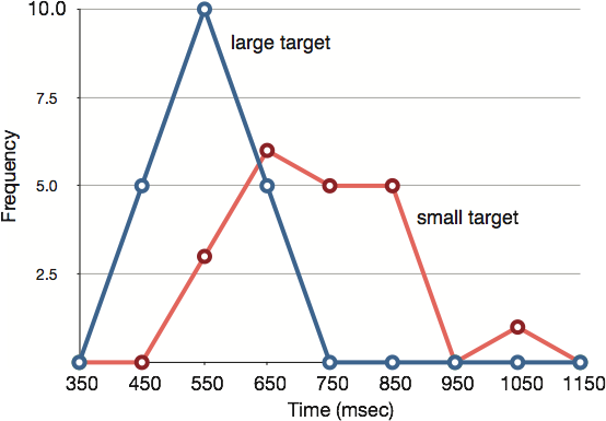
Figure 12. Overlaid frequency polygons.
It is also possible to plot two cumulative frequency distributions in the same graph. This is illustrated in Figure 13 using the same data from the cursor task. The difference in distributions for the two targets is again evident.
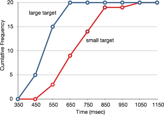
Figure 13. Overlaid cumulative frequency polygons.
Stem and Leaf
The stem-and-leaf graph or stemplot, comes from the field of exploratory data analysis. It is a good choice when the data sets are small. To create the plot, divide each observation of data into a stem and a leaf. The leaf consists of a final significant digit. For example, 23 has stem two and leaf three. Write the stems in a vertical line from smallest to largest. Draw a vertical line to the right of the stems. Then write the leaves in increasing order next to their corresponding stem.
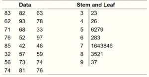
Figure 14. Stem and Leaf Plot
Box Plots
We have already discussed techniques for visually representing data (see histograms and frequency polygons). In this section, we present another important graph, called a box plot. Box plots are useful for identifying outliers (extreme scores) and for comparing distributions. We will explain box plots with the help of data from an in-class experiment. Students in Introductory Statistics were presented with a page containing 30 colored rectangles. Their task was to name the colors as quickly as possible. Their times (in seconds) were recorded. We’ll compare the scores for the 16 men and 31 women who participated in the experiment by making separate box plots for each gender. Such a display is said to involve parallel box plots.
Therefore, the bottom of each box is the 25th percentile, the top is the 75th percentile, and the line in the middle is the 50th percentile. The data for the women in our sample are shown in Table 6.
|
14, 15, 16, 16, 17, 17, 17, 17, 17, 18, 18, 18, 18, 18, 18, 19, 19, 19 |
|
20, 20, 20, 20, 20, 20, 21, 21, 22, 23, 24, 24, 29 |
Table 6. Women’s times.
For these data, the 25th percentile is 17, the 50th percentile is 19, and the 75th percentile is 20. For the men (whose data are not shown), the 25th percentile is 19, the 50th percentile is 22.5, and the 75th percentile is 25.5.
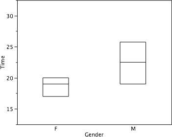
Figure 15. The first step in creating box plots is to identify appropriate quartiles.
Before proceeding, the terminology in Table 7 is helpful.
|
Name |
Formula |
Value from example |
|
Upper Hinge |
75th Percentile |
20 |
|
Lower Hinge |
25th Percentile |
17 |
|
H-Spread |
Upper Hinge – Lower Hinge |
3 |
|
Step |
1.5 x H-Spread |
4.5 |
|
Upper Adjacent |
Largest value below Upper Hinge + 1 Step |
24 |
|
Lower Adjacent |
Smallest value above Lower Hinge + 1 Step |
14 |
|
Outside value/Outlier |
Value beyond “whiskers” |
29 |
Table 7. Box plot terms and values for women’s times.
Continuing with the box plots, we put “whiskers” above and below each box to give additional information about the spread of data. Whiskers are vertical lines that end in a horizontal stroke. Whiskers are drawn from the upper and lower hinges to the upper and lower adjacent values (24 and 14 for the women’s data), as shown in Figure 16.
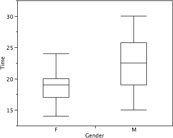
Figure 16. The box plots with the whiskers drawn.
Although whiskers may not cover all data points, we still wish to represent data outside whiskers in our box plots. This is achieved by adding additional marks beyond the whiskers. Specifically, outside values are indicated by small “o’s” and outlier values are indicated by asterisks (*). In our data, there are no far-out values and just one outside value. This outside value of 29 is for the women and is shown in Figure 17.
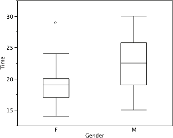
Figure 17. The box plots with the outside value shown.
There is one more mark to include in box plots (although sometimes it is omitted). We indicate the mean score for a group by inserting a plus sign. A mean is one type of average we will learn about calculating in the next chapter. Figure 18 shows the result of adding means to our box plots.
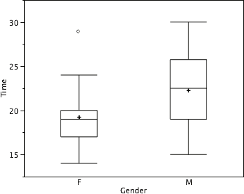
Figure 18. The completed box plots.
Figure 18 provides a revealing summary of the data. Since half the scores in a distribution are between the hinges (recall that the hinges are the 25th and 75th percentiles), we see that half the women’s times are between 17 and 20 seconds whereas half the men’s times are between 19 and 25.5 seconds. We also see that women generally named the colors faster than the men did, although one woman was slower than almost all of the men.
The Shape of Distribution
Finally, it is useful to present discussion on how we describe the shapes of distributions, which we will revisit in the next chapter to learn how different shapes affect our numerical descriptors of data and distributions.
The primary characteristic we are concerned about when assessing the shape of a distribution is whether the distribution is symmetrical or skewed. A symmetrical distribution, as the name suggests, can be cut down the center to form 2 mirror images. Although in practice we will never get a perfectly symmetrical distribution, we would like our data to be as close to symmetrical as possible for reasons we delve into in Chapter 3. Many types of distributions are symmetrical, but by far the most common and pertinent distribution at this point is the normal distribution, shown in Figure 19. Notice that although the symmetry is not perfect (for instance, the bar just to the right of the center is taller than the one just to the left), the two sides are roughly the same shape. The normal distribution has a single peak, known as the center, and two tails that extend out equally, forming what is known as a bell shape or bell curve.
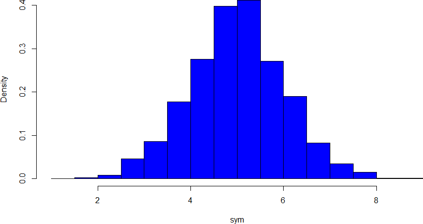
Figure 19. A symmetrical distribution
Symmetrical distributions can also have multiple peaks. Figure 20 shows a bimodal distribution, named for the two peaks that lie roughly symmetrically on either side of the center point. As we will see in the next chapter, this is not a particularly desirable characteristic of our data, and, worse, this is a relatively difficult characteristic to detect numerically. Thus, it is important to visualize your data before moving ahead with any formal analyses.
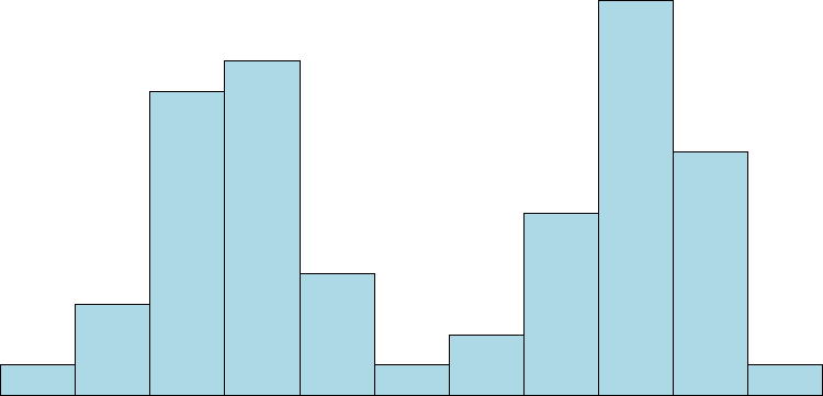
Figure 20. A bimodal distribution
Skew can either be positive or negative (also known as right or left, respectively), based on which tail is longer. It is very easy to get the two confused at first; many students want to describe the skew by where the bulk of the data (larger portion of the histogram, known as the body) is placed, but the correct determination is based on which tail is longer. You can think of the tail as an arrow: whichever direction the arrow is pointing is the direction of the skew. Figures 21 and 22 show positive (right) and negative (left) skew, respectively.
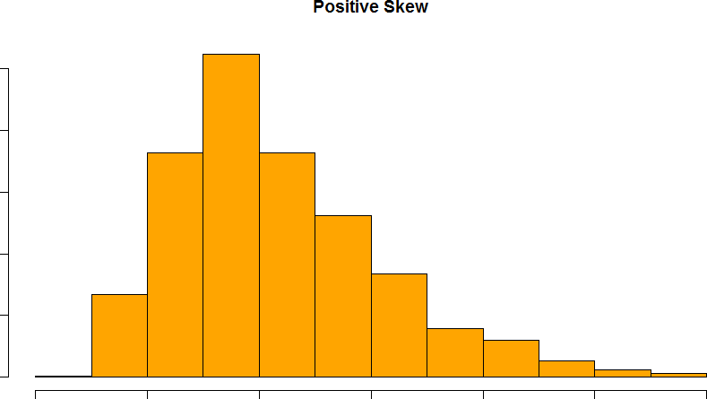
Figure 21. A positively skewed distribution
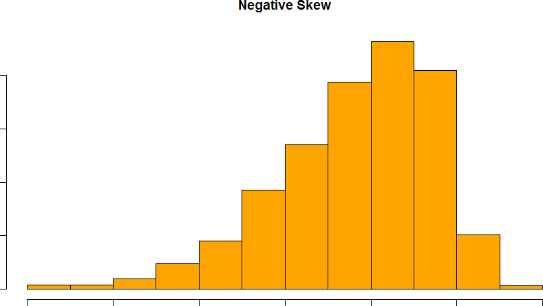
Figure 22. A negatively skewed distribution
A tip to remember skewness
Tip: Take a look down at your feet!
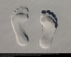
The left foot shows a negative skew (tail is pinky). The right foot is a positive skew.
Recap
Whether you are using a table or a graph the same two elements of frequency distribution must be present:
- the entire set of categories that make-up the original distribution must be included
- a record of the frequency, or number of individuals in each category within the distribution must be included
Examining our data graphically is useful and there are different choices in graphing depending on what is needed and the type of data you have. The scale of measurement determines the most appropriate graph to use. Bar charts are used to display qualitative data along a nominal or ordinal scale of measurement. Histograms, frequency polygons, stem and leaf plots, and box plots are most appropriate when using interval or ratio scales of measurement.
Box plots provide basic information about the distribution, examining data according to quartiles. By examining a box plot you are able to identify more about the distribution (see Figure X). For example, a distribution with a positive skew would have a longer box and whisker above the 50th percentile (median) in the positive direction than in the negative direction (middle boxplot in Figure 23). Box plots are good at portraying extreme values and are especially good at showing differences between distributions. However, many of the details of a distribution are not revealed in a box plot and to examine these details one should use create a histogram and/or a stem and leaf plot.
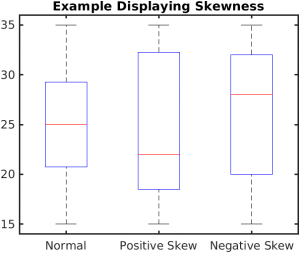
Figure 23. Examples of distributions in Box plots.
Graphing Beyond Frequency
In this section, we will briefly review some graphing techniques that extend beyond reporting frequencies.
Bar charts beyond frequency
In this section we show how bar charts can be used to present other kinds of quantitative information, not just frequency counts. The bar chart in Figure 24 shows streaming services price changes in the past year in 2024. The graph shows three positive bars for Netflix, Disney+, and Amazon, while HBO Max shows a decrease (negative bar) extending below the zero line. While Netflix, Disney+, and Amazon increased there was a decrease in subscribers for HBO Max. The negative percentage for HBO Max illustrates price reduction due to market competition and restructuring of their service tiers, making it an excellent example of how not all price changes trend upward.
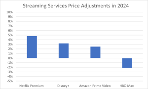
Figure 24. Percent change in price for streaming services in 2024
Bar charts are particularly effective for showing change over time. Figure 25, for example, shows the percent increase in the Consumer Price Index (CPI) over four three-month periods. The graph shows inflation was higher at the start of the year with a slowdown in price increases throughout the year.
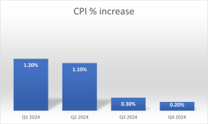
Figure 25. Percent change in the CPI over time (2024). Each bar represents a percent increase for the three months ending at the date indicated.
Bar charts are often used to compare the means of different experimental conditions. Figure 26 shows the mean time it took one of us (DL) to move the cursor to either a small target or a large target. On average, more time was required for small targets than for large ones.
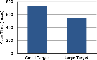
Figure 26. Bar chart showing the means for the two conditions.
Although bar charts can display means, we do not recommend them for this purpose. Box plots should be used instead since they provide more information than bar charts without taking up more space. For example, a box plot of the cursor-movement data is shown in Figure 27. You can see that Figure 27 reveals more about the distribution of movement times than does Figure 26.
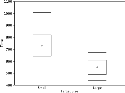
Figure 27. Box plots of times to move the cursor to the small and large targets.
Line Graphs Beyond Frequency
A line graph is a bar graph with the tops of the bars represented by points joined by lines (the rest of the bar is suppressed). For example, Figure 28 was presented in the section on bar charts and shows changes in the Consumer Price Index (CPI) over time in 2001.
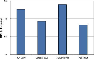
Figure 28. A bar chart of the percent change in the CPI over time. Each bar represents percent increase for the three months ending at the date indicated.
A line graph of these same data is shown in Figure 29. Although the figures are similar, the line graph emphasizes the change from period to period.
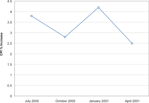
Figure 29. A line graph of the percent change in the CPI over time. Each point represents percent increase for the three months ending at the date indicated.
Line graphs are appropriate only when both the X- and Y-axes display ordered (rather than qualitative) variables. Although bar charts can also be used in this situation, line graphs are generally better at comparing changes over time. Figure 30, for example, shows percent increases and decreases in five components of the CPI. The figure makes it easy to see that medical costs had a steadier progression than the other components. Although you could create an analogous bar chart, its interpretation would not be as easy. Again, let us stress that it is misleading to use a line graph when the X-axis contains merely categorical variables.
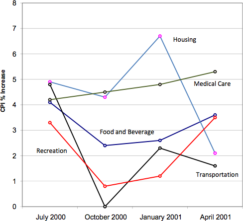
Figure 30. A line graph of the percent change in five components of the CPI over time for 2021
Beyond Frequencies: Which graph to use?
There are many different types of plots that we can use, which have different advantages and disadvantages. Let’s say that we are interested in characterizing the difference in height between men and women in the NHANES dataset. Figure 31 shows four different ways to plot these data.
- The bar graph in panel A shows the difference in means (a type of average), but doesn’t show us how much spread there is in the data around these means – and as we will see later, knowing this is essential to determine whether we think the difference between the groups is large enough to be important.
- The second plot shows the bars with all of the data points overlaid – this makes it a bit clearer that the distributions of height for men and women are overlapping, but it’s still hard to see due to the large number of data points.
In general we prefer using a plotting technique that provides a clearer view of the distribution of the data points.
- In panel C, we see one example of a violin plot, which plots the distribution of data in each condition (after smoothing it out a bit).
- Another option is the box plot shown in panel D, which shows the median (another type of average, central line), a measure of variability (the width of the box, which is based on a measure called the interquartile range), and any outliers (noted by the points at the ends of the lines). These are both effective ways to show data that provide a good feel for the distribution of the data.
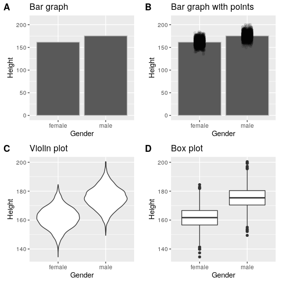
Figure 31: Four different ways of plotting the difference in height between men and women in the NHANES dataset. Panel A plots the means of the two groups, which gives no way to assess the relative overlap of the two distributions. Panel B shows the same bars, but also overlays the data points, jittering them so that we can see their overall distribution. Panel C shows a violin plot, which shows the distribution of the datasets for each group. Panel D shows a box plot, which highlights the spread of the distribution along with any outliers (which are shown as individual points). (Source)
Avoid distorting the data
It’s often possible to use visualization to distort the message of a dataset. A very common one is use of different axis scaling to either exaggerate or hide a pattern of data. For example, let’s say that we are interested in seeing whether rates of violent crime have changed in the US. In Figure 32, we can see these data plotted in ways that either make it look like crime has remained constant, or that it has plummeted. The same data can tell two very different stories!
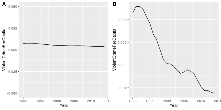
Figure 32: Crime data from 1990 to 2014 plotted over time. Panels A and B show the same data, but with different ranges of values along the Y axis. Data obtained from https://www.ucrdatatool.gov/Search/Crime/State/RunCrimeStatebyState.cfm
Choose the Y-axis wisely
We mentioned this tip when we went over bar charts, but it is worth reviewing again. One of the major controversies in statistical data visualization is how to choose the Y-axis, and in particular whether it should always include zero. In his famous book “How to lie with statistics”, Darrell Huff argued strongly that one should always include the zero point in the Y axis. On the other hand, Edward Tufte has argued against this:
“In general, in a time-series, use a baseline that shows the data not the zero point; don’t spend a lot of empty vertical space trying to reach down to the zero point at the cost of hiding what is going on in the data line itself.” (from https://qz.com/418083/its-ok-not-to-start-your-y-axis-at-zero/)
There are certainly cases where using the zero point makes no sense at all. Let’s say that we are interested in plotting body temperature for an individual over time. In Figure 33 we plot the same (simulated) data with or without zero in the Y-axis. It should be obvious that by plotting these data with zero in the Y-axis (Panel A) we are wasting a lot of space in the figure, given that body temperature of a living person could never go to zero! By including zero, we are also making the apparent jump in temperature during days 21-30 much less evident. In general, my inclination for line plots and scatterplots is to use all of the space in the graph, unless the zero point is truly important to highlight.
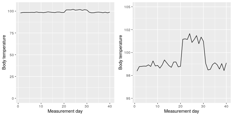
Figure 33: Body temperature over time, plotted with or without the zero point in the Y axis (Source)
Avoid pie charts
This is one reason why statisticians never use pie charts: It can be very difficult for humans to accurately perceive differences in the volume of shapes. Pie charts are not recommended when you have a large number of categories. Pie charts can also be confusing when they are used to compare the outcomes of two different surveys or experiments. In an influential book on the use of graphs, Edward Tufte asserted “The only worse design than a pie chart is several of them.” The pie chart in Figure 34 (presenting the same data on religious affiliation that we showed above) shows how tricky this can be. Can you spot the issues in reading this graph?
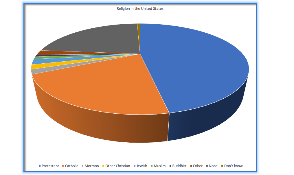
Figure 34: An example of a pie chart, highlighting the difficulty in apprehending the relative volume of the different pie slices.
This plot is terrible for several reasons. First, it requires distinguishing a large number of colors from very small patches at the bottom of the figure. Second, the visual perspective distorts the relative numbers, such that the pie wedge for Catholic appears much larger than the pie wedge for None, when in fact the number for None is slightly larger (22.8 vs 20.8 percent), as was evident in Figure 34. Third, by separating the legend from the graphic, it requires the viewer to hold information in their working memory in order to map between the graphic and legend and to conduct many “table look-ups” in order to continuously match the legend labels to the visualization. And finally, it uses text that is far too small, making it impossible to read without zooming in.
Plotting the data using a more reasonable approach (Figure 35), we can see the pattern much more clearly. This plot may not look as flashy as the pie chart generated using Excel, but it’s a much more effective and accurate representation of the data.
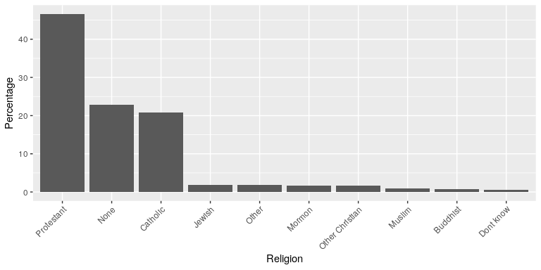
Figure 35: A clearer presentation of the religious affiliation data (obtained from http://www.pewforum.org/religious-landscape-study/).
This plot allows the viewer to make comparisons based on the length of the bars along a common scale (the y-axis). Humans tend to be more accurate when decoding differences based on these perceptual elements than based on area or color.
Key Takeaway: which graph can go with what levels of measurement?!
| Level of Measurement | Graph | Other considerations? | |
| Nominal | Bar (Y variable or frequency on Y-axis)
Pie (perhaps!?) |
you may have research where your X-axis is nominal data and your y-axis is interval/ratio data (ex: figure 34) | |
| Ordinal | Bar (frequency on Y-axis)
Pie (perhaps?!) Line graph (frequency on Y-axis) Stem & Leaf Plot |
||
| Interval | Bar (part of Y-axis)
Stem & Leaf Plot Box plot Histogram (frequency on Y-axis) |
you may have research where your X-axis is nominal data and your y-axis is interval/ratio data (ex: figure 34) | |
| Ratio | Bar (part of Y-axis)
Stem & Leaf (discontinuous) Box plot Histogram (frequency on Y-axis) |
you may have research where your X-axis is nominal data and your y-axis is interval/ratio data (ex: figure 34) |
Learning objectives
Having read this chapter, you should be able to:
- Identify different types of graphs and when we would use them based on the type of data
- Differentiate between different types of frequency graphs
- Identify the shape of a distribution in a frequency graph.
- Identify good versus bad graphs using some basic tips and principles
- Promise to never create a pie chart.
Video recap
These are all optional video that help summarize what was covered in the chapter
- Watch video (3 min) on frequency distributions (What’sUpDude, 2020). This reviews frequency tables, group frequency tables, relative frequency variable. Class limits is same as class interval.
- Watch video (7 min) that reviews frequency distributions and differences between types of charts (MooMoo Math and Science, 2016)
- Watch video (11 min) on the shapes of distributions (Crash Course, 2018)
- Watch Gasolwitz’s TedEd video (4-min) on how to catch misleading graphs (TedEd, 2017)
Exercises – Ch. 3
- Name some ways to graph quantitative variables and some ways to graph qualitative variables.
- Given the following data, construct a pie chart and a bar chart. Which do you think is the more appropriate or useful way to display the data?
- Pretend you are constructing a histogram for describing the distribution of salaries for individuals who are 40 years or older, but are not yet retired.
- What is on the Y-axis? Explain.
- What is on the X-axis? Explain.
- What would be the probable shape of the salary distribution? Explain why.
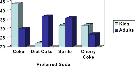
- A graph appears below showing the number of adults and children who prefer each type of soda. There were 130 adults and kids surveyed. Discuss some ways in which the graph below could be improved.
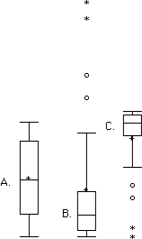
- Which of the box plots on the graph has a large positive skew? Which has a large negative skew?
- Create a histogram of the following data representing how many shows children said they watch each day.
- Explain the differences between bar charts and histograms. When would each be used
- Draw a histogram of a distribution that is
Negatively skewed
Symmetrical
Positively skewed
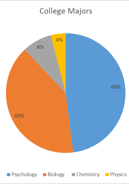
- Based on the pie chart below, which was made from a sample of 300 students, construct a frequency table of college majors.
- Create a histogram of the following data. Label the tails and body and determine if it is skewed (and direction, if so) or symmetrical.
Hours worked per week
Proportion
0-10
4 10-20
8 20-30
11 30-40
51 40-50
12 50-60
9 60+
5 Answers to Odd-Numbered Exercises – Ch. 3
- Qualitative variables are displayed using pie charts and bar charts. Quantitative variables are displayed as box plots, histograms, etc.
- [You do not need to draw the histogram, only describe it below]
- The Y-axis would have the frequency or proportion because this is always the case in histograms
- The X-axis has income, because this is out quantitative variable of interest
- Because most income data are positively skewed, this histogram would likely be skewed positively too
- Chart b has the positive skew because the outliers (dots and asterisks) are on the upper (higher) end; chart c has the negative skew because the outliers are on the lower end.
- In bar charts, the bars do not touch; in histograms, the bars do touch. Bar charts are appropriate for qualitative variables, whereas histograms are better for quantitative variables.
- Use the following dataset for the computations below:
Major
Freq
Psychology
144
Biology
120
Chemistry
24
Physics
12
